- TemplatesTemplates
- Page BuilderPage Builder
- OverviewOverview
- FeaturesFeatures
- Dynamic ContentDynamic Content
- Popup BuilderPopup Builder
- InteractionsInteractions
- Layout BundlesLayout Bundles
- Pre-made BlocksPre-made Blocks
- DocumentationDocumentation
- EasyStoreEasyStore
- ResourcesResources
- DocumentationDocumentation
- ForumsForums
- Live ChatLive Chat
- Ask a QuestionAsk a QuestionGet fast & extensive assistance from our expert support engineers. Ask a question on our Forums, and we will get back to you.
- BlogBlog
- PricingPricing
Image
Images are another element of a webpage that adds interest and improves user understanding and experience. Let us go over how you can work with Images in SP Page Builder.
How to Add an Image
Open the Addons Panel by clicking on the Addons button on the Sidebar or using the plus icon found within a Row. Scroll to the Media section and drag & drop the Image addon where you want to place it on your canvas.
Content

Next, it’s time to choose the Image you want to add from the Media Manager and customize it. Under the General tab, you will find all available customization options.
In the Content section, you can add and edit your image. You will also be presented with the following options:
Choose Image: Opens the Media Manager from where you can select the image you want to use. After adding the Image, an Image Thumbnail will replace the Choose Image button. Initially, you will get the following additional options:
- Replace: Hover over the Thumbnail to find the Replace button which will open the Media Manager
- Clear: Click on this button to remove this image and add another one.
Image URL: If the image you want is online, you can simply paste its URL into the text field beside the Upload button.
Upload: Also opens Media Manager and from here you can click on the Upload Files option to upload your Image. Choose formats based on image use:
- PNG: This format is best for images that require transparency or sharp edges.
- JPEG/JPG: The JPEG or JPG format is ideal for detailed photographs due to efficient compression. It is wise to use this format for most of your static images.
- SVG: This vector format is ideal for logos and icons. SVGs are scalable without losing quality and are easily customizable with CSS or JavaScript.
- WebP: WebP offers superior compression without compromising quality, with broad browser support. You can use these for high-quality images.
- AVIF: AVIF provides even better compression and image quality than WebP but with limited browser support. Use WebP for compatibility and AVIF for maximum compression.
- GIF: GIFs are best for simple animations but less efficient than WebP for complex graphics.
Image 2x: Upload 2x image here which is the optimized image for the Retina display.
Alt Text: A brief description of an image that is used to convey the image's meaning when it cannot be viewed for various reasons.
Title: Set the title of your image.
Alignment: Set the alignment of your image on the page.
Image Shape
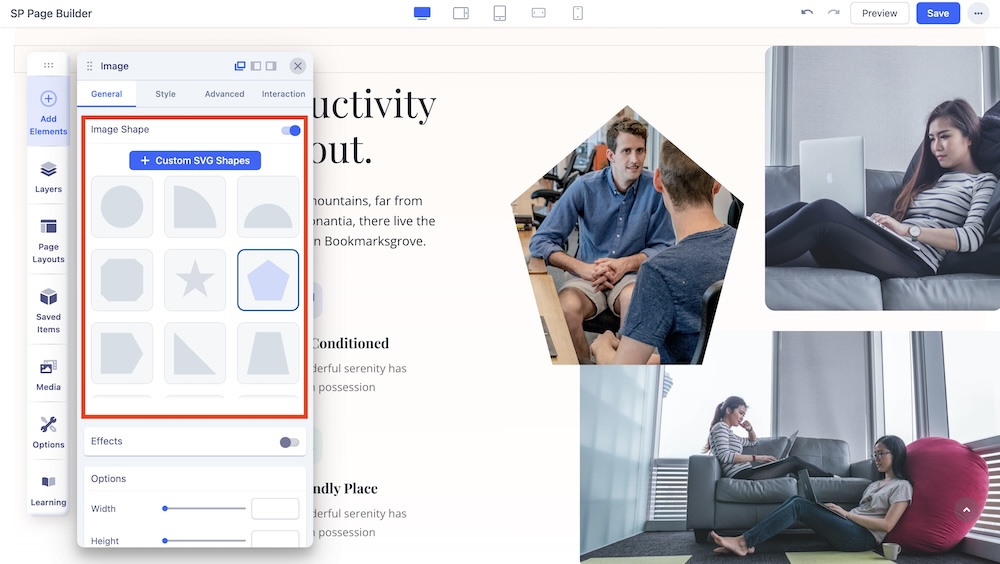
Enable the Image Shape option to access the list of available shapes. Simply click on each shape to apply it to your desired image. Here, you will find two different customization options:
+ Custom SVG Shapes: Add your custom image shapes here. Upon clicking the blue “+ Custom SVG Shapes” button, a field to include your SVG code will appear. Copy the code of your favorite image shape and paste it in this field. Hit “Save” and your custom image shape will be instantly added to the Image Shape list.
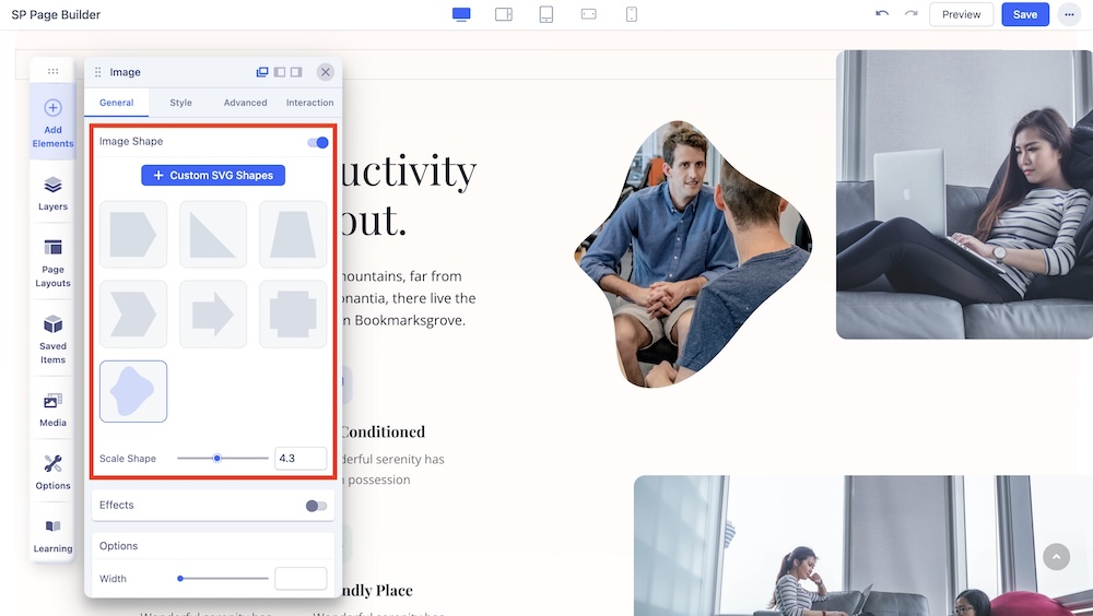
Please note that only a single path code can be used for custom shapes. This means that each SVG shape must be defined by a single path element within the SVG code to maintain simplicity and consistency in how the shapes are processed and rendered.
Scale Shape: Drag the pointer to the left or right to resize the SVG shape proportionally. Or use the adjacent field to enter a numerical value to resize the custom shape.
Effects (Color, Opacity)
The Effects options property applies graphical effects to the image element. For example, we can apply a blur effect to an image, a black an white filter, or change properties like contrast, saturation, etc. When the filter property values contain multiple functions, the filters are applied in order. You may combine any number of functions to manipulate the rendering.
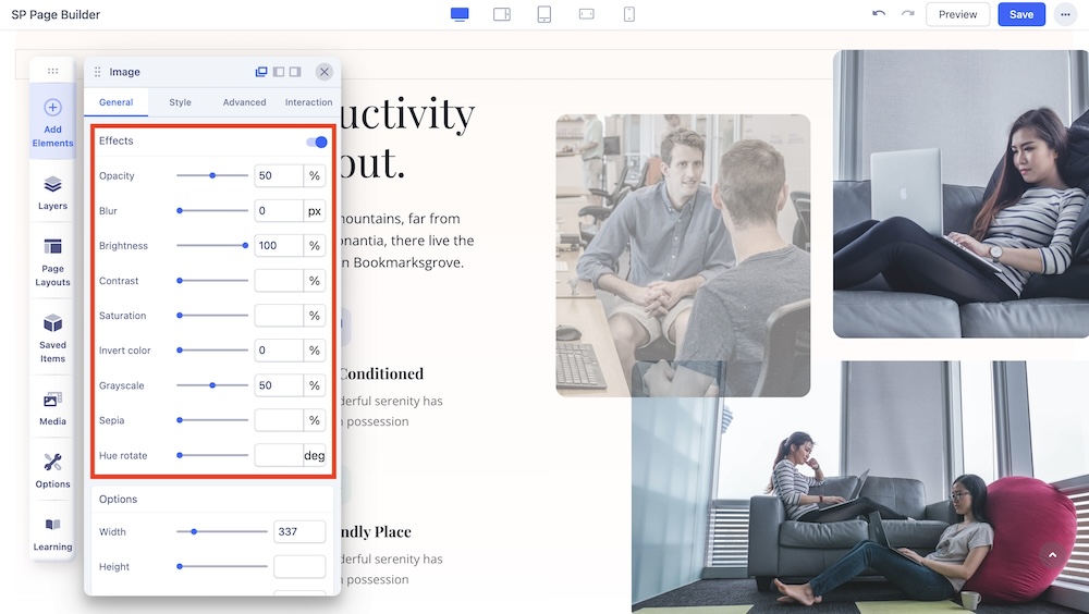
Enable the Effects option to apply color filter effects to your images. Once enabled, adjust the intensity of each effect by dragging left or right. Alternatively, input values directly into the corresponding boxes for precise adjustments.
Note: The filter property (Effects) is not supported in Internet Explorer or Edge 12.
Options
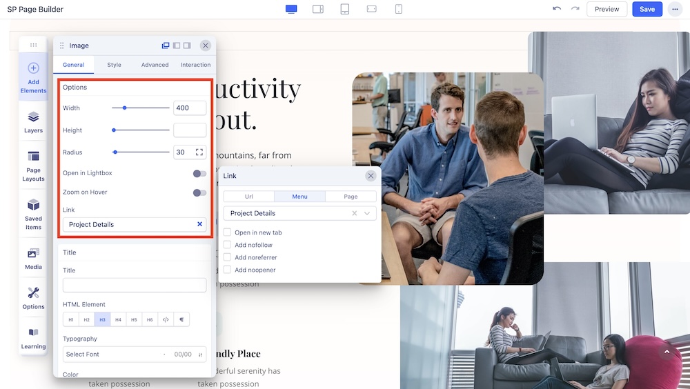
You can customize the dimensions of your image from the Options setting.
Width: Set the Image’s width. Use the range slider to increase or decrease the value or enter a number into the text field beside it.
Height: Set the Image’s height. Use the range slider to increase or decrease the value or enter a number into the text field beside it.
Radius: Use this option to round the edges of the Image. Increasing it will give you rounder edges and decreasing it will give you sharper edges.
Open in Lightbox: Enable this option to open this image within a color overlay.
Zoom on Hover: Enable this option to add a zoom animation on hover. Also, adjust the scale of the zoom.
Link: Add a link to your added image using the Link tab.
- For URL, simply paste the web address you want to link to into the first field.
- For Menu, select the option you want to link to from the dropdown list. Note that the options on this list are all Menu Items that exist on your website.
- For Pages, select the option you want from the dropdown list. Like Menu, these options are all existing Pages available on this website.
- Lastly, you can enable the option Open in New Tab to open this link in a new tab, Add nofollow to tell search engines to ignore this link, Add Noreferrer to prevent any referrer information from being sent to the target resource, and Noopener to stop a third-party website you connect to from using the window object to take over the browser tab.
Title
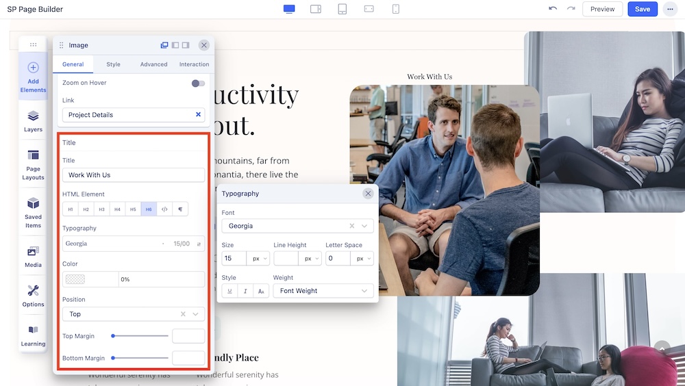
You can also give your Image a Title. Scroll down to the Title section to access this option.
Title: Add a title to your addon.
HTML Element: Set the HTML Element of your title.
Typography: The Typography Settings lets you edit your title’s appearance to fit your preference. Adjust your font types, Size, Line Height, Letter Space, Style, and Weight for your Feature box button texts. Learn more about Typography here.
Color: Choose your title’s color option. Learn more about color settings here.
Position: Select the position of the image within the row.
Top Margin: Adjust the top margin of the image.
Bottom Margin: Adjust the bottom margin of the image.

