- TemplatesTemplates
- Page BuilderPage Builder
- OverviewOverview
- FeaturesFeatures
- Dynamic ContentDynamic Content
- Popup BuilderPopup Builder
- InteractionsInteractions
- Layout BundlesLayout Bundles
- Pre-made BlocksPre-made Blocks
- DocumentationDocumentation
- EasyStoreEasyStore
- ResourcesResources
- DocumentationDocumentation
- ForumsForums
- Live ChatLive Chat
- Ask a QuestionAsk a QuestionGet fast & extensive assistance from our expert support engineers. Ask a question on our Forums, and we will get back to you.
- BlogBlog
- PricingPricing
Image Carousel
SP Page Builder’s Image Carousel addon will let you display your images smartly on your website. It will help you create a gorgeous image gallery easily. You can take full control over the carousel design with easy settings.
How to Add Image Carousel Addon?
You can add the Image Carousel addon to your page from the SP Page Builder sidebar. Simply drag the addon from the Addons panel and drop it on the section of the page where you want to add the Image Carousel.
Content
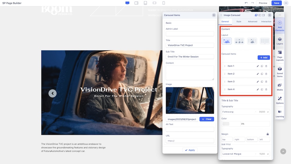
The first Content section contains these two options:
Layout: You can showcase your image carousel in 4 different layouts. Select your desired carousel layout and customize it your way. 4 of these carousel layouts vary on the basis of their image positioning. Each of these layouts is unique and has its own design needs.
Carousel Items: You can add and edit carousel items here. Each image can be given additional adjustments such as Admin Label, Title, Sub Title, Content Description, Alt Text, and a URL that will redirect elsewhere. Click on the settings icon on the inline editor to access the item customization settings of the addon.
- Admin Label: Use the text field to add an admin label to the carousel item.
- Title: Use the text field to add a title to the carousel item.
- Sub Title: Use the text field to add a subtitle to define the carousel item.
- Content: Use the text field to add the description of the carousel item.
- Carousel Image: Use the upload option to upload the carousel image item.
- Alt Text: Add alt text to accompany the image.
- URL: You can either link the carousel item to an external URL, a menu, or a page.
Title & Sub Title
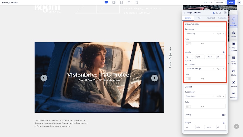
This section contains some additional settings:
Typography: Adjust the fonts of the Title and Sub Title. Separate setting for both.
Color: Adjust the color of the fonts of the Title and Sub Title. Separate setting for both.
Margin: Adjust the margins of the Title and Sub Title.
Container Typography & Overlay
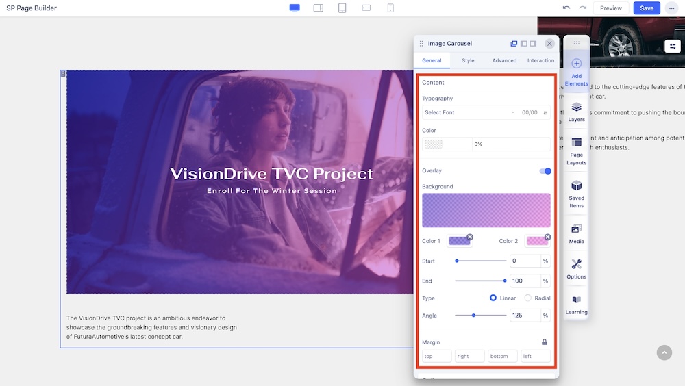
The second Content section allows you to adjust the following settings:
Typography: Adjust the overall font of the text within the carousel container.
Color: Select the overall color of the text within the carousel container.
Overlay: Select this option to apply a gradient color background as an overlay.
- Color 1: Select the first Color for the Gradient.
- Color 2: Select the second Color for the Gradient.
- Start: Define how far the first color will spread.
- End: Define how far the second color will spread.
- Type: Select if the Gradient type will be Linear or Radial. A Linear Gradient is in a straight direction whereas a Radial Gradient is in a circular direction.
- Angle: Set the Angle of the Gradient.
- Margins: Adjust the margins of the overlay.
Options
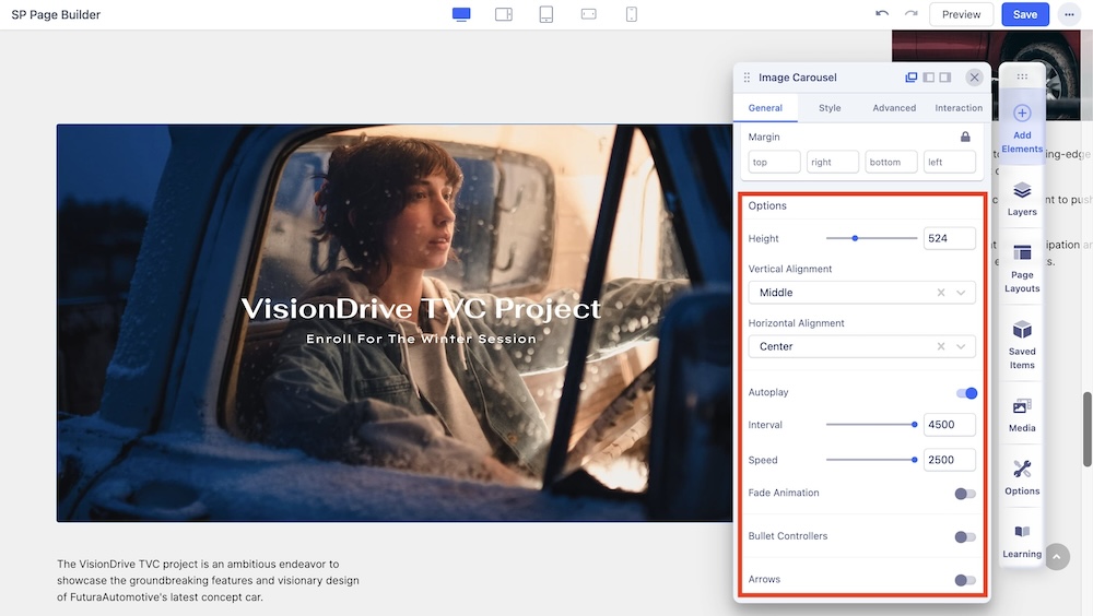
Randomize Carousel: Enable the option to randomize the order of the carousel items.
Height: Use the slider or the input field to define the height of the carousel.
Vertical Alignment: Set the vertical alignment of the carousel to the top, bottom, or middle.
Horizontal Alignment: Set the horizontal alignment of the carousel to the top, bottom, or middle.
Autoplay: Enable autoplay to slide to the next item in the carousel.
Interval: Set the interval after which elements in a Carousel will slide to the next.
Speed: Set the speed at which elements in a Carousel will slide to the next.
Fade Animation: Toggles a fade animation.
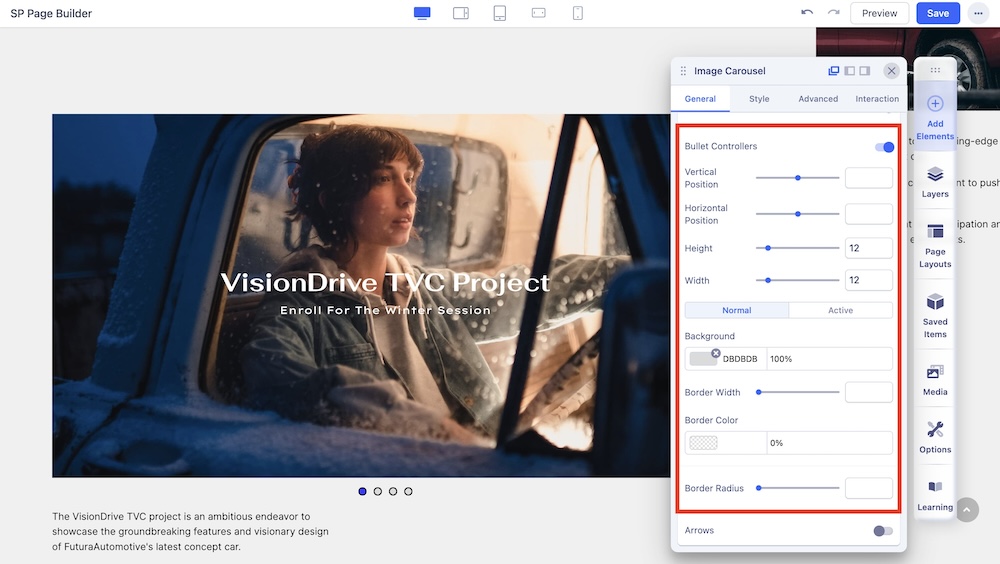
Bullet Controllers: Enable to show Bullets to slide the next item in the carousel. You can customize the position, width, height, color, border, and more of the bullet controller from the settings.

Arrows: Enable to show arrows that point left and right to slide to the next item in the carousel. You can customize the position, width, height, color, border, and more of the arrow controller from the settings.

