- TemplatesTemplates
- Page BuilderPage Builder
- OverviewOverview
- FeaturesFeatures
- Dynamic ContentDynamic Content
- Popup BuilderPopup Builder
- InteractionsInteractions
- Layout BundlesLayout Bundles
- Pre-made BlocksPre-made Blocks
- DocumentationDocumentation
- EasyStoreEasyStore
- ResourcesResources
- DocumentationDocumentation
- ForumsForums
- Live ChatLive Chat
- Ask a QuestionAsk a QuestionGet fast & extensive assistance from our expert support engineers. Ask a question on our Forums, and we will get back to you.
- BlogBlog
- PricingPricing
Progress Bar
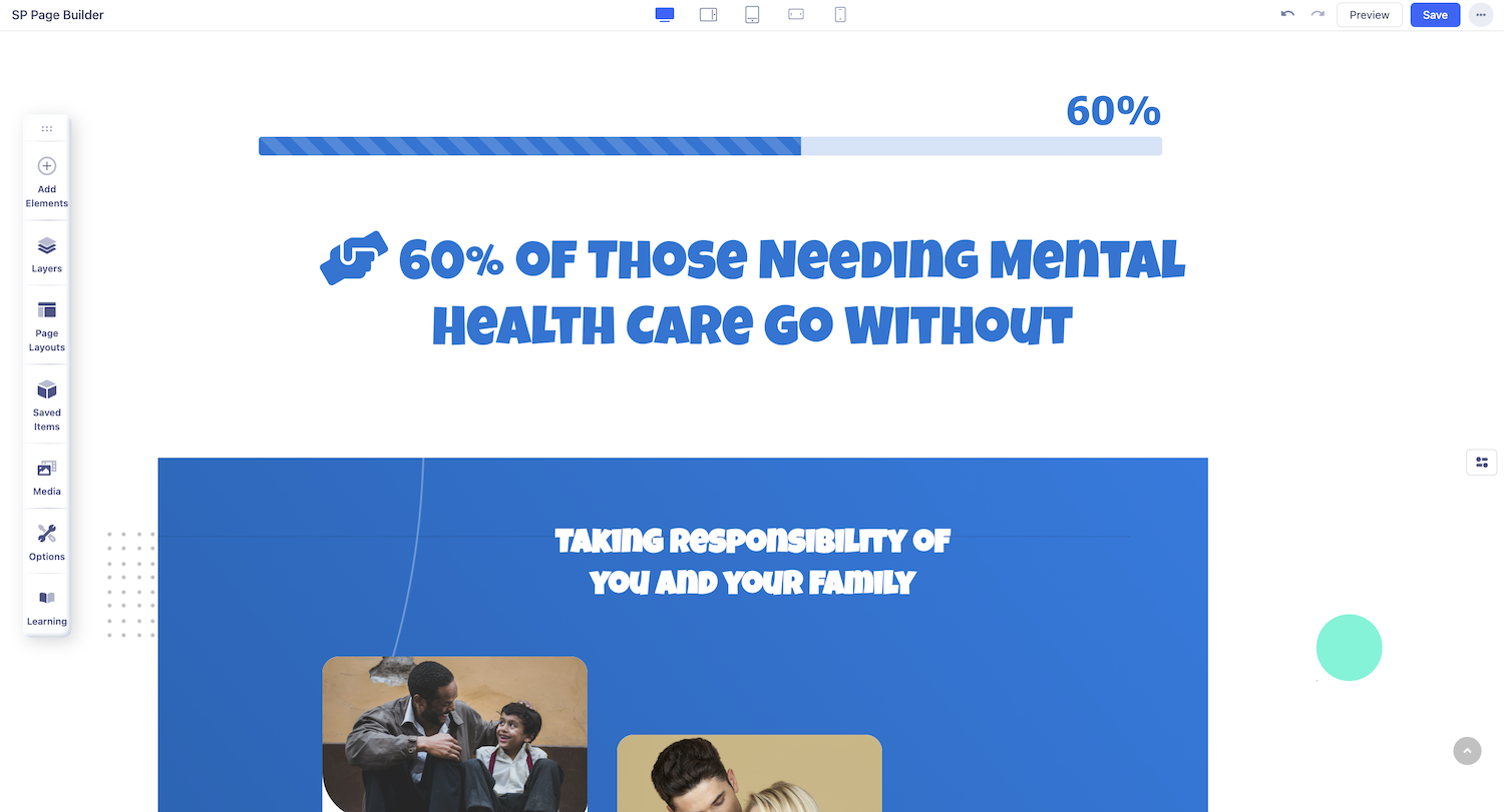
The Progress Bar addon is a chart that displays progress in the form of a horizontal bar. This chart is very handy when it comes to representing complex information in a simple way.

How to Add a Progress Bar
To add a Progress Bar, start by opening the Addons Panel. The Addons Panel can be accessed by clicking on the Addons button on the Sidebar. You’ll find the Progress Bar addon under the Content section so drag & drop it to where you want it placed.
Progress Bar Settings

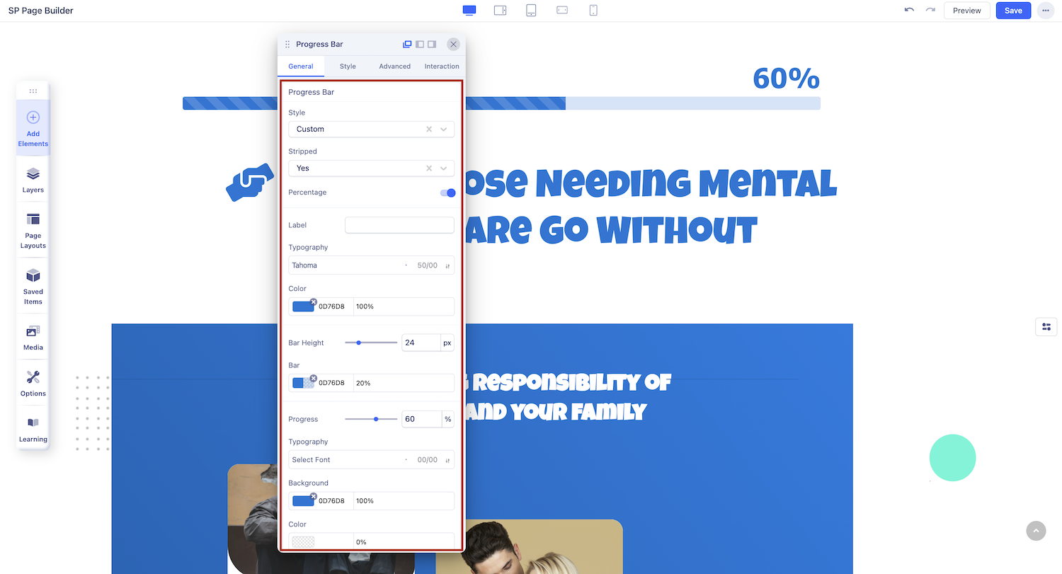
Now that you've added the progress bar, click on it to open the addon settings. Here, you'll find all the options you need to customize it to your preference.
Label: Add text using this option to explain what the Progress Bar is for.
Progress: Set the percentage of Progress achieved.
Bar Height: Define the height of the Progress Bar. Leave blank to use default height.
Style: Set the style of your Progress Bar. Choose the Custom option if you want it to be a custom color.
Stripped: Enable this to get a stripe patterned Progress Bar.
Percentage: Enable this to display the progress percentage.
Typography Settings
Click on the ‘A’ Letter icon on the inline editor to open the Typography window. Here, you can adjust the Font, Font Size, Line Height, etc for the text in your Progress Bar. For detailed information on Typography check out this documentation.
Color Settings

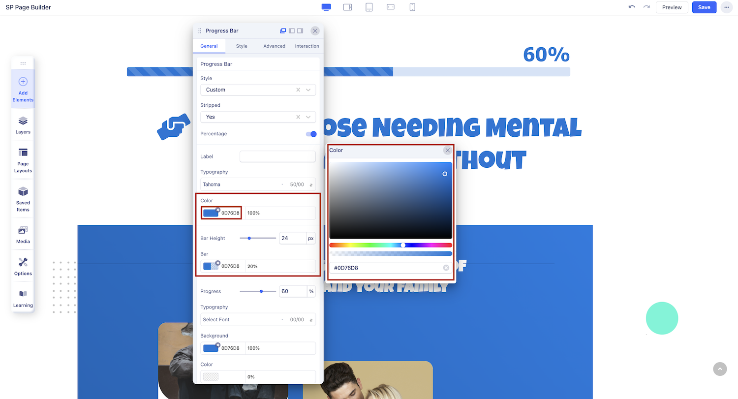
Change your Progress Bar’s color scheme using the Color Settings. From the Color section of the settings panel, you can customize the colors for the Bar, Progress, Label, and Percentage. Clicking on the color box will open the Color Picker window, allowing you to select your desired color easily.

