

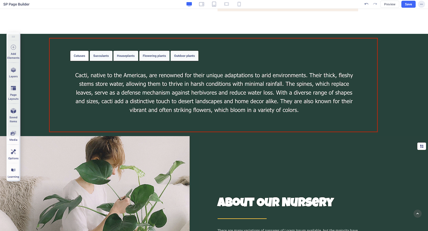
Tabs
Website Tabs are similar to Browser Tabs as it consists of multiple “Divs” that are grouped together to save space. Because of this, the Tabs addon is especially helpful for single-page websites or websites with limited space. When designed well, they help improve readability and decrease clutter.
How to Add Tabs
Start by opening the Addons Panel. Click on the Addons button on the Sidebar or the plus icon inside a row to do this. Finally, scroll down to the Content section and drag & drop Tabs to your canvas.
Tabs Settings
After adding the Tabs Addon to your page, simply click on it to access the settings panel, where you can customize its appearance and functionality to suit your needs.
Content
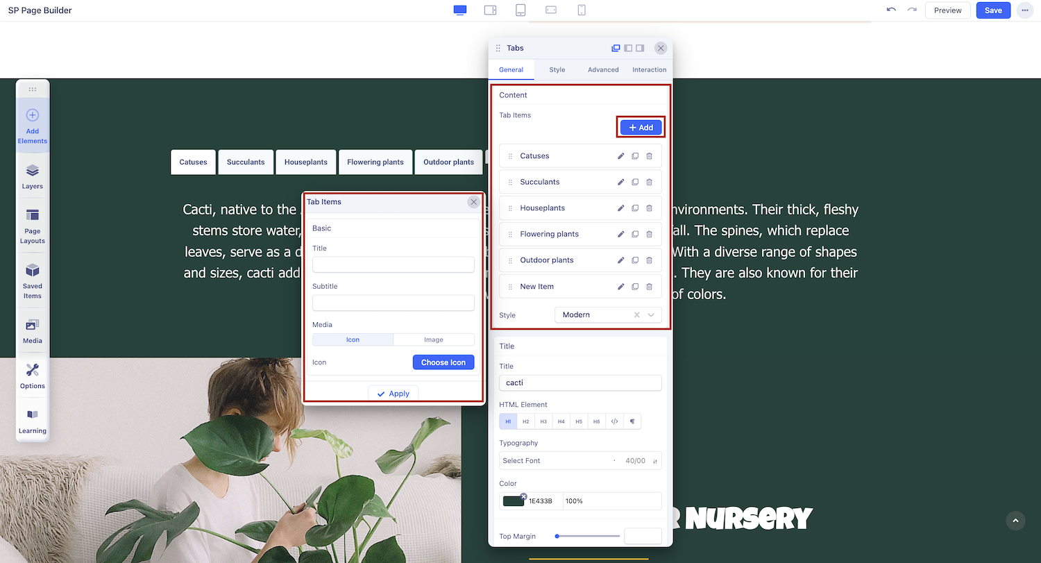
+Add: By default, the Tabs addon only consists of one Tab Item but you can easily add more by clicking on this button.
Style: Select the Tabs’ Style from here. Options include Modern, Default, Pills, Lines, and Custom.
Title: Set a Title for your New Tab Item
Subtitle: Set a Subtitle for your New Tab Item.
Media: Select the type Icon or Image if you want to add a Media to appear beside your New Tab Item’s Title.
Finally, click on Apply to save your changes.
Title
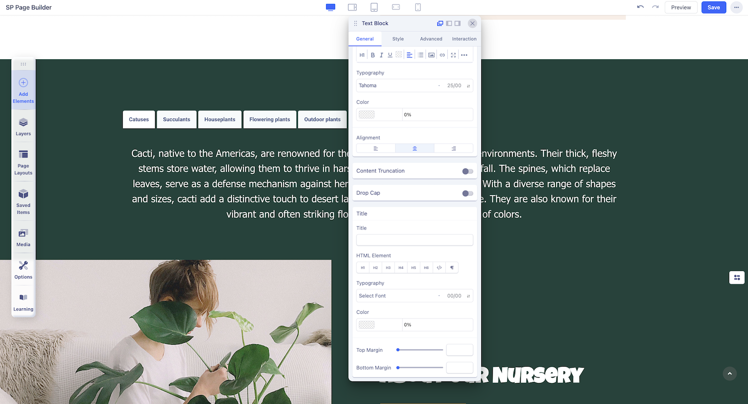
Title: Set the title of your tabs here, if applicable.
HTML Element: Choose the appropriate HTML tag for your title.
Typography: Customize the font style, size, weight, and spacing.
Color: Select the desired color for your title text.
Top Margin: Adjust the spacing above the title.
Bottom Margin: Set the spacing below the title.
Navigation
If you select Custom as your tabs style, you will unlock the following settings:
Position: Choose from Top, Bottom, Left, or Right.
Padding: Adjust the inner spacing of the tabs.
Margin: Set the outer spacing around the tabs.
Justify: Define how the tab labels are spaced within the tab container.
Alignment: Control tab alignment within the container.
Color: Set the text color for your tabs. Click on the rectangle box to open the color panel and use the slider to adjust the opacity.
Background: Choose the background color for your tabs.
Border Width: Adjust the thickness of the border.
Border Color: Select the border color.
Border Radius: Round the corners of your tabs by sliding the bar or inputting a specific value.
Media: Choose between an icon or image as media for your tab.
Adding Content to Tabs
The Tabs addon comes with a Text Block by default, but that doesn’t mean it’s limited to just text. What makes this addon amazing is that you can actually nest any addon you want! You have all the flexibility you need when designing a webpage with a Tab Item’s window.
To nest other addons, open the Addons Panel, then drag and drop the element you want into the Tab. You’ll notice grey lines appearing in the Tab Item window when you hover with the new element, indicating where it will be placed once dropped.
Once the addon has been added, you can customize it to your preferences using its settings panel.