

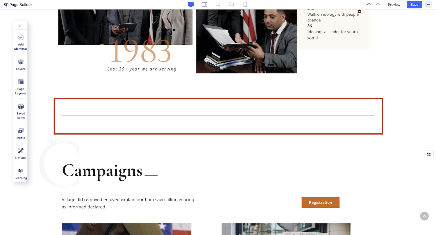
Divider
What is a Divider
The Divider addon lets you add a divider between web elements to help individualize sections prominently. This addon comes with multiple customization options to let you fully customize your divider.
How to Add a Divider
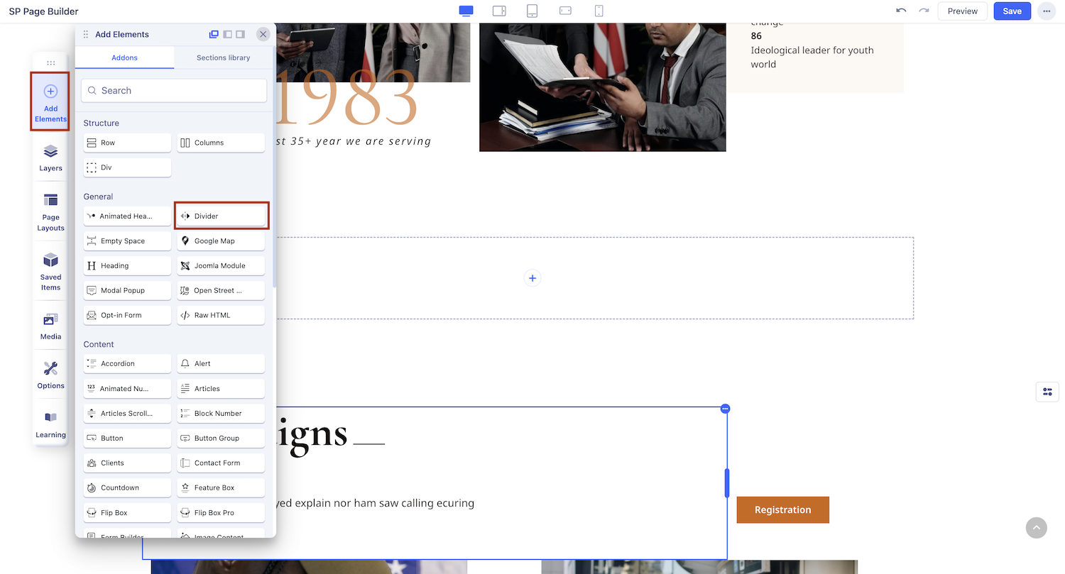
You can add a Divider to your web page from the Addons panel of the SP Page Builder sidebar. Simply drag the Divider addon from the SP Page Builder Addons panel and drop it on the section of the page where you want to add the addon.
Divider Settings
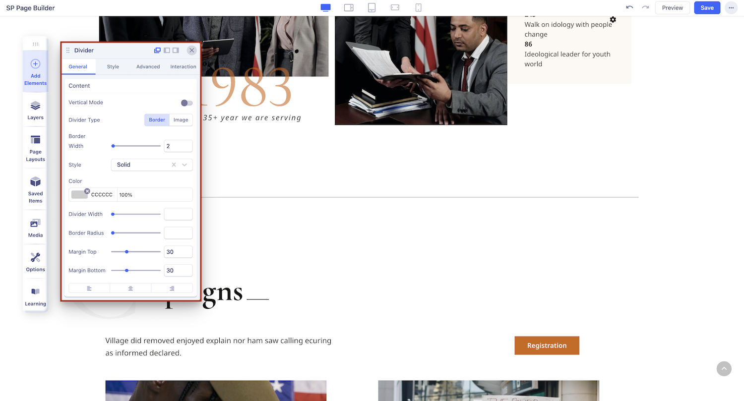
Click on the divider to access its settings, where you can customize it to fit your design preferences.
Content
Configure your divider with precise settings to enhance your layout structure.
- Vertical Mode: Enable this mode in case you want to set your divider vertically.
- Divider Type: Choose between two divider options : Border and Image.
- Divider Dimensions: Set the height and width of your divider
- Margin: Customise top and bottom margin
- Alignment: Set the alignment of your divider
Divider Type
You can choose between two border types: a standard border or an image border.
-
Border
You can choose between three types of border: Solid, Dashed, Dotted
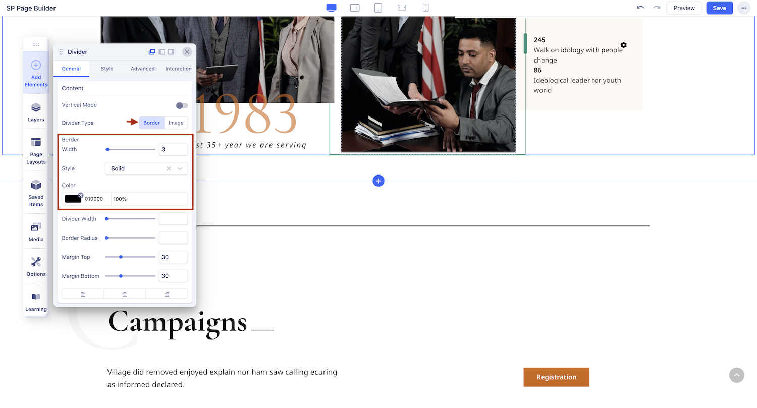
You can customise the width, colour and opacity of your border.
-
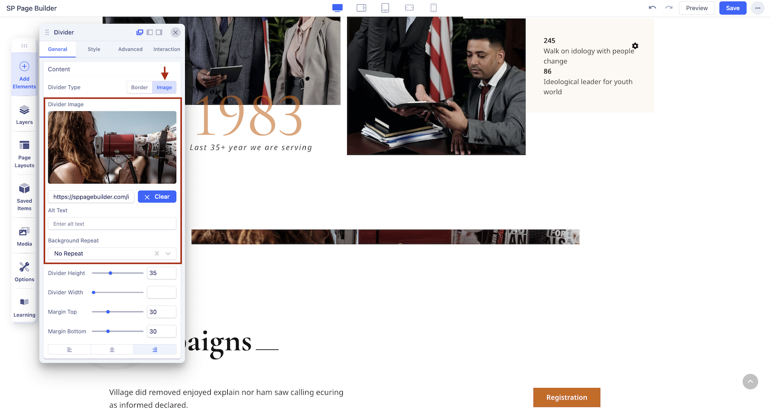
Image
The ‘Image’ option lets you set your preferred image as a divider. You can customize it further by selecting the image, adjusting the divider height, and choosing how the background repeats. Options include no-repeat, repeat all, and repeat horizontally.
You can also click the ‘Generate with AI’ button to open the Image Generator panel and create images using a few simple prompts.