- TemplatesTemplates
- Page BuilderPage Builder
- OverviewOverview
- FeaturesFeatures
- Dynamic ContentDynamic Content
- Popup BuilderPopup Builder
- InteractionsInteractions
- Layout BundlesLayout Bundles
- Pre-made BlocksPre-made Blocks
- DocumentationDocumentation
- EasyStoreEasyStore
- ResourcesResources
- DocumentationDocumentation
- ForumsForums
- Live ChatLive Chat
- Ask a QuestionAsk a QuestionGet fast & extensive assistance from our expert support engineers. Ask a question on our Forums, and we will get back to you.
- BlogBlog
- PricingPricing
Addon Editing Tools
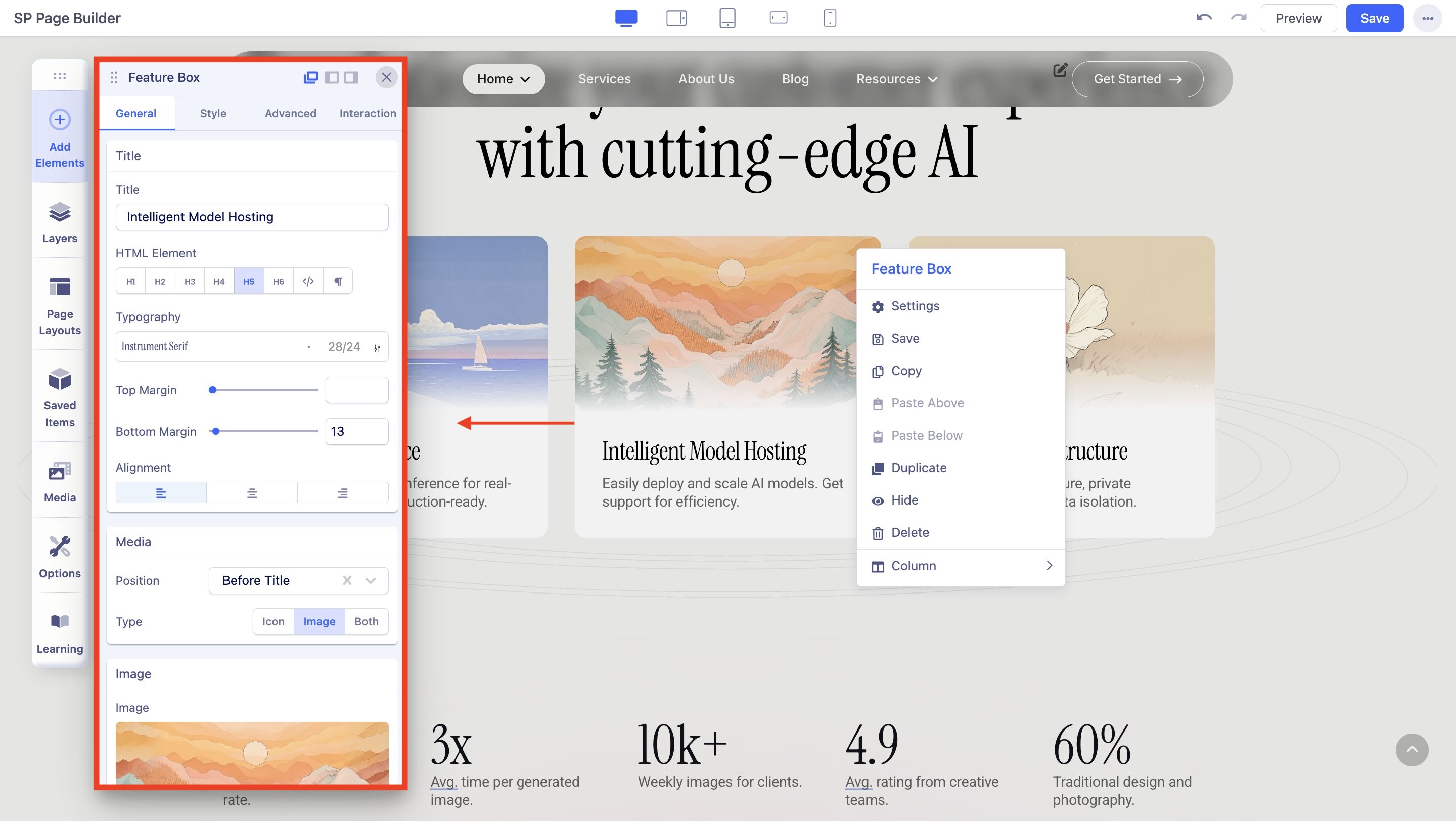
For every added addon, when you click on it an inline editor appears. There you will find the tools for accessing the styling options of the addon. The options are addon specific and we have in-depth documentation for every addon in the Addons section.

Save addon: After customization, you can save an addon to reuse later to speed up your development. Click on the save icon, give your addon a name and use it to reuse.
Copy: This allows to copy the addon for later use.
Paste Above/Paste Below: You can paste the previously copied addon either above or below the currently selected addon.
Duplicate: This creates a duplicate of the addon immediately below the selected addon.
Delete: You can delete the addon from the page using this option.
Column: Customize addon's column settings using this option.
When you click on the settings icon this will open the Addon Editor to add styling and customization. Again, the addon editor is addon-specific which we have covered in-depth in the Addons documentation. However, there are some options that apply to all addons, which will be covered below.
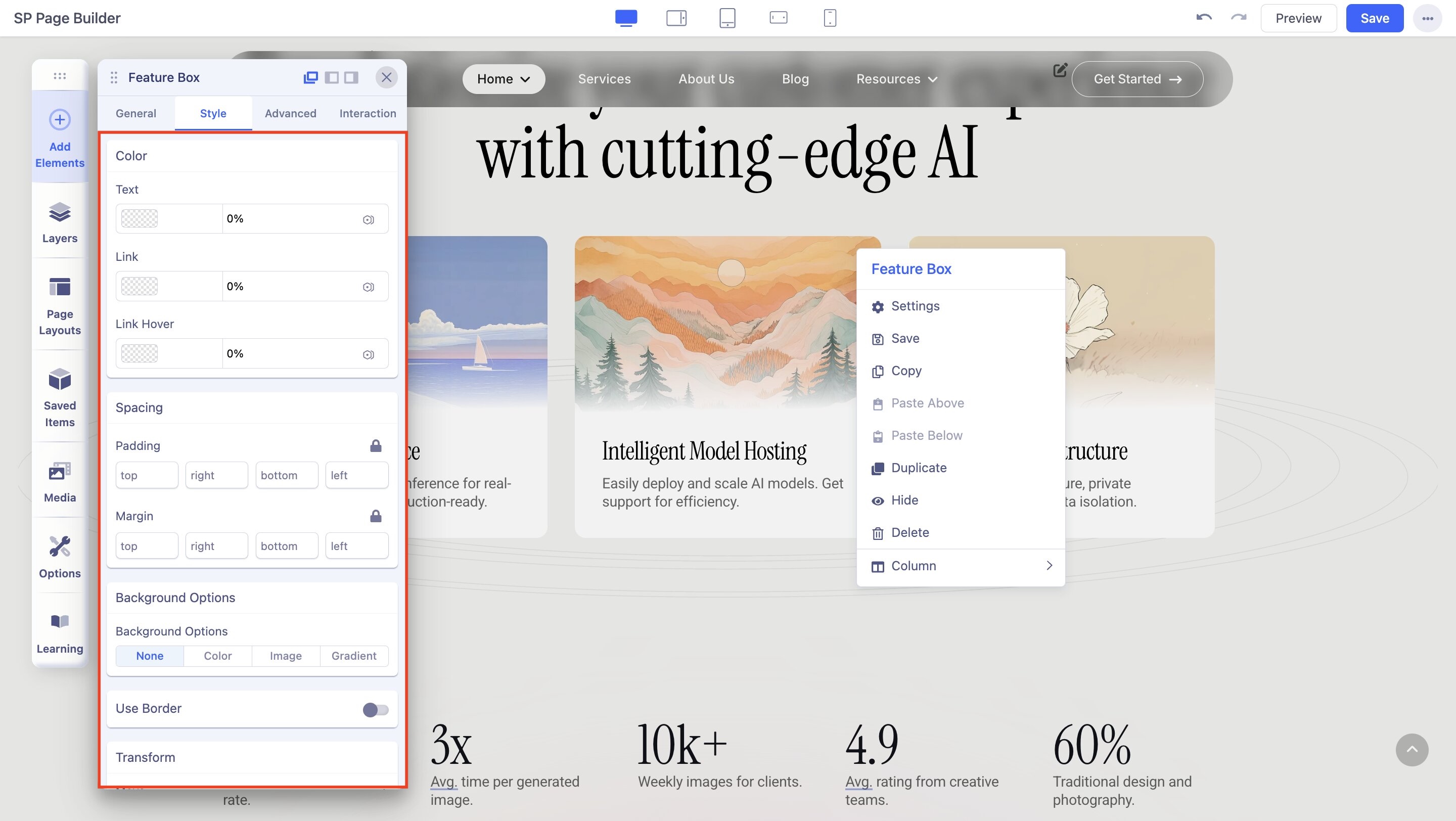
Style

Padding: Add padding (spacing inside) to one side, complementary sides, or all four sides at once.
Margin: Add margins (spacing outside) to one side, complementary sides, or all four sides at once.
Text Color: Use this option to set a color to all the text inside the addon.
Link Color: Use this option to set a color for all the links inside the addon.
Link Hover Color: Use this option to set a hover color for all the links inside the addon.
Background Options: Use this to set the background of the addon to the following options:
- None
- Color
- Image
- Gradient
Border: Enable this option to add a border across the entire row or section.
Border Style: Choose your border style from the drop-down list.
Border Color: Choose a color for the row's border.
Border Width: Use the slider to change the width of the border width.
Border Radius: Border radius is for the corners of the border to be rounded or straight. Use the slider to up and down the number to set the Border Radius.
Box Shadow: Enable to open the Box Shadow settings.
Color: Choose a shadow color to add a shadow effect to the row.
Horizontal: Use the slider to change the shadow radius horizontally.
Vertical: Use the slider to change the shadow radius vertically.
Blur: Use the slider to change the blur level of the shadow.
Spread: Use the slider to change the size of the shadow's spread.
Animation: From this tab, you can select the animation for the row. It has the following options:
- Fade
- Rotate
- Flip
- Bounce
- Zoom
- Special
Direction: Select from the drop-down list the direction of the animation.
Duration: Use the slider or input field to set the duration of the animation in milliseconds.
Delay: Use the slider or input field to set the delay for the start of the animation in milliseconds.
CSS Class: If you wish to style a particular content element differently, then use this field to add a class name and also refer to it in your CSS file.
Custom CSS: Write the custom CSS code here.
Advanced

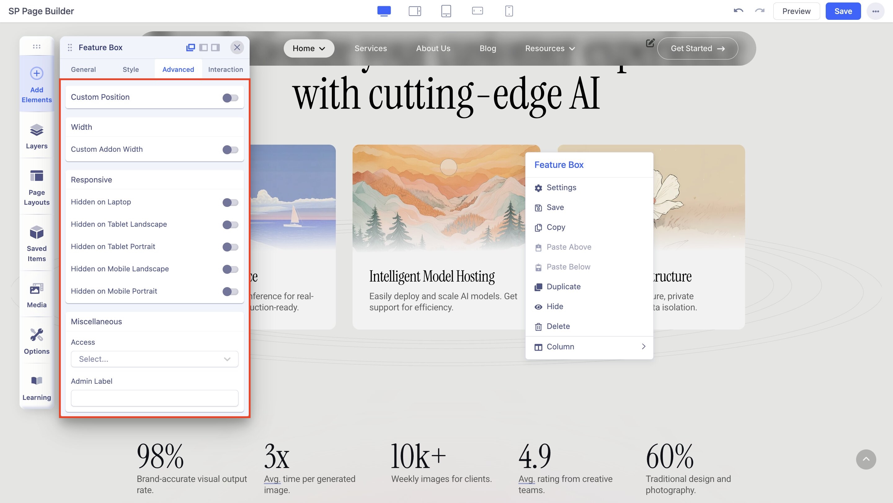
The set of settings offered in this section is mostly position-based. It also allows you to hide the content of this specific addon to hide in certain devices. Provided below is the list of all available styling options.
Enable Custom Position: This allows you to define a custom position for the addon. Caution: custom positioning is not a good practice for responsive web design and should not be used too frequently. If enabled, you’ll have the following features:
- Select Position: Lets you choose a position from Absolute, Fixed, and Relative.
- From X-axis: You can move the addon horizontally, positive values refer to the right and negative refers to the left position. The feature is responsive which means you can set different values for each device type.
- From Y-axis: From X-axis: You can move the addon vertically, positive values refer to the top and negative refers to the bottom position. The feature is responsive, which means you can set different values for each device type.
- Addon CSS Z-index: If you want to change the z-index of the addon within the row/section, change this value.
- Section CSS Z-index: if you need to change the z-index of the addon outside the row/section, change this value.
Custom Addon Width: It allows you to change the width of the addon (in %), regardless of the width of the column, i.e. you can generally set it to be narrower.
Tip: The addon custom width is aligned to left by default, to change its position and center the addon, please adjust the margin options by using those values: 0px auto 0px auto.
Hide Content: You can hide the addon for certain device types. Enabling Hidden on Desktop, Hidden on Template, or Hidden on Mobile will hide the addon content from that particular device type.
Interaction

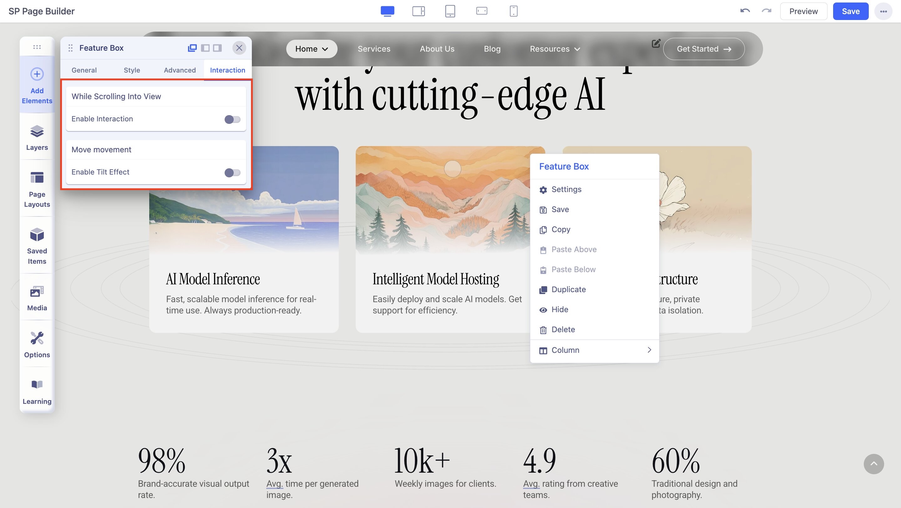
Addon Interaction lets you (as a web developer) unleash your creativity and makes you do crazy stuff. With interaction in SP Page Builder, you have a whole new way to create live motion effects on your site. It has a set of powerful controls that lets you add attractive transitions and beautiful animations. All Addon offers two kinds of interaction options:
- While Scrolling Into View
- Interact On Mouse Movement > Enable Tilt Effect
While Scrolling Into View
Enable Interaction: Enable to use scrolling effects to create animations for when visitors scroll through a web page. A motion effect is created by determining a starting and an ending point.
Scrolling Options: Select the scrolling options to Fullpage or Viewport.
Using the two options, you can create animations that are either visible on the viewport when visitors scroll through a web page or takes up the full page.
Scroll Actions: Using the Scroll Actions you can create transitions when users scroll on a particular element.
Transform Origin X-axis & Transform Origin Y-axis
Transform Origin for the x-axis and y-axis works as the anchor for the effects. You can define the starting point of all the effects using these options.
For instance, if you set Transform Origin of the x-axis to right and the y-axis to the bottom, the interaction effect will start the action from the bottom rightmost corner of the element.
Enable for Tablet: Enable to see the effect on Tablet devices.
Enable for Mobile: Enable to see the effect on Mobile devices.
Interact on Mouse Movement
Using the mouse effect you can create transitions for when users hover the mouse on a particular element.
Enable Tilt Effect: Enable Tilt Effect on the addon.
Tilt Direction: Tilt Direction defines what will happen upon mouse hover. The forward Direction makes the element move towards the mouse and the Opposite Direction makes the element move backward.
Speed: Use this field to set the speed of the tilt.
Maximum Value: Set a maximum value, i.e up to which degree the addon will tilt on hover.
Enable for Tablet: Enable to see the effect on Tablet devices.
Enable for Mobile: Enable to see the effect on Mobile devices.
Visit the Animation and Interaction documentation to learn more.

