

Articles Scroller
Article Scroller addon has a great use when there’s a need for showing a lot of articles in a compact space, that too with an elegant design. Its usage is second to none. For a news/magazine website, it is the best way to present breaking news and for other websites, it can be used to show a glimpse of the most attractive articles.
Important Notes: The Article Scroller addon collects content data from an article that has been created using the Joomla Editor. The important note here is, that the Article Scroller addon will only show the article content that is before the "Read More" text. Anything after the "Read More" text even contents created with SP Page Builder article integration will not be shown with this addon. If you don't use "Read More" in an article created with Joomla Editor, the article contents will be shown. The Article Scroller can also retrieve related data of an article including the banner image, publishing time/date, title, and more.
How to Add an Article Scroller?
You can add the Article Scroller addon to your page from the SP Page Builder sidebar. Simply drag the addon from the Addons panel and drop it on the section of the page where you want to add the article scroller.
Article Scroller Settings
When you click on the Article Scroller addon, the addon inline editor will open up. You can access the addon settings and customize the addon to fit your needs.
Source

Addon Mode: The addon mode allows you to control the appearance of the addon. Currently, there are three preset styles for this addon.
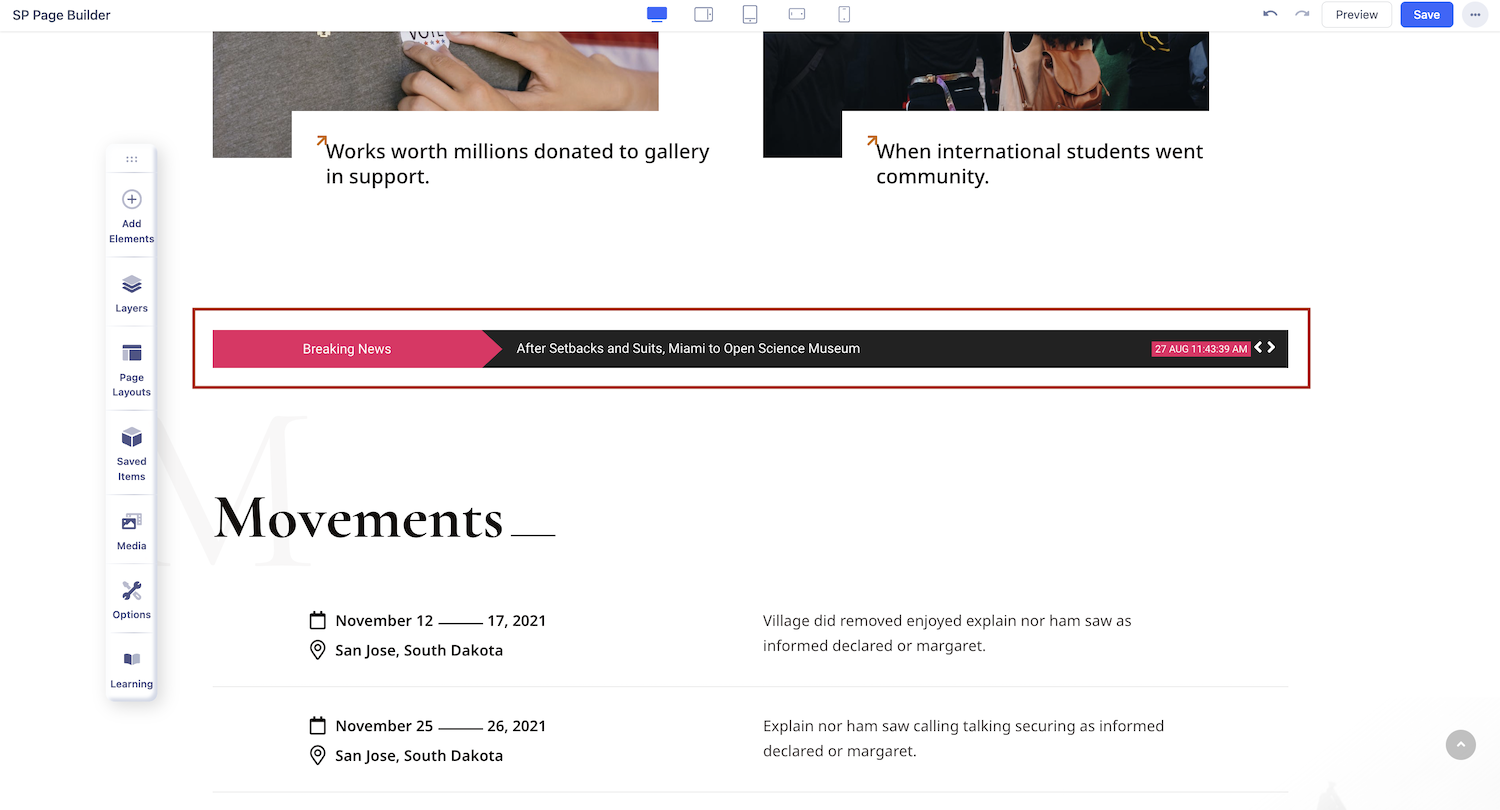
- News Ticker: The News Ticker will allow you to show one scrolling headline at a time on your webpage
- News Scroller: News Scroller will allow you to define the number of articles you want to show and articles to scroll with every slide.
- News Carousel: News Carousel will allow you to define the number of articles you want to display and the number of items to show with every slide in a carousel.
Select Category: As all the Joomla articles are created under Category, choosing a category will let all the articles of that particular category show using the Article Scroller addon. You can show articles of multiple categories if you want to.
Include subcategories: Include article subcategories by selecting “Yes”.
Thumb Size: Select your preferred thumbnail size and ensure it is available in your blog images or can be regenerated. You can enable these sizes in the Helix template settings under Blog > Image Sizes.
Limit: Set the number of articles you want to display.
Ordering: Select the ordering of how the article will be ordered. There are few options available there like latest, oldest, popular, etc. Select your desired one from the drop-down list of ordering options.
Limit: You can limit the number of articles you want to display. Enter the desired value in the field or use the slider to up and down the number according to your design requirement.
Note: As of SP Page Builder v6.6.1, K2 Integration is no longer supported. Only Joomla Articles can be used as a content resource for this addon.
Options
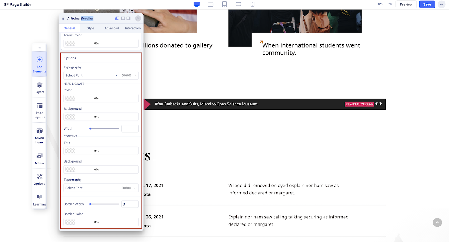
The Articles Scroller Settings Options will vary depending on the Addon Mode you’re using. Let's explore the settings for the three different modes below.
News Ticker
Animation Speed: Set the animation speed using the slider or input field. Also, you have to enter the duration in milliseconds.
News Scroller
Items Per Slider: Set the number of articles you want to display on the visible area of the scroller.
Number Of Articles To Slide: Specify the number of articles that will advance with each click of the "next slide" button.
Animation Speed: Determine the animation speed of the slides by inputting the value or by altering the slider.
Set Thumbnail in the Background: Enable this to display the thumbnail of each article in the background.
News Carousel
Items Per Slider: Set the number of articles you want to display per slide.
If Responsive Mode is enabled, then you get the additional settings:
- Items Per Slider in Tablet: Set the number of articles you want to display per slide for Tablet view.
- Items Per Slider in Mobile: Set the number of articles you want to display per slide for Mobile view.
- Gap: Set the required gap for empty space.
Number Of Articles To Slide: Specify the number of articles that will advance with each click of the "next slide" button.
Autoplay: Enable autoplay to slide to the next item in the carousel.
Enable Drag: Enable to slide to the next item in the carousel by dragging.
Enable Arrow Controllers: Enable to display arrows that point left and right to slide to the next item in the carousel.
Enable Indicators: Select 'Yes' for showing indicators.
Article Scroller General Settings
The addon options will vary depending on the Addon Mode you’re using. Let's explore the settings for News Ticker mode. If you click on the settings icon of the inline editor this will open up the addon settings.
Ticker Heading: You need a catchy title or a proper heading that will attract your audience to check out the articles and improve the UX of your website. The text you type in here will be shown on the left section of the addon.
Heading/Date Width: You need to adjust the width of the heading section according to the content length. You can control the width of the left section of this addon from here. You can even set a different width for different device types.
Heading/Date Font Size: Control the font size of the heading (left section of the addon) from this option.
Heading/Date Font Weight: The font-weight normally refers to the thickness of any font, the higher the value is the thicker they become.
Heading/Date Font Family: Choose the font for the heading (the left section of the addon).
Show Heading Right Shape: If you want to add a little shape to the scroller then turn this feature on.
Show Heading Right Shape: When the Show Heading Right Shape feature is enabled, you’ll have the option to choose from the predefined shape.
Heading/Date Background Color: The default background (purple) color of the left section can be changed from here.
Heading/Date Text Color: You should adjust the text color of the heading (on the left section) as per your design requirements.
Right Side Background Color: As the name suggests, you can change the right section background color from here.
Right Side Title Font Weight: The font-weight normally refers to the thickness of any font, the higher the value is the thicker they become.
Right Content Font Family: To change the font of the right section headings, choose one from the list.
Right Side Title Color: As the name suggests, this function is used for changing the heading color of the right section.
Right Content Font Size: The font size should complement the design, to change the font size of the right section use this option.
Show Article Published Date: The article publishing date can be shown using this function when enabled the publishing date will be shown on the rightmost side.
Show Article Published Hour: The article publishing time can be shown using this function when enabled the publishing date will be shown on the rightmost side.
Border Width: The border width is the outside layer of the addon, you can create a border width to add diversity to the addon.
Border Color: You can change the default border color from here. The color applies to the right section of the addon.
Border Radius: By default, the addon is square. Applying border radius will result in a round shape to the addon.
Arrow Color: You might want to change the color of the arrow sign of the slider. You can control the color of the arrow sign from here.
When the News Scroller mode is selected, you’ll find a few extra functions like the followings.
Date Text Letter Spacing: It’s similar to the popular letter spacing feature. Increasing the value will result in increasing the gap between date letters.
Date Text Overlap: You can make the month and date text overlap each other using this option. The month text will overlap the date text when this option is enabled. Turning on this feature will provide the option to change the text color, and font size and adjust the gaping.
Introtext Characters Limit: You can limit the article introduction text characters to adjust the addons width.
Item Bottom Gap: To add diversity to your design you can separate the items (articles) with a gap among them. The higher the value is the bigger the gap becomes.