- TemplatesTemplates
- Page BuilderPage Builder
- OverviewOverview
- FeaturesFeatures
- Layout BundlesLayout Bundles
- Pre-made BlocksPre-made Blocks
- InteractionsInteractions
- DocumentationDocumentation
- EasyStoreEasyStore
- ResourcesResources
- DocumentationDocumentation
- ForumsForums
- Live ChatLive Chat
- Ask a QuestionAsk a QuestionGet fast & extensive assistance from our expert support engineers. Ask a question on our Forums, and we will get back to you.
- BlogBlog
- PricingPricing
Carousel
Carousel is the exclusive slider addon of SP Page Builder. Whether content or image, you can get an amazingly well-developed carousel within a second with this awesome addon. The addon comes with all the great functionalities that a trendy functional carousel should have.
How to Add a Carousel Addon
You can add a Carousel addon to your page from the SP Page Builder sidebar. Simply drag the addon from the Addons panel and drop it on the section of the page where you want to add a Carousel addon.
Carousel Settings

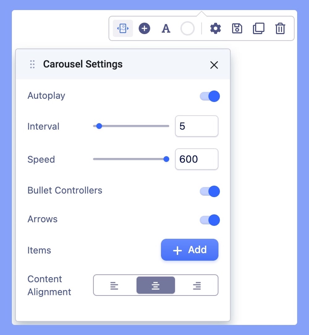
When you click on the Carousel addon, the addon inline editor will open up. You can access the Carousel addon settings and customize the addon to fit your needs.
Autoplay: Autoplay is the function of auto-rotating the images and content without any click from the user. If you want that feature. Set the carousel to autoplay.
Interval: Select the interval speed between each sliding item.
Speed: Set an optimum slider speed.
Bullet Controllers: Enable this in case you want to display the bullet controllers.
Arrows: Arrows are there to direct the flow of images and content in a specific direction. If you enable the option the navigation arrows will show up in the carousel. Navigation arrows are shown on both sides of the carousel.
Items: Add multiple items to the slider.
Content Alignment: In case you have added text to your slider image, you can set the text alignment from here. Choose from an option of Left, Middle, and Right alignment.
How to Customize Carousel Items
When you click on the +Add button in the Carousel settings, the addon’s general settings will open up. You can edit your slider’s title, replace & upload images, add links, access color settings, etc from here.
Carousel Items Settings
Carousel Item Title: This option will allow you to add a title to the slider item. The purpose of the title is to express the naming of the section you just added to the addon.
Title Padding: Set optimum padding to your title.
Title Margin: Set the optimum margin for your title.
Content: Use this editor field to enter your alert content here. Arrange your content in your desired way using this content field. Carousel content will be shown on top of the carousel image.
Content Padding: Set optimum padding to your content.
Content Margin: Set the optimum margin for your content.
Image: Use SP Page Builder's well-developed media manager to upload the images of the carousel. You can upload images by adding multiple items.
Button Text: The button text is the text that will be displayed on top of the button. It’s quick on what that button is going to do. Leave it blank if don’t want any button.
Button Link: Button link is the absolute URL of the page that will be linked. Remember the link must contain http:// or https:// in the URL. URL can be sensitive, so the double check will let you be on the safe side.
Button Icon: There are lots of icons there to choose from. You can find almost every type of icon there. Use the search field on the top to find your desired one. Select the one you want from the list.
Button Icon Position: Set the icon position of your button from to the Left or Right side.
Button Settings
Basic: Set you button’s basic settings using this Button Settings tab. Customize your button’s Style, Shape, Size, etc using this settings tab.
Typography: The Typography Settings lets you edit the button text to fit your preference. Adjust your font types, Size, Line Height, Letter Space, Style, and Weight for your Form builder button texts. Learn more about Typography Here.
Color: Use the Color tab settings to edit the color of your added button.
The Color tab comes with the following two tabs:
- Normal
- Hover
Normal
This tab lets you change the color of your button’s background and the color of the text inside your button.
Hover
This tab lets you change the color of your button’s background and the color of the text inside your button upon hovering.
Add New Carousel Items
Click on the “+” button to instantly add multiple carousel items to your section.

