

Form Builder
The SP Page Builder comes with the Form Builder addon which is an incredibly powerful tool to create functional contact forms on your Joomla site. It has a collection of rich and useful features to create a solid and accessible contact form in minutes.
Notice! That addon does not store submitted messages anywhere. Therefore, you may lose important messages forever if your mail server has issues or you make a mistake in mail configuration.
How to Add a Form Builder Addon
You can add a Form Builder addon to your page from the SP Page Builder sidebar. Simply drag the addon from the Addons panel and drop it on the section of the page where you want to add a Form Builder addon.
Form Builder Settings
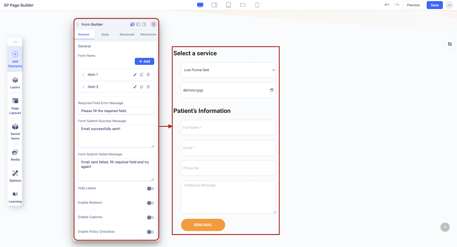
When you click on the Form Builder addon, the addon settings panel will open up. You can access the Form Builder addon settings and customize the addon to fit your needs.
General
Form Items
Within this section, you can effortlessly add new items by clicking on ‘+Add’ to your contact form, enriching your form-building capabilities.
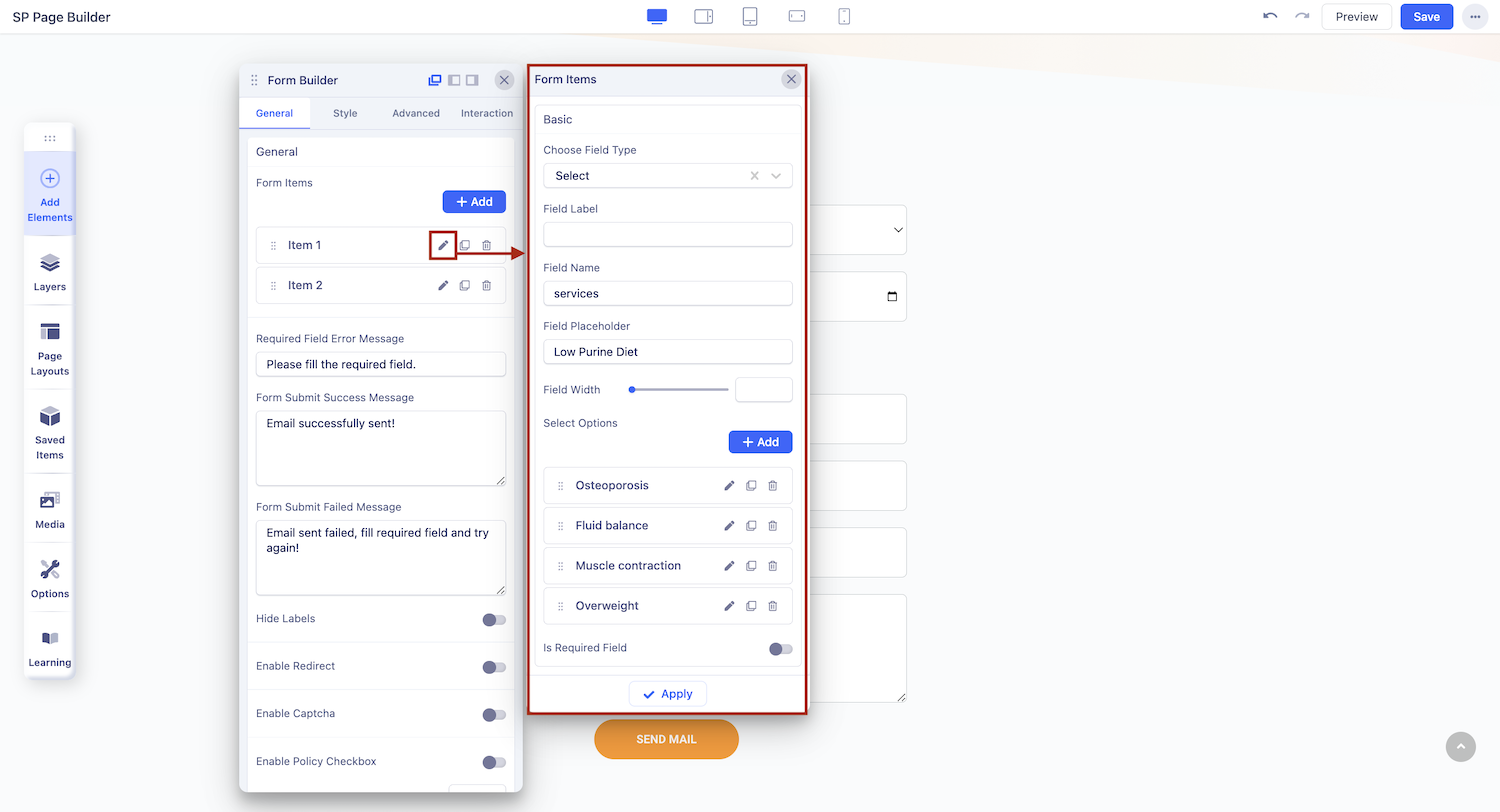
Edit Form Items
You have the flexibility to customize your field items according to your preferences.
To edit a form item, click the "edit" button for the field item you want to customize. This will open a dedicated editing panel for that item.
- Choose Field Type: Select the appropriate field type for your item. If your field type is set to “Date”, then you will get the option to change the date format using the Date Formatter setting. You can choose from the list of available formats.
- Field Label: Specify the label for your field.
- Field Name: Define a unique name for the field.
- Field Width: Adjust the width of the field using the provided options.
- Required Field: To make a field mandatory, enable the "Is Required Field" option.
- Display Required Indicator: If you want to indicate mandatory fields, enable the "Show Required Star Mark" option. This will display a star mark next to the required fields
Message
In this section, you have full control over the success and error messages, allowing you to customize them as needed.
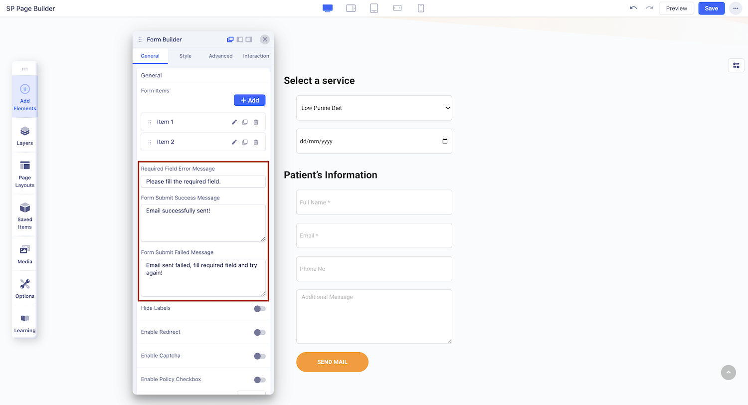
- Required Field Error Message: Customize the default error message that appears when a user forgets to fill out a required field. The content you provide here will be displayed as an error prompt.
- Form Submit Success Message: Craft your personalized success message for when a form is submitted successfully. This message will be showcased to users upon successful submission.
- Form Submit Failed Message: Tailor the text for situations when a form submission fails. This customized message will only be visible when a form fails to submit correctly.
Form options
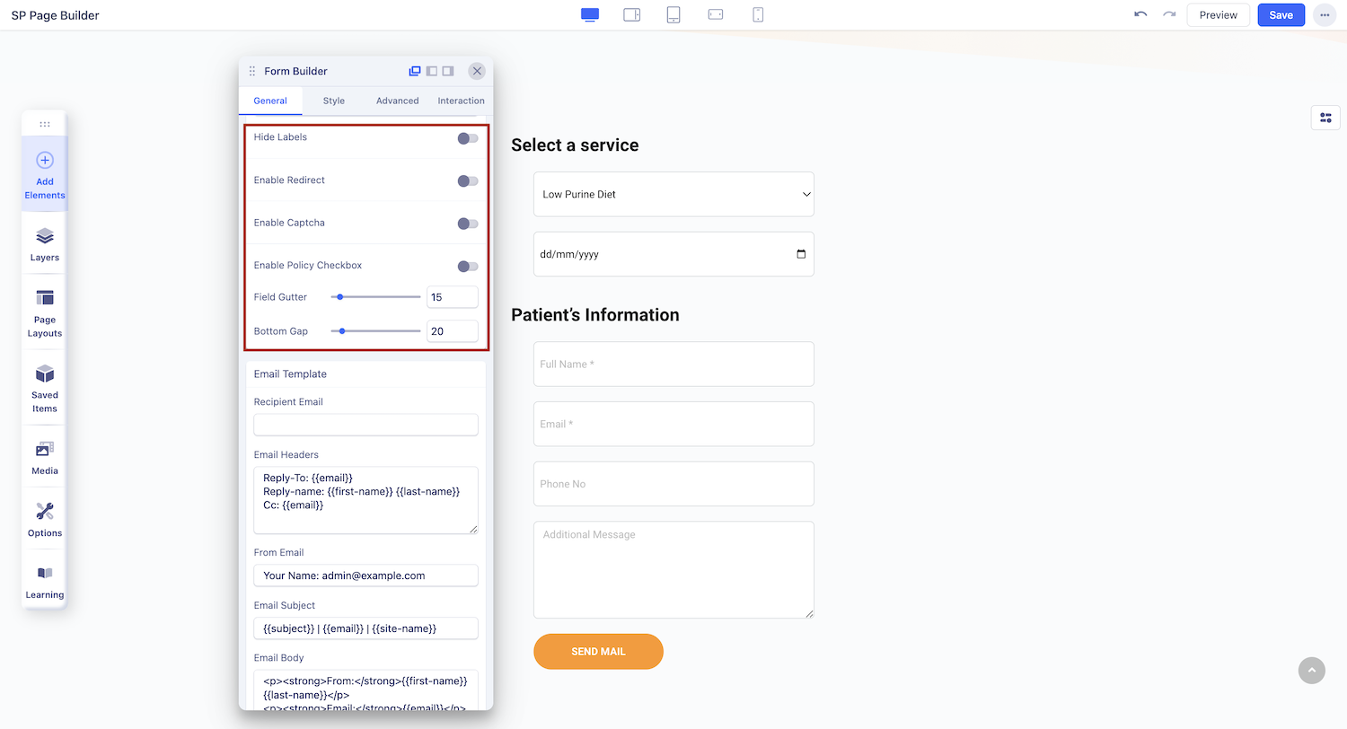
- Enable Redirect: After a successful form submission, you can redirect users to a specific link by enabling this option.
- Redirect URL: Enter the desired redirect link here.
- Enable Captcha: Enhance security by enabling Captcha. The reCAPTCHA, hCaptcha, and Cloudflare Turnstile integrations are available. Users must solve a Captcha puzzle before submitting the form. For all those ensure the plugin is installed, enabled in your backend and that site keys are correctly configured.
- Captcha Type: Select the Captcha type that best suits your needs.
- Captcha Question: Customize the Captcha question to align with your requirements.
- Captcha Answer: Provide the correct answer to your Captcha question.
- Enable Policy Checkbox: Include user policy or GDPR information if needed by enabling this option.
- Terms, Policy, or GDPR Text: Edit and input your Terms, Policy, or GDPR text as necessary.
- Field Gutter: The Field Gutter refers to the space between two columns, specifically between two form items. You have the flexibility to define the gutter for various device types. A larger value results in a more significant gap between form items.
- Bottom Gap: The Bottom Gap setting enables you to manage the horizontal gap between form items, tailored for different device types.
Email Template
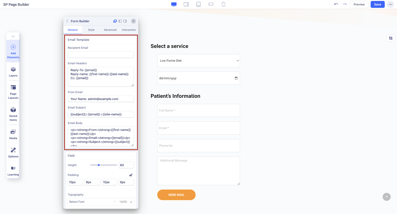
Recipient Email: This is a mandatory field for the addon. The email address you put here will receive the responses collected using this form.
Email Headers: Email headers provide additional information about the email and its sender. You can customize the following email headers:
- Reply-To: This header specifies the email address to which replies to the email should be sent. It dynamically uses the {{email}} variable to include the sender's email address.
- Reply-name: This header includes the sender's name, which is dynamically generated using the {{first-name}} and {{last-name}} variables.
- Cc: Use this tag to include additional email addresses that will receive a carbon copy (cc) of the email. It also supports the {{email}} variable. You can add multiple emails using this tag.
From Email: Specify the email address from which the email will appear to be sent. This is typically set to a domain-specific email address.
Email Subject: Customize the subject line of the email. You can include dynamic content using variables like {{subject}} and {{site-name}} to personalize the subject line.
Email Body: The Email Body section allows you to create the content of the email. It uses HTML markup to structure the email's appearance.
Note: When using collected names or emails from forms, reference them by their assigned "Field Name" for accuracy.
Field
Use this section to customize
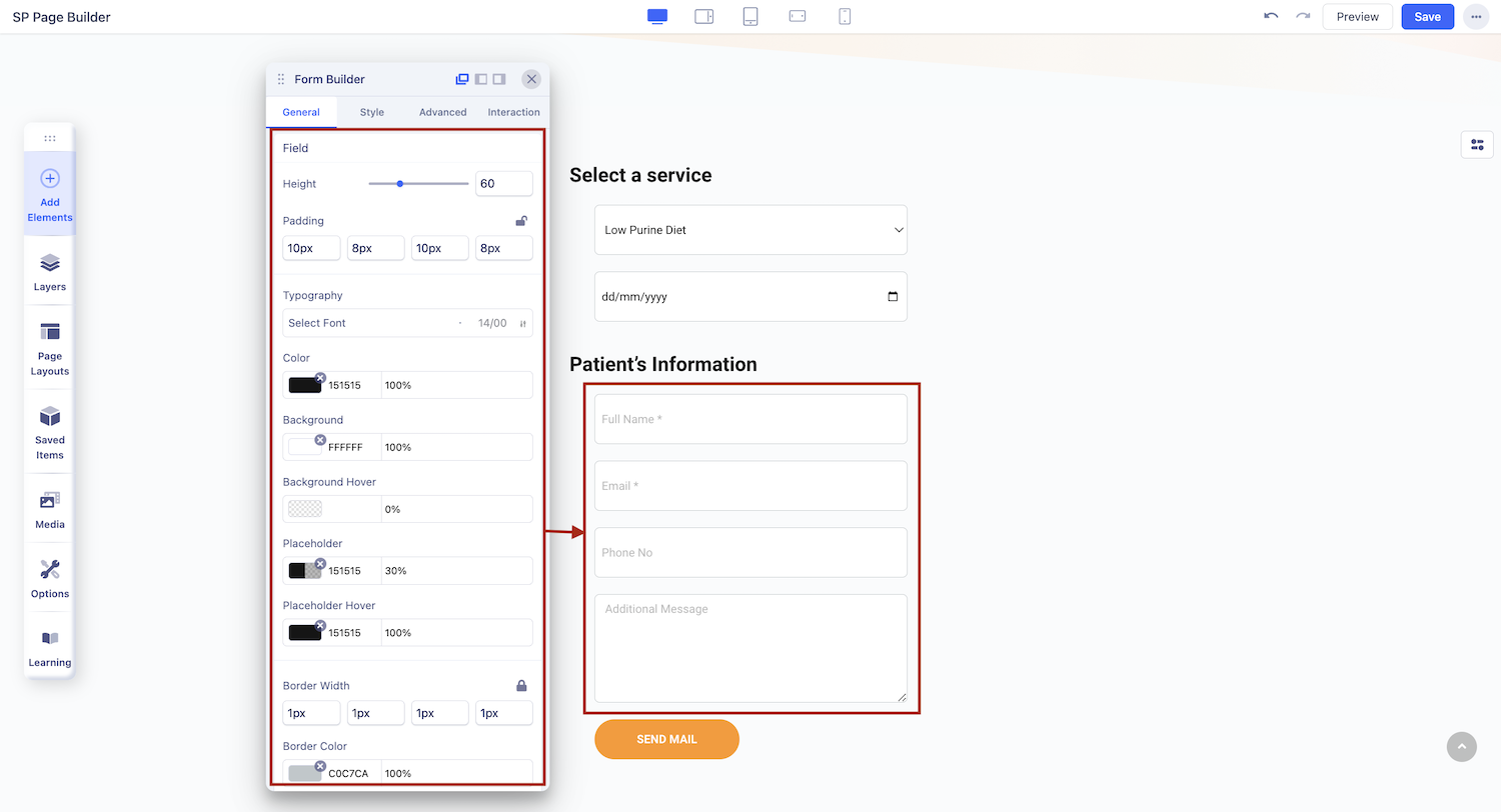
form fields
Field Height: With this option, you have the ability to adjust the height of the field for all items within the form.
Textarea Height: The Textarea Height setting is specifically designed to control the height of input fields, excluding Textarea types. It allows you to fine-tune the height of Textarea input fields.
Padding: If you wish to manage the internal space within the form fields, the Padding option empowers you to do just that. You can define the padding as per your preferences.
Label Margin: Set the margin for your field labels to precisely position them within the form. This feature allows you to customize the spacing around the labels for a polished look.
Border Width: Define the thickness of the field’s border on all sides.
Border Color: Set the color of the field’s border.
Focused Border Color: Choose the border color when the field is focused.
Field Border Radius: Adjust the roundness of the field's corners.
Label Typography: Select the font style for the field's label.
Label Color: Set the color of the field's label text.
Margin: Define the space around the field on each side.
Radio & Checkbox: Customize the appearance of radio buttons and checkboxes.
Button
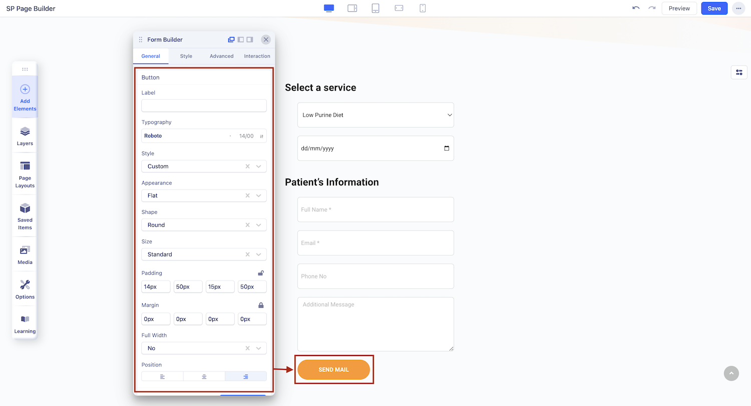
The Button Settings comes with all the options necessary to create a fully customized button.
Label: Enter the button text here. Leave it blank if you don’t want any button.
Style: You can choose a desired button style from the given list.
Appearance: You can choose a suitable button appearance from the list.
Shape: Choose your button shape from the list using this option.
Size: There are numerous options you can choose from to define your button size.
Full Width: Set this option to ‘Yes’ if you want a full-width button. Leave that to ‘No’ if you don’t.
Margin: Set an optimum distance around your button.
Button Icon: Choose your desired icon from a list of available icons in the Icon Library.
Icon Position: Choose whether you want to set the icon position to the left or right of your button text.
Button Link
Add a link to your added button using the Link tab options.
- For URL, simply paste the web address you want to link to into the first field.
- For Menu, select the option you want to link to from the dropdown list. Note that the options on this list are all Menu Items that exist on your website.
- For Pages, select the option you want from the dropdown list. Like Menu, these options are all existing Pages available on this website.
Lastly, you can enable the option Open in New Tab to open this link in a new tab and No Follow to tell search engines to ignore this link.
Enable Rate Limit
- Max Requests: Define the maximum number of form submissions allowed per user within the specified time window. For example, setting this to "5" means a user can submit the form up to 5 times before the limit is applied.
- Time Window: Specify the duration for the rate limit in seconds. For example, a value of "10 seconds" means that the user can only submit the form up to the defined Max Requests within that 10-seconds period.