- TemplatesTemplates
- Page BuilderPage Builder
- OverviewOverview
- FeaturesFeatures
- Dynamic ContentDynamic Content
- Popup BuilderPopup Builder
- InteractionsInteractions
- Layout BundlesLayout Bundles
- Pre-made BlocksPre-made Blocks
- DocumentationDocumentation
- EasyStoreEasyStore
- ResourcesResources
- DocumentationDocumentation
- ForumsForums
- Live ChatLive Chat
- Ask a QuestionAsk a QuestionGet fast & extensive assistance from our expert support engineers. Ask a question on our Forums, and we will get back to you.
- BlogBlog
- PricingPricing
Gallery
SP Page Builder Gallery Addon is designed for a gorgeous-looking image gallery output. You can add thumbnails for your images and upon clicking the thumbnails the image pops up.
How to Add a Gallery Addon
You can add a Gallery addon to your page from the SP Page Builder sidebar. Simply drag the addon from the Addons panel and drop it on the section of the page where you want to add a Gallery addon.
Content

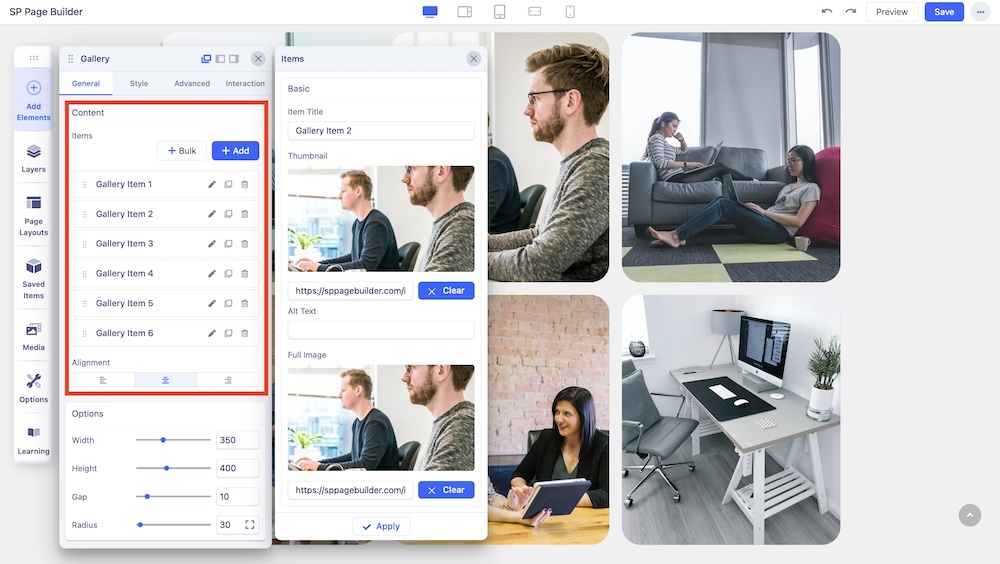
Under the Content section of the General tab, you can add or delete your gallery items and edit the existing ones.
Click on the “+ Add” button to instantly add your image items to your gallery.
Select “+ Bulk” to add multiple gallery items together. Upon clicking, you'll be directed to the Media Manager, where you can choose multiple media items. You have the flexibility to select items individually or you can opt for an entire folder selection.
Click on the edit button to add Titles, Thumbnails, Alt Text, and Full images for your gallery items.
You can choose the best alignment for your gallery items. You can choose from Left, Right, and Middle alignment options.
Options

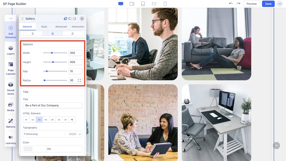
The Options settings allow you to customize the basic settings of your gallery image.
- Width: Set an optimum width of your image.
- Height: Set an optimum height for your image.
- Gap: Customize the gap between each image in your gallery to fit your needs.
- Radius: Use this option to add a radius to your Gallery addon’s items.
Title

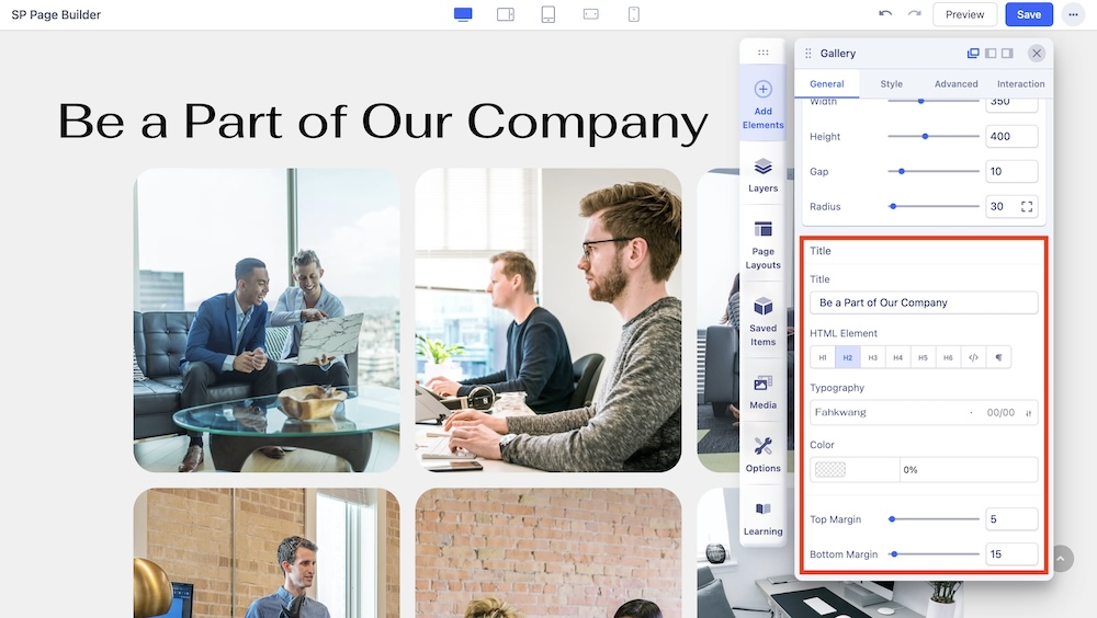
Use this tab to add a title to the section you just added with the addon.
- Title: Add a title to your addon.
- HTML Element: Set the HTML Element of your title.
- Typography: The Typography Settings lets you edit your title’s appearance to fit your preference. Adjust your font types, Size, Line Height, Letter Space, Style, and Weight for your Feature box button texts. Learn more about Typography here.
- Color: Choose your title’s color option. Learn more about color settings here.
- Top Margin: Adjust the top margin of the Gallery.
- Bottom Margin: Adjust the bottom margin of the Gallery.

