

Heading
Headings are an essential part of any webpage. They help divide chunks of text, give structure and help increase readability.
How to Add a Heading
To add a Heading, click on the plus icon inside a row or the Addons button on the Sidebar to open the Addons Panel. Find the Headings addon under the General section and drag & drop it to where you want it placed.
Heading Settings
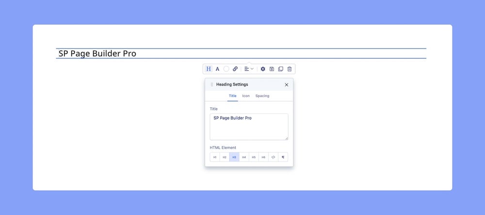
Now that we’ve added the Heading, it’s time to change the placeholder text and customize it. To do this, click on the ‘H’ Letter icon on the inline editor to open the Heading Settings.
Title
To add a Title to your Heading, go to the Title tab to access the following options:
Title: Enter the text for the Title.
HTML Element: Set the HTML element hierarchy as H1, H2, H3, etc.
Top Margin: Set the top margin of your Title.
Bottom Margin: Set the bottom margin of your Title.
You can further customize your Title’s style using the options from the Color and Typography menus on the Title tab. For more information check out their dedicated documentation.
Icon
A Heading Icon is useful as it can be used to give more meaning to a Heading. To add an Icon, go to Headings Settings > Icon.
Choose Icon: Click on this to open the Icon Library from where you can select the Icon of your choice.
Color: Select the color of your Icon.
Position: Select whether the Icon will be placed before or after the Heading.
Spacing
From the inline editor, head to Heading Settings > Spacing to adjust the addon’s Margin and Padding values.
Margin: Set the Margin value i.e. the space between the addon element’s border and the edge of the canvas. Define the values in the order Top, Right, Bottom, and Left.
Note that Margin values are allowed to be negative.
Padding: Set the Padding value i.e. the space between the content of the addon element and its border. Like Margin, you can define the values in the order Top, Right, Bottom, and Left.
However, unlike Margin, Padding values cannot be negative. Also, other than px, Padding also supports the units em and %.
Also, notice the padlock icon on the top-right corner for both of these options. When this is locked, all sides will have the same spacing but when this is unlocked, all sides can have varying spacing.
Typography Settings
Next, click on the ‘A’ Letter icon on the inline editor to open the Typography window. Here, you can adjust your Heading’s Font, Font Size, Line Height, and more. For detailed information on Typography check out this documentation.
Color Settings
Change your Heading text’s color by opening the Color Settings. To do this, click on the Circle icon from the inline editor. The Color Settings window gives you three different options:
- Single Color: One solid color.
- Linear Gradient: A straight progression of two colors.
- Radial Gradient: A circular progression of two colors.
More on Color Settings here.
Alignment
Adjust the Heading position by clicking on the Alignment icon on the inline editor. Select between Left, Center, or Right Alignment.
Link Settings
To add a Link to your Heading, head over to Link Settings from the inline editor. Here you can choose between the options URL, Menu, and Page.
URL: Choose this option to add an outbound link or link using a URL.
Menu: Choose this option if you want to link to a Menu Item from this website. Select the one you want to link to from the following dropdown list.
Pages: Choose this option if you want to link to a Page from this website. Select the one you want to link to from the following dropdown list.
Open in New Tab: Open the added link in a new tab.
No Follow: Tell search engines to ignore this link.