

Icon
The Icon addon lets you add an icon to your site easily. SP Page Builder comes with the Icon Addon to let you add and fully customize the icon to fit your needs.
How to Add an Icon Addon
You can add an Icon Addon to your page from the SP Page Builder sidebar. Simply drag the addon from the Addons panel and drop it on the section of the page where you want to add an Icon addon.
Icon Settings
When you click on the Icon addon, the addon inline editor will open up. You can access the addon settings and customize the addon to fit your needs.
Icon
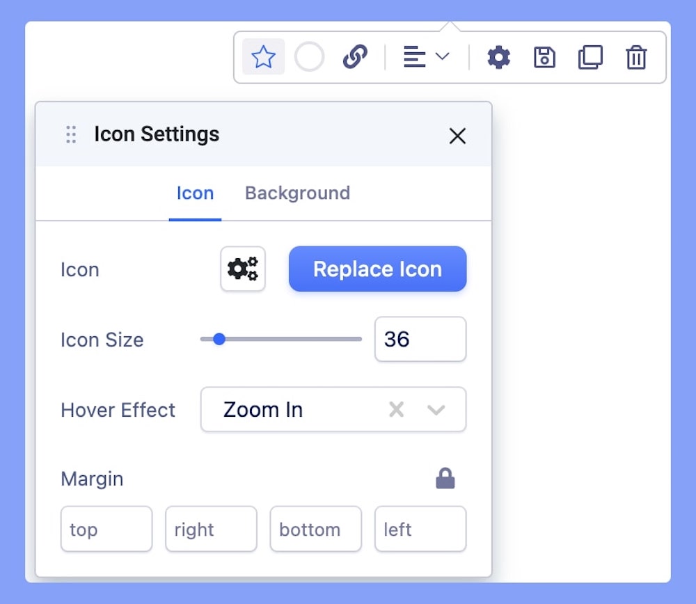
The Icon settings come with the basic Icon addon settings.
- Icons: There are hundreds of icons in the drop-down list of icons. Select your desired one from the list. Click the icon to add.
- Icon Size: Set the size of the icon using this option. Example: 36. Use the scroll to up and down the number to adjust it according to your requirements.
- Hover Effect: There are two types of hover effects "zoom in" and "zoom out". Select your desired one, if you want it select 'none'.
- Margin: Set the margin for the icon. Use this option to enter the value. The value you have entered is the pixel(px) value. Set the margin for all four sides (Top Right Bottom Left). Negative values are also allowed.
Background
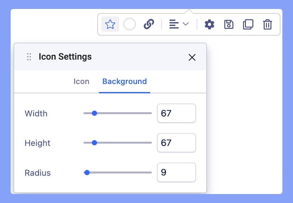
The background settings are all about editing your Icon’s background look.
Width: Use this field to add the width of the border. The width you declare will work as the horizontal space for the border of the icon.
Height: Use this field to add the height of the border. The height you declare will work as the vertical space for the border of the icon.
Radius: Add the Border radius as per your design requirement. Border radius is for the corner of the border to be rounded or straight.
Color Settings
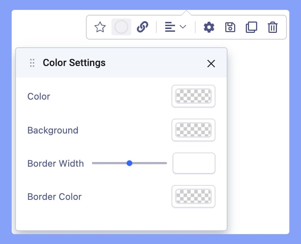
The color settings let you manage the color customization of your icon.
Color: Add the counter color as per your design requirement. You can use the color picker tool to add the desired color you want.
Background: Add the background color of the icon as per your design requirement. You can use the color picker tool to add the desired color you want.
Border Width: Adjust the border width off your Icon’s border color.
Border Color: Add the border color of the icon as per your design requirement. You can use the color picker tool to add the desired color you want.
Link
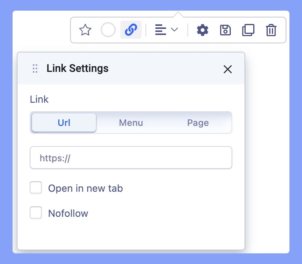
Add a link to your added icon using the Link tab.
- For URL, simply paste the web address you want to link to into the first field.
- For Menu, select the option you want to link to from the dropdown list. Note that the options on this list are all Menu Items that exist on your website.
- For Pages, select the option you want to from the dropdown list. Like Menu, these options are all existing Pages available on this website.
Lastly, you can enable the option Open in New Tab to open this link in a new tab and No Follow to tell search engines to ignore this link.
Alignment
Choose the alignment for your added icon. You can choose from Left, Right, and Middle alignment options.