

Icons Group
Icons group addon helps you add multiple icons altogether to a certain section of your website. Along with other usages, It’s also great for showcasing your social media profiles.
How to Add Icons Group Addon
You can add an Icons Group Addon to your page from the SP Page Builder sidebar. Simply drag the addon from the Addons panel and drop it on the section of the page where you want to add an Icons Group addon.
Icon Settings
The addon inline editor will open up when you click on the Icon addon. You can access the addon settings and customize the addon to fit your needs.
Icons
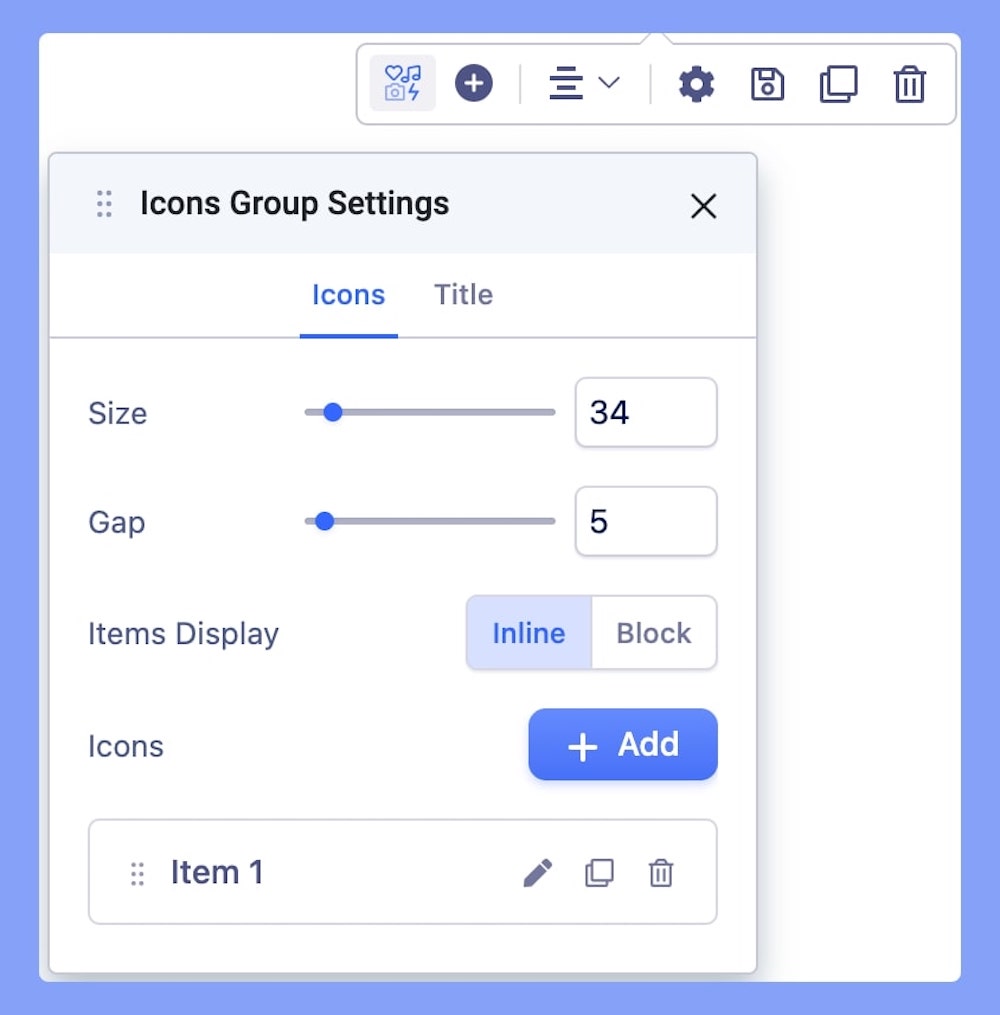
The Icons settings tab comes with the following basic settings.
- Size: You can control all the icons size used in this addon by this option. It’s a responsive feature which means you can define different sizes for different device types.
- Gap: Choose an optimum distance between your added icons within the section.
- Items Display: You can choose how you would like to view the icons in this addon. There are two options available: inline and block.
- Icons: Add or edit your icons from this option.
How to Customize Your Icon
When you click on the +Add button in the Icons tab, the addon’s general settings will open up. You can edit your Icons’ title, replace & upload icons, add links, and access color settings from here.
Title: Title helps you to identify your element for later use. A title should be named after its usability. A proper naming will help you to understand its future use.
Icon: The Icons group addon has a collection of hundreds of icons which includes Font Awesome 4.7. You can choose your desired one from the list.
Link:
- For URL, simply paste the web address you want to link to into the first field.
- For Menu, select the option you want to link to from the dropdown list. Note that the options on this list are all Menu Items that exist on your website.
- For Pages, select the option you want to from the dropdown list. Like Menu, these options are all existing Pages available on this website.
- Lastly, you can enable the option Open in New Tab to open this link in a new tab and No Follow to tell search engines to ignore this link.
Color: Set the color of your icon from here. When applying color, be considered your website design.
Background Color: The background color covers the entire background space of the icon. You can apply solid colors to the background.
Width: You can set custom width and height for your icon using these features. You can set different sizes for different devices.
Border Width: The border width defines how thick you want to make the border-line. It’s a responsive setting which means you can define different values for different devices. But in order to make an effect, you need to choose a border style.
Border Style: Using the border style feature you can apply a few styles to your border. Choose from: Solid, Dotted, Dash, Double, and None.
Border Color: There is an option for you to color the border as well. Applying a color will make the border design more effective.
Padding: Using the padding option you can control the position of the icon inside its box. Like placing it in the middle or in the corner. It’s a responsive feature which means you can set different values for different devices.
Enable Hover Options: If you want to apply a hover effect to this particular icon. You can turn on the feature here.
- Hover Background Color: Change the background color for the hover state for the icon using this feature.
- Hover Color: Change the icon color for the hover state using this feature. Only solid RGB color is available.
- Hover Border Color: Change the border color for the hover state for the icon using this feature.
CSS Class: This option will allow you to style this particular icon of the addon. Customize and style a particular area and then use this field to add the CSS class name you just used to style the icon also don’t forget to refer it to your CSS file.
Title
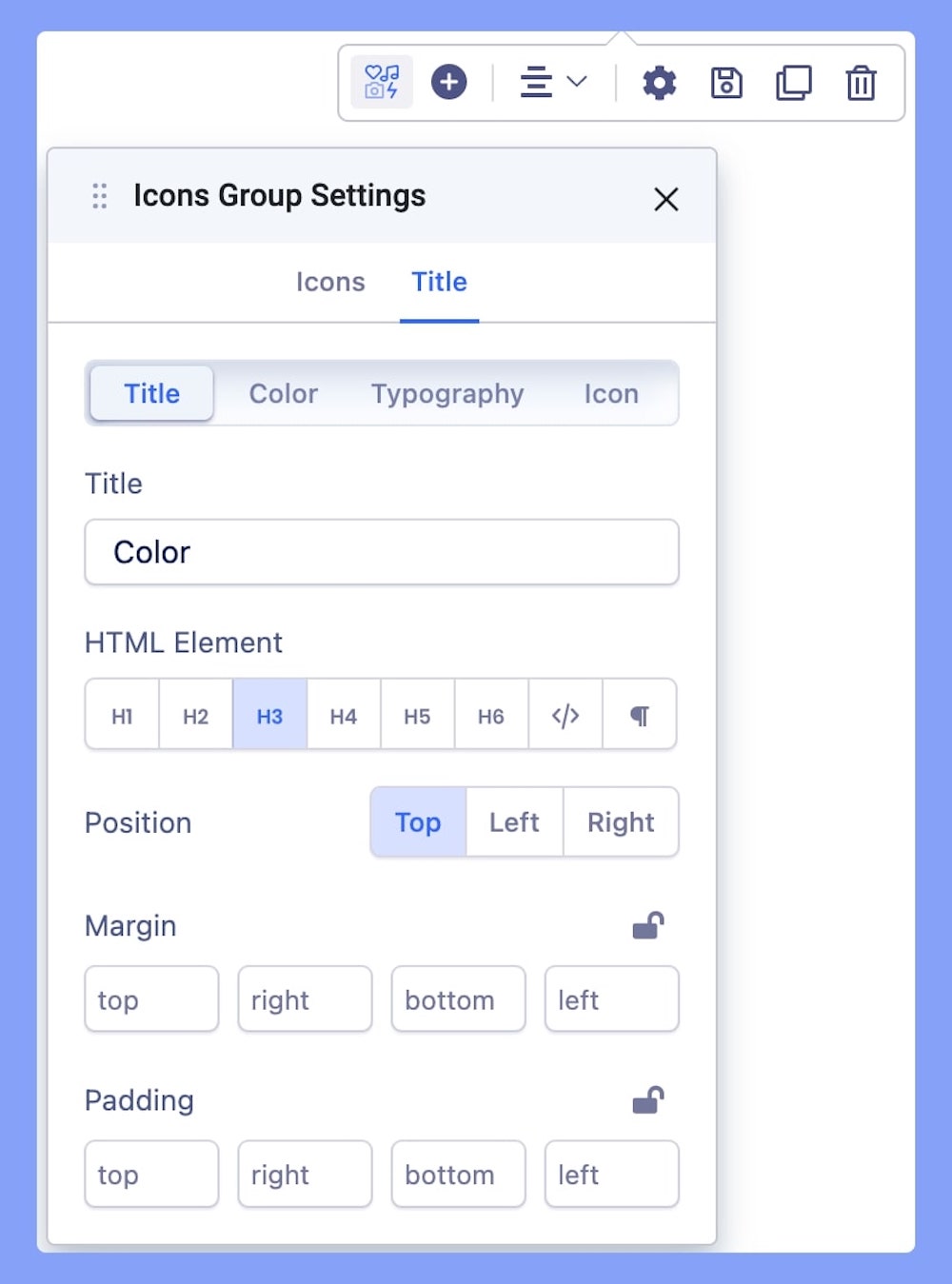
Give a title to your Icons Group Addon. This option lets you edit your Icons’ title completely. This option comes with 4 different tabs:
- Title: Add a title to your addon and set your HTML Element, Position, Margin, and Padding.
- Color: Choose your title’s color option. Learn more about color settings here.
- Typography: The Typography Settings lets you edit your title’s appearance to fit your preference. Adjust your font types, Size, Line Height, Letter Space, Style, and Weight for your Feature box button texts. Learn more about Typography Here.
- Icon: You can also add an icon along with the title. Once you choose your icon, you need to define its position.
Add New Icons Items
Click on the “+” button to instantly add multiple Icons to your section.
Alignment
Choose the alignment for your added icon. You can choose from Left, Right, and Middle alignment options.