

Image
Images are another element of a webpage that adds interest and improves user understanding and experience. Let us go over how you can work with Images in SP Page Builder.
How to Add an Image
Open the Addons Panel by clicking on the Addons button on the Sidebar or using the plus icon found within a Row. Scroll to the Media section and drag & drop the Image addon where you want to place it on your canvas.
Image Settings
Next, it’s time to choose the Image you want to add from the Media Manager and customize it. Open Image Settings by clicking on the image icon from the inline editor to find these options.
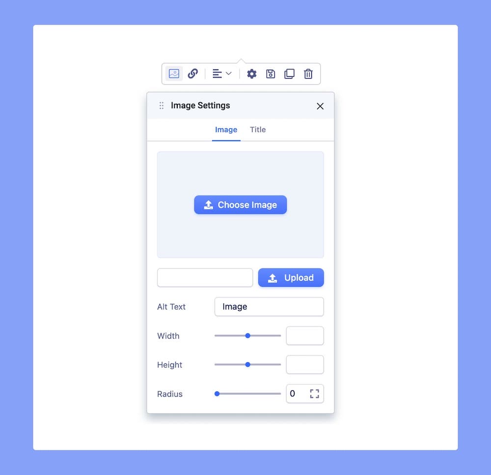
Choose Image: Opens the Media Manager from where you can select the image you want to use.
Image URL: If the image you want is online, you can simply paste its URL into the text field beside the Upload button.
Upload: Also opens Media Manager and from here you can click on the Upload Files option to upload your Image.
Alt Text: Add an alternative text to your Image.
Width: Set the Image’s width. Use the range slider to increase or decrease the value or enter a number into the text field beside it.
Height: Set the Image’s height. Use the range slider to increase or decrease the value or enter a number into the text field beside it.
Radius: Use this option to round the edges of the Image. Increasing it will give you rounder edges and decreasing it will give you sharper edges.
Zoom on Hover: Enable this option to allow an image to enlarge when a user hovers their mouse pointer over it. This creates a zoom effect, providing a closer look at the image. You can drag the pointer left or right to adjust the amount by which the image enlarges when hovered over or use the adjacent field to enter a numerical value.
Click on the Expansion icon and unlock the padlock to specify the radius for each corner differently.
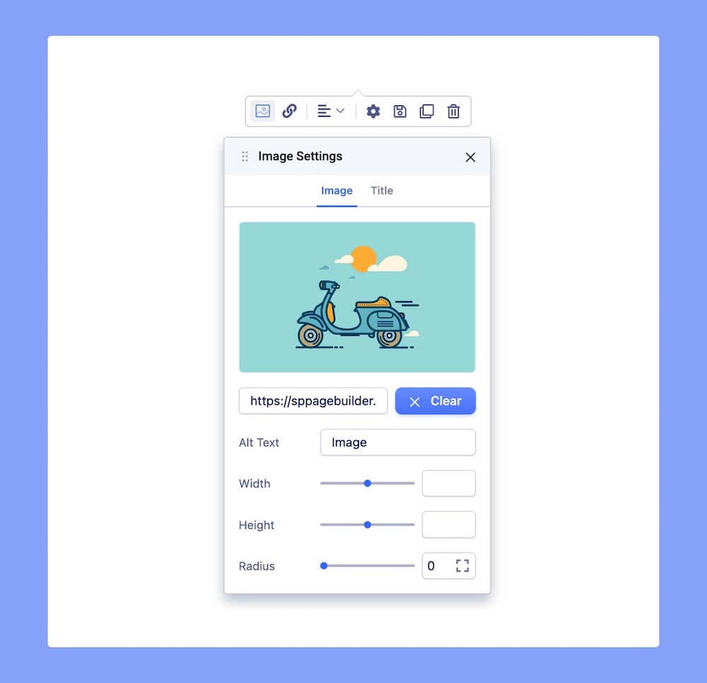
After adding the Image, the panel will look as shown above. An Image Thumbnail will replace the Choose Image button.
Replace: Hover over the Thumbnail to find the Replace button which will open the Media Manager
Clear: Click on this button to remove this image and add another one.
Image Shapes

Enable the Image Shapes option to access the list of available shapes. Simply click on each shape to apply it to your desired image.

- + Custom SVG Shapes: Add your custom image shapes here. Upon clicking the blue “+ Custom SVG Shapes” button, a field to include your SVG code will appear. Copy the code of your favorite image shape and paste it in this field. Hit “Save” and your custom image shape will be instantly added to the Image Shape list.
Please note that only a single path code can be used for custom shapes. This means that each SVG shape must be defined by a single path element within the SVG code to maintain simplicity and consistency in how the shapes are processed and rendered. - Scale Shape: Drag the pointer to the left or right to resize the SVG shape proportionally. Or use the adjacent field to enter a numerical value to resize the custom shape.
Effects (Color, Opacity)
The Effects options property applies graphical effects to the image element. For example, we can apply a blur effect to an image, a black an white filter, or change properties like contrast, saturation etc. When the filter property values contain multiple functions, the filters are applied in order. You may combine any number of functions to manipulate the rendering.

Enable the Effects option to apply color filter effects to your images. Once enabled, adjust the intensity of each effect by dragging left or right. Alternatively, input values directly into the corresponding boxes for precise adjustments.
Note: The filter property (Effects) is not supported in Internet Explorer or Edge 12.
Title
You can also give your Image a Title. Go to the Title tab on the Image Settings to access this option.
Title: Enter the text for the Title.
HTML Element: Set the HTML element hierarchy as H1, H2, H3, etc.
Position: Set the position as top or bottom.
Top Margin: Set the top margin of your Title.
Bottom Margin: Set the bottom margin of your Title.
You can further customize your Title’s style using the options from the Color and Typography menus on the Title tab. For more information check out their dedicated documentation.
Link Settings
To link your image to a page, head over to Link Settings from the inline editor. Here you can choose between the options URL, Menu, and Page.
Open in Lightbox: Enable this option to open this image within a Lightbox.
URL: Choose this option to add an outbound link or link using a URL.
Menu: Choose this option if you want to link to a Menu Item from this website. Select the one you want to link to from the following dropdown list.
Pages: Choose this option if you want to link to a Page from this website. Select the one you want to link to from the following dropdown list.
Open in New Tab: Open the added link in a new tab.
No Follow: Enable to tell search engines to ignore this link.
Alignment
To adjust the Text Block’s Alignment, click on its icon on the inline editor. Alignment options include Left, Center, and Right.