

Pie Progress
Pie Progress is a circular progress chart that’s a popular choice to represent complicated information. Using this addon, any stats on your webpage can be displayed in a way that’s eye-catching and easy to understand.
How to Add Pie Progress
As usual, to add a Pie Progress, open the Addons Panel from the Sidebar or by clicking on the plus icon at the center of a row. You’ll find the Pie Progress addon under the Content section so drag and drop this to your canvas.
Pie Progress Settings
Now that you’ve added the Pie Progress, it’s time to customize it to make it your own. Click on the Pie Chart icon that’s on the inline editor. This will open up the Pie Progress Settings where you’ll find several options which we’ve gone through below.
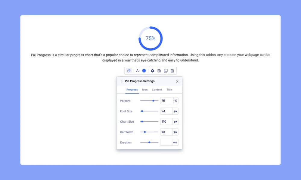
Progress
Percent: This is the most important option. Percent represents how much of the Pie Progress will be filled up and is basically the progress or data that you want to show.
Font Size: This option will change the size of the progress percentage text that’s at the center of the Pie Chart.
Chart Size: Use this range slider to adjust the size of the chart using this option.
Bar Width: This option is used to change the width of the circular Bar of the Pie Progress.
Duration: Set how long the Pie Progress animation will take. This duration is in milliseconds.
Drag the range slider or enter a number into the input fields to change these values.
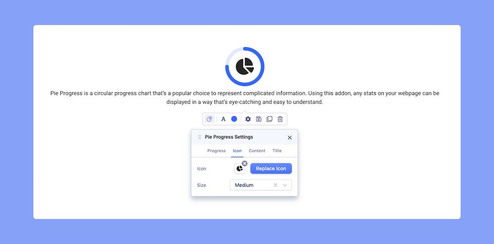
Icon
You can also add an Icon to your Pie Progress chart. To do this, open the Pie Progress Settings and go to the Icon tab.
Choose Icon: Click on this to open the Icon Library and select your Icon.
Size: Select the size from the dropdown list. Size options available are Standard, Tiny, Small, Medium, Large, and Extra Large.
Content
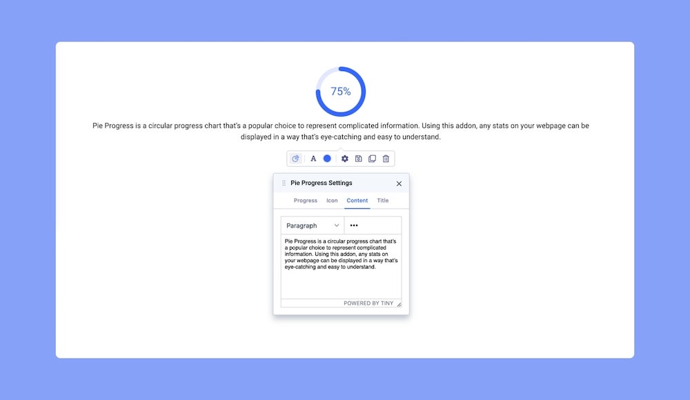
You can also add some Text to your Pie Progress which helps add more context to it. To do this open the Pie Progress Settings and go to the Content tab.
This tab is actually a third-party rich text editor known as TinyMCE.
Enter your content within the large text field or simply click on the existing content and edit it directly.
You’ll find a dropdown at the top-left corner with several options like Headings, Inline, etc. From here, you’ll be able to select the HTML elements you want your content to consist of.
And the three-dot icon on the top-right gives you even more options to customize your Content like font size, alignment, list, image upload, etc.
Title
You can also add a Title to your Pie Progress. Go to the Title tab on Pie Progress Settings to access this option.
Title: Enter the text for the Title
HTML Element: Set the HTML element hierarchy as H1, H2, H3, etc.
Top Margin: Set the top margin of your Title.
Bottom Margin: Set the bottom margin of your Title.
Typography Settings
Click on the ‘A’ Letter icon on the inline editor to open the Typography window. Here, you can adjust the Font, Font Size, Line Height, etc for the text in your Pie Progress. For detailed information on Typography check out this documentation.
Color
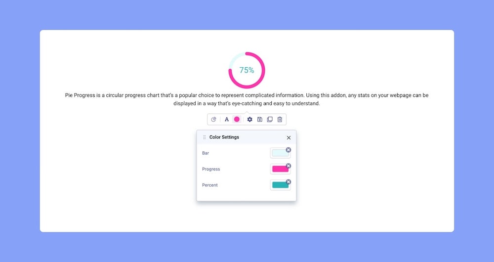
Change your Pie Progress’s color scheme using the Color Settings. Click on the Circle icon from the inline editor to open this window. Here, you will be able to change the color for the Bar, Progress, and Percent. Clicking on the color box will open the Color Picker window where you can easily select the color you want.
More on Color Settings here.