- TemplatesTemplates
- Page BuilderPage Builder
- OverviewOverview
- FeaturesFeatures
- Dynamic ContentDynamic Content
- Popup BuilderPopup Builder
- InteractionsInteractions
- Layout BundlesLayout Bundles
- Pre-made BlocksPre-made Blocks
- DocumentationDocumentation
- EasyStoreEasyStore
- ResourcesResources
- DocumentationDocumentation
- ForumsForums
- Live ChatLive Chat
- Ask a QuestionAsk a QuestionGet fast & extensive assistance from our expert support engineers. Ask a question on our Forums, and we will get back to you.
- BlogBlog
- PricingPricing
Slideshow
Sliders have always been one of the most attractive features of any website. There’s a Carousel addon to rotate images radially, a Gallery addon to showcase multiple images elegantly, and then there is SP Page Builder’s Slideshow addon to redefine how to use sliders on a website.
How to Add a Slideshow Addon?
You can add the Slideshow addon to your page from the SP Page Builder sidebar. Simply drag the addon from the Addons panel and drop it on the section of the page where you want to add the Team Carousel.
Content

The first Content section contains these three options:
Slider Items: Add items to the slider and also edit them individually. You can edit the typography and style of each added item, as well as add custom animation to them.
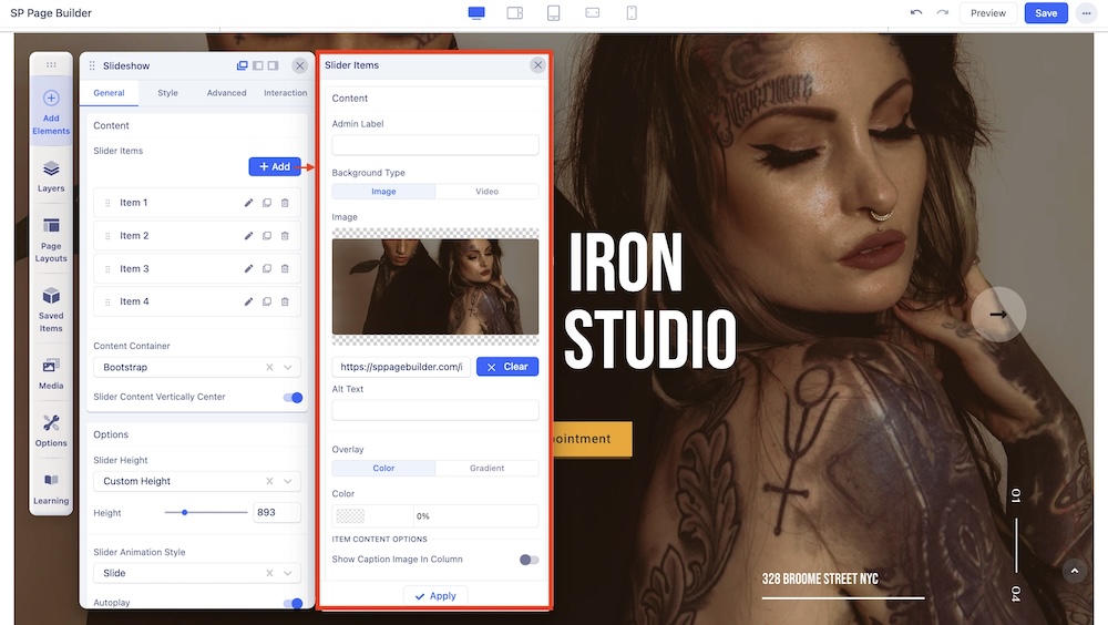
Content Container: Set container dimensions using Bootstrap settings or make custom settings.
Slider Content Vertically Center: Adjust the vertical position of the slider.
Options
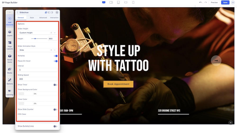
Here, you will be presented with several customization settings for the slideshow. Such as:
Slider Height: Set whether the slider will be of Window Height or a Custom Height.
Slider Animation Style: Select an animation style between Slide, Stack, Clip, Bubble, Fade, and 3D.
Autoplay: Set whether the slideshow will play automatically. You will also get the option to have it pause on hover.
Interval: Adjust the time at which the slides will change.
Slide Speed: Adjust the speed at which the slides will change.
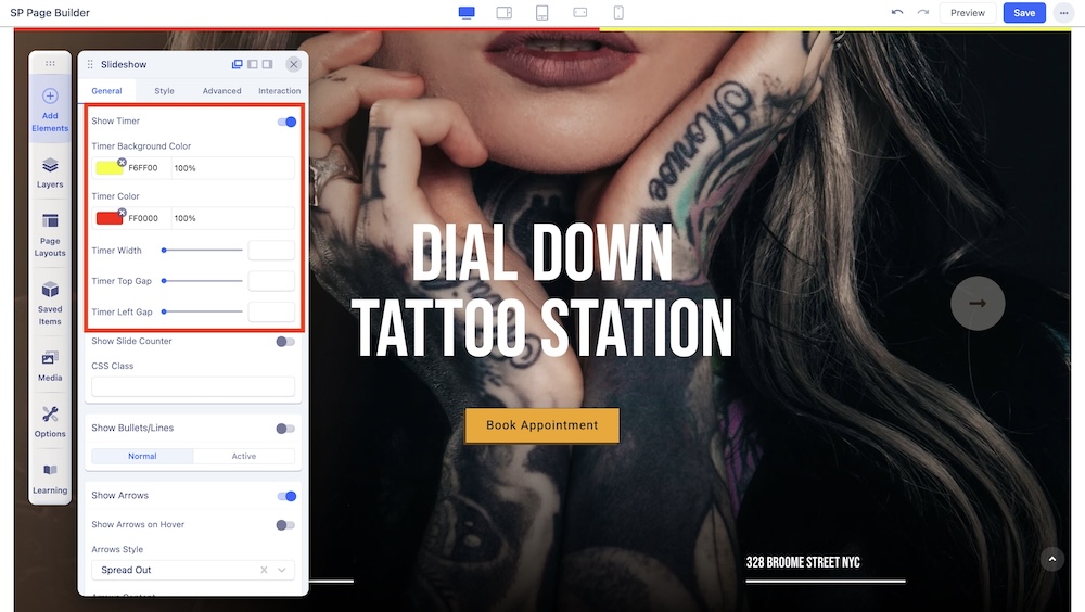
Show Timer: You can toggle the Timer’s visibility. If toggled on, it will show some additional settings:
- Timer Background Color: The background color of the timer.
- Timer Color: The color of the timer itself.
- Timer Width: Width of the timer.
- Timer Top Gap: Spacing at the top of the timer.
- Timer Left Gap: Spacing at the left side of the timer.
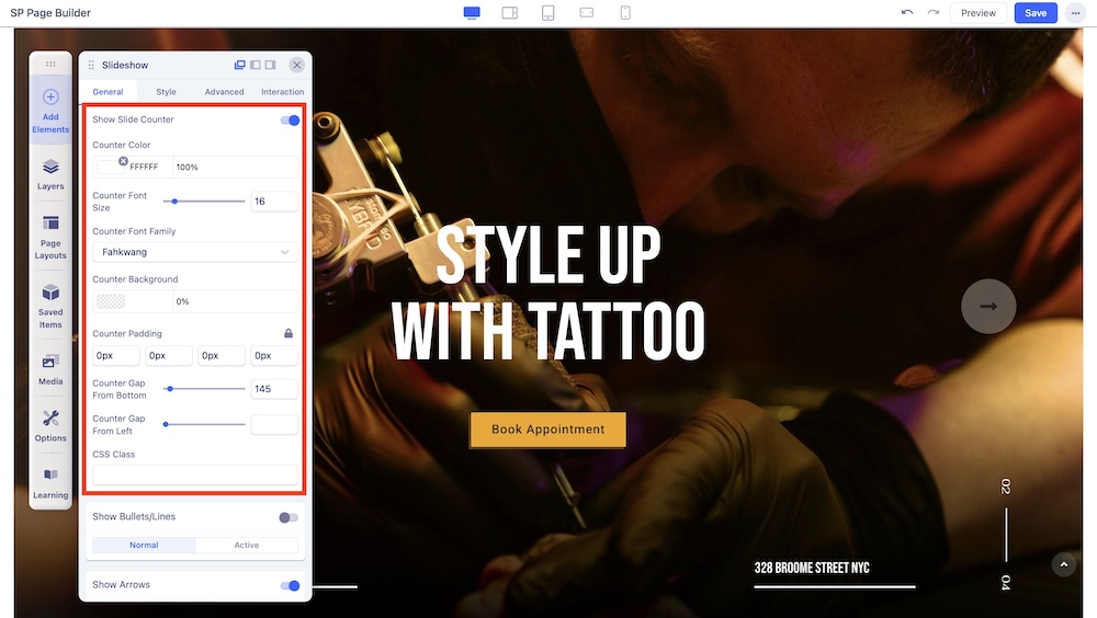
Show Slide Counter: You can toggle the Slide Counter’s visibility as well. If toggled on, it will show these additional settings:
- Counter Color: The color of the counter.
- Counter Font Size: The size of the text in the counter.
- Counter Font Family: The typography of the counter.
- Counter Background: The background color of the counter.
- Counter Padding: The spacing of the counter and surrounding elements.
- Counter Gap From Bottom: Distance of counter from the bottom.
- Counter Gap From Left: Distance of counter from the left.
CSS Class: Add some additional CSS to further customize the slider.
Show Bullets/Lines
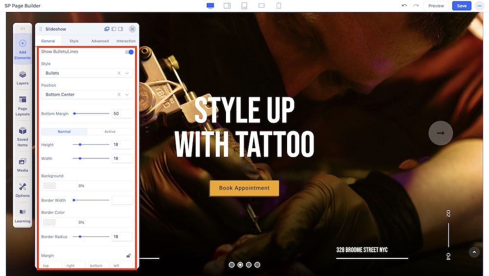
This section allows you to control the bullet points of the slide. The options include:
Style: The bullet/line controller comes with 4 different types of slider controllers: Bullet, Line, Image Thumbnail, and Text Thumbnail.
- For the Text Thumbnail style, you get additional options for customizing the Thumbnail Container Width, Thumbnail Container Background, Thumbnail Container Padding, as well as the typography and colors for the Number, Title, and Subtitle. You can also enable the “Use Slider Image” option to implement dynamic slide backgrounds that match the backgrounds of each slide item.
Position: Adjust the position of the bullets from Bottom Left, Bottom Center, Bottom Right, Vertically Center Left, and Vertically Center Right.
Bottom Margin: Adjust the Bottom Margin.
Height & Width: Choose between Normal and Active Modes to adjust height and width.
Background: Set the background color of the bullets.
Border Width: Adjust the border.
Border Color: Set the color of the border.
Border Radius: Radius of the border.
Margin: Choose the margin values of the bullets.
Show Arrows
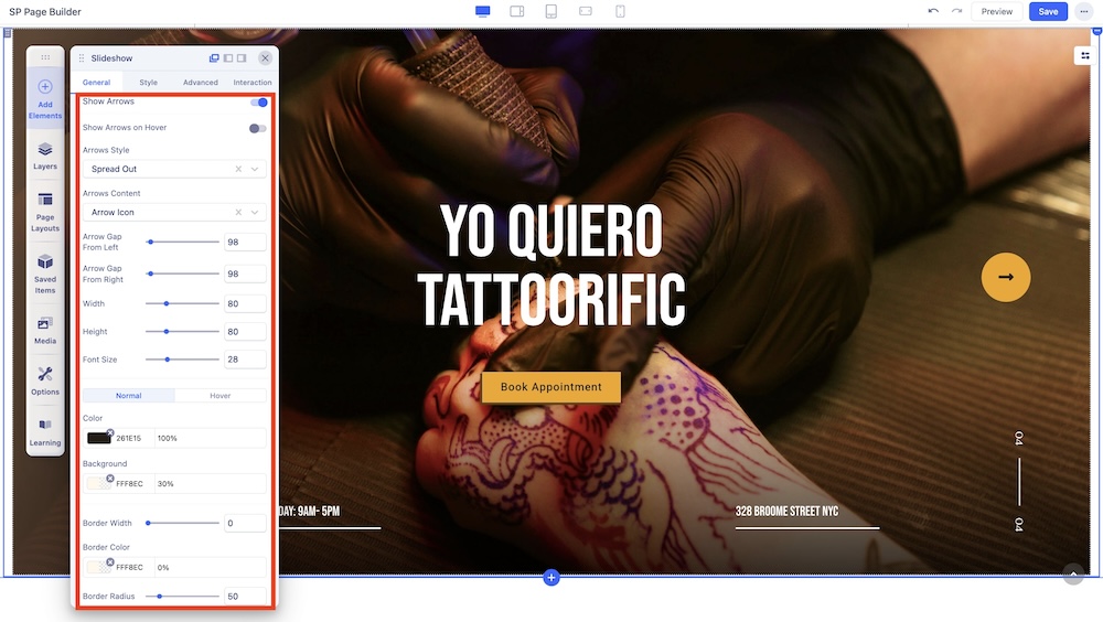
The Arrow controller comes with even more versatility. The options include:
Show Arrows on Hover: Toggle this to determine if arrows will only show when the user hovers over them.
Arrows Style: There are 2 arrow styles, Spread Out and Along With.
Arrows Content: There are 4 content styles, Text Only, Angle Icon, Arrow Icon, and Arrow With Text.
Arrow Gap From Left: Gap of an arrow from the left direction.
Arrow Gap From Right: Gap of an arrow from the right direction.
Width: Adjust the width of the arrow.
Height: Adjust the height of the arrow.
Font Size: Adjust the size of the typography.
Color: This option allows you to customize the color of the arrows. You can choose Normal to have static colors or Hover to have the color change upon hovering. Added options include:
- Color: The specific color of the arrow.
- Background: The background color of the arrow.
- Border Width: The width of the color border applied on the arrow.
- Border Color: Color of the border around the arrow.
- Border Radius: Radius of the border around the arrow.

