

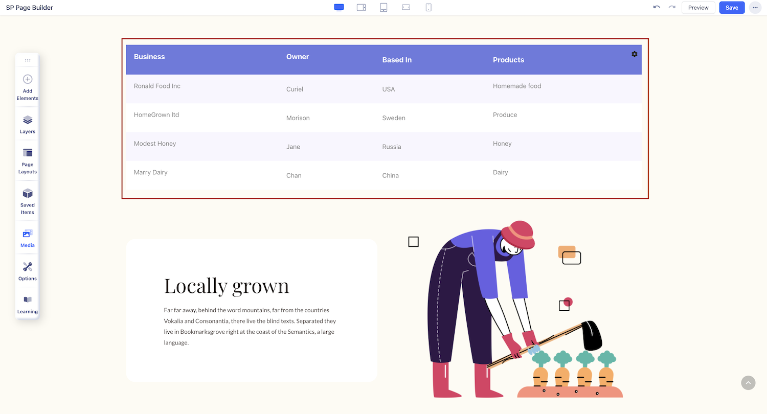
Table
Tables are another great way to represent complex information. They help make information easily scannable thus improving user experience.
How to Add a Table
Open the Addons Panel and find the Table addon under the Content section. Finally, drag & drop this to the row you want to place it in.
Table Content Settings
Once you have placed the addon on your page, click on the small settings icon in the top right corner of your table to open the settings panel.
Turn Off Header
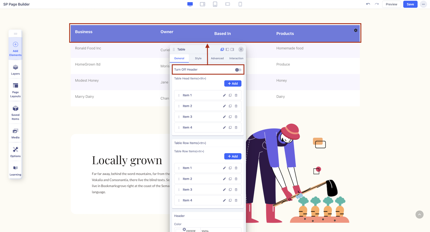
Turn this toggle on to remove the top most row i.e. the row containing the table head items (Column headings).
Table Head Items (<th>)
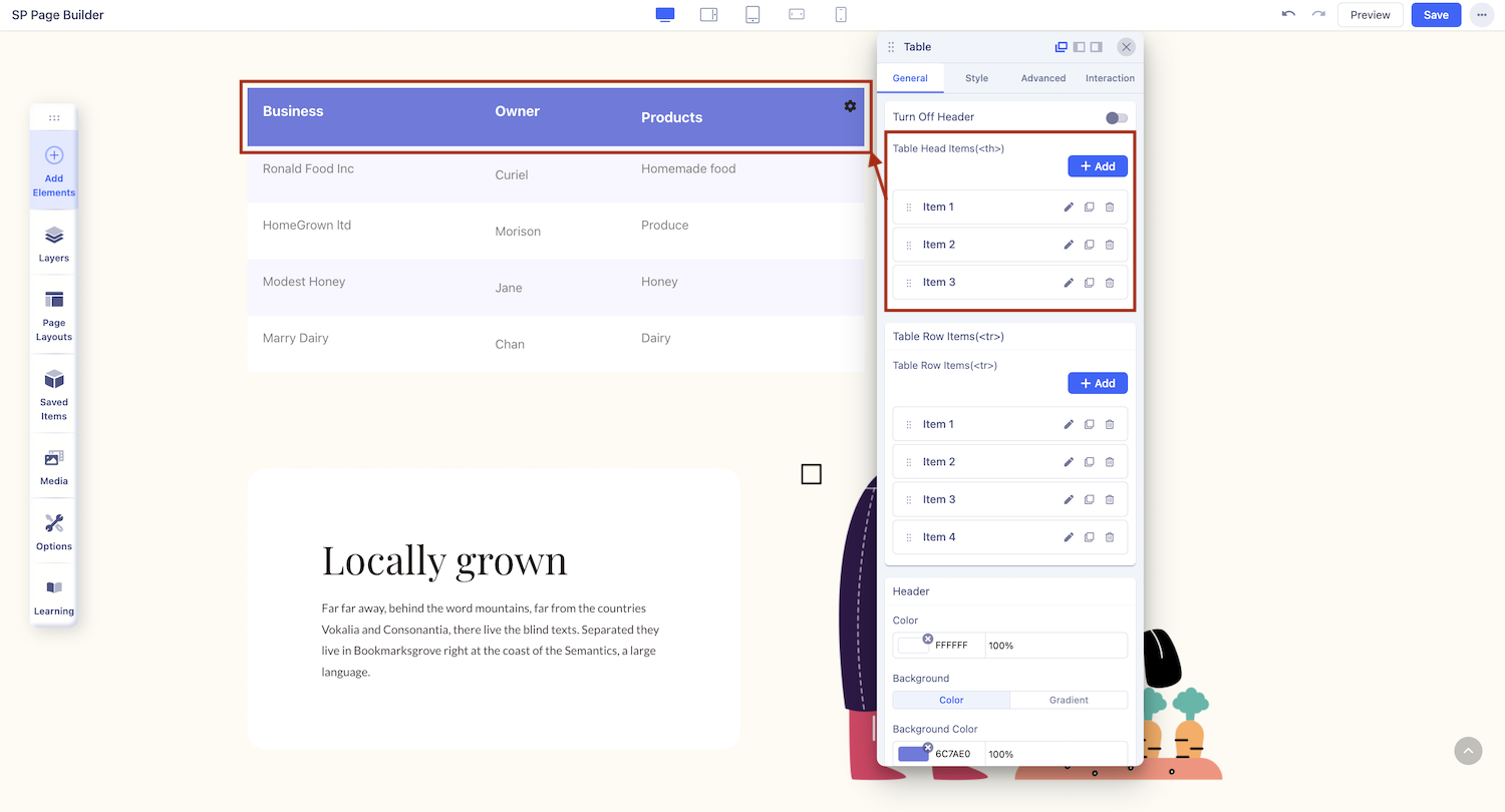
Add Table Head Items: Click on the +Add button to add a new Table Head Item (Column).
Admin Label: Give your Table Head Item a name.
Column Span Number: Specify how many cells this Column will span.
Column Header Content: Click on the plus symbol to access the list of addons and select the one you want to add. For instance, as it's a column heading, you can choose a Text Block.
Once you add this item, you will see it appear under the Table Head Item section. Besides each of these items, you’ll find the options to edit, duplicate, or delete it.
Table Row Items (<tr>)
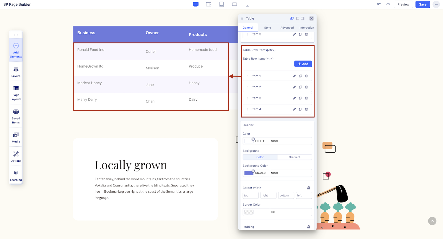
Add Table Row Items: Click on the +Add button to add a new Table Row Item. The plus icon on the inline editor can also be used to do this.
Admin Label: Give your Table Row Item a name.
Once you add this item, you will see it appear under the Table Row Item section. Besides each of these items, you’ll find the options to edit, duplicate, or delete it.
Table Column Items (<td>)
Add Table Row Items: Start by adding a new Row or editing one that already exists. To add a new Table Column Item, click on the +Add button located inside the Table Row Items form.
Admin Label: Give your Table Column Item a name.
Column Span Number: Specify how many cells this Column will span.
Column Header Content: Click on the plus symbol to access the list of addons and select the one you want to add.
Column Background Color: Select the Column’s background color.
Once you add this item, you will see it appear under the Table Column Item section. Besides each of these items, you’ll find the options to edit, duplicate, or delete it.
Enable Search Option
Enable this option to add a Search Field to your Table allowing users to search through this information to find what they need.
Enable Sort Option
Enable this option to allow your Table to be sorted.
Enable Pagination
Enable this option to show Pagination for your Table.
Turn Off Responsive
Forcefully turn off the Tables’ mobile responsiveness. It will cause an overflow scroll to appear on the Table in mobile view.
Table Style Settings
Once again, open the inline editor by clicking on the settings icon that’s at the top-right corner of the Table. Next, click on the Table icon to open the Table Settings and head over to the Table Styles tab.
Text Alignment
Set the Text Alignment of the Table’s contents from here. Options include Left, Center, and Right Alignment.
Header Style Options
Color BG: Select this option to give the Table Header a solid color background.
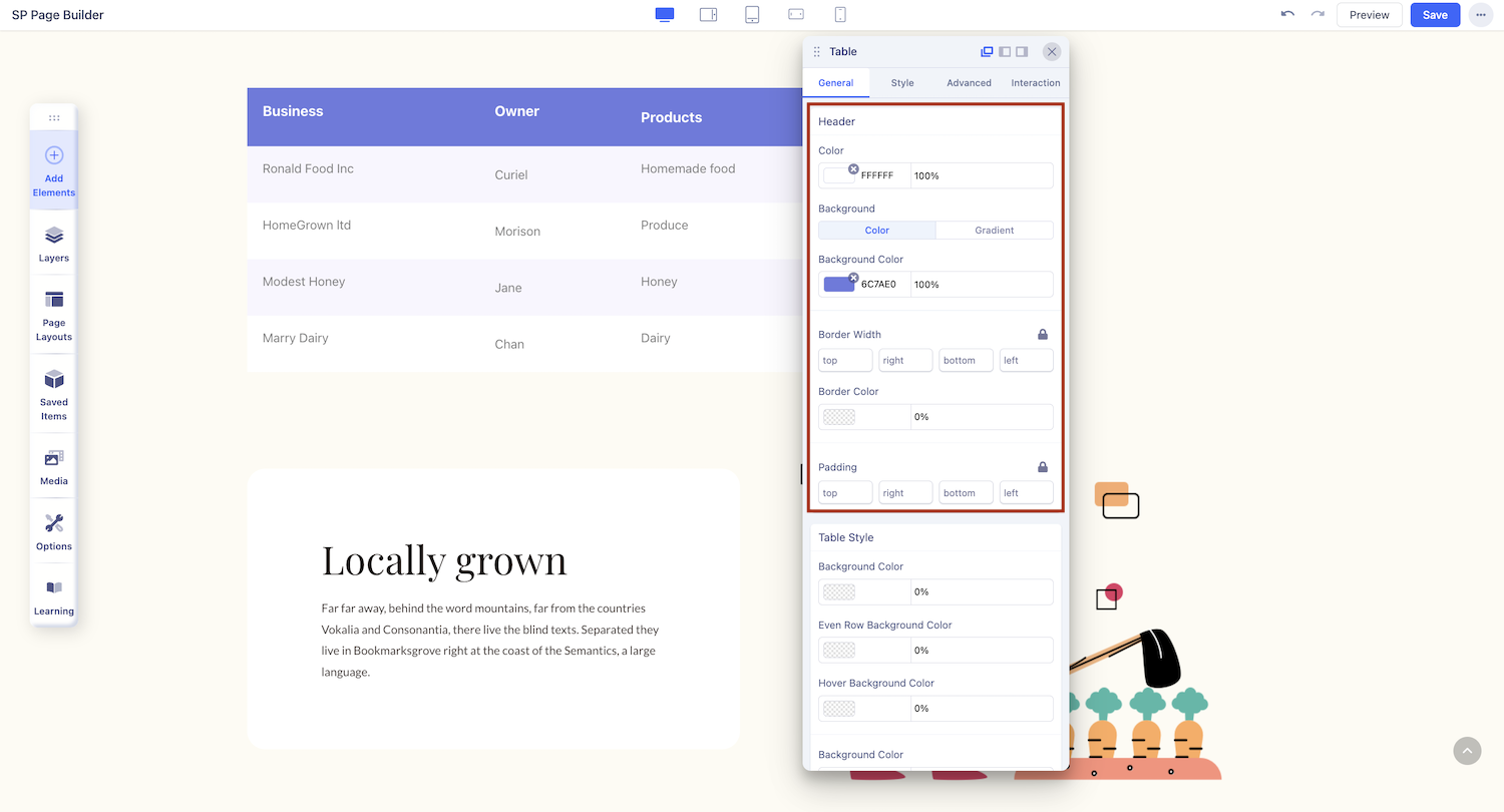
Background Color: Use the Color Picker to select the background color of the Table Header.
Color: Select the Text Color of the Table Header.
Padding: Define the Table Header’s Padding.
Border Width: Define the Border Width of the Table Header.
Border Color: Define the Border Width’s color.
Gradient BG: Select this option to give the Table Header a gradient color background.
Color: Select the Text Color of the Table Header.
Color 1: Select the first Color for the gradient.
Color 2: Select the second Color for the gradient.
Start: Define how far the first color will spread.
End: Define how far the second color will spread.
Type: Select if the gradient type will be linear or radial. A Linear Gradient is in a straight direction whereas a Radial Gradient is in a circular direction.
Angle: Set the Angle of the Gradient
Row (<tr>) & Data (<td>) Style Options
Row Style: Click on this to access the Row’s style options.
Background Color: Set the Background Color of all Rows.
Even Row Background Color: Set the Background Color of even Rows. Use this in conjunction with the previous option to get alternating colored Rows.
Hover Background Color: Set the Background Color of a Row in hover mode.
Data Style: Click on this to access Data’s style options.
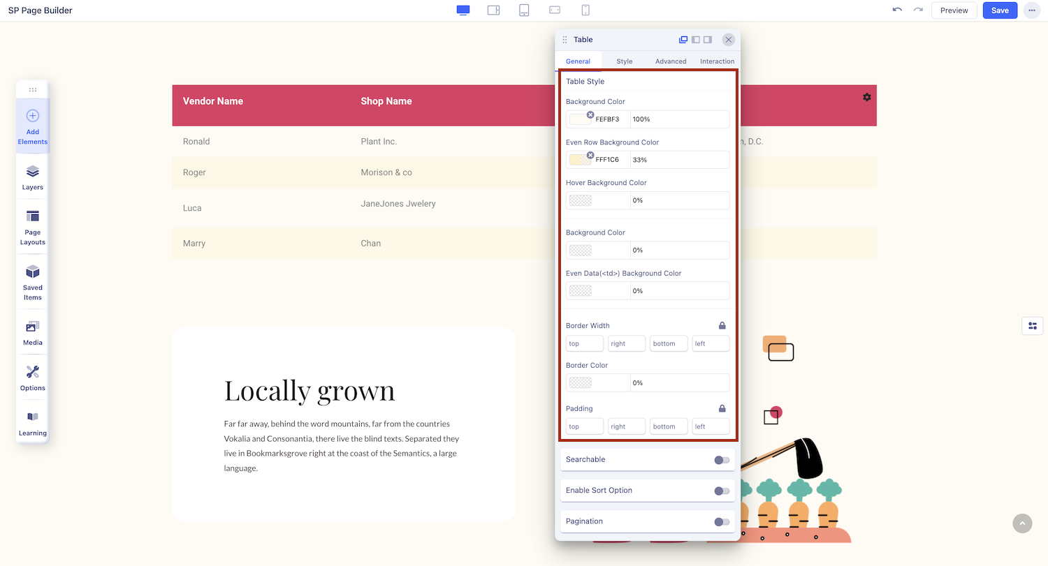
Background Color: Set the Background Color of all Data
Even Data (<td>) Background Color: Set the Background Color of even Columns. Use this in conjunction with the previous option to get alternating colored Columns.
Padding: Set the Data’s Padding.
Border Width: Set the Data’s Border Width.
Border Color: Set the Data’s Border Color.