

Tabs
Website Tabs are similar to Browser Tabs as it consists of multiple “Divs” that are grouped together to save space. Because of this, the Tabs addon is especially helpful for single-page websites or websites with limited space. When designed well, they help improve readability and decrease clutter.
How to Add Tabs
Start by opening the Addons Panel. Click on the Addons button on the Sidebar or the plus icon inside a row to do this. Finally, scroll down to the Content section and drag & drop Tabs to your canvas.
Tabs Settings
Once this addon has been added, it’s time to customize it to suit your purposes. To do this, click on the Tabs icon on the inline editor to open the Tabs Settings.
Tabs
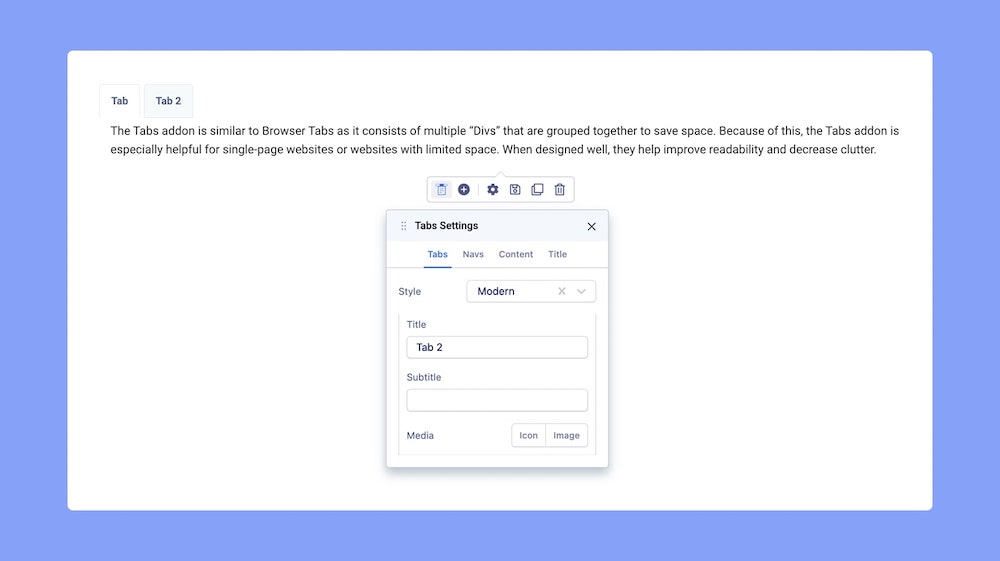
Style: Select the Tabs’ Style from here. Options include Modern, Default, Pills, Lines, and Custom.
+Add: By default, the Tabs addon only consists of one Tab Item but you can easily add more by clicking on this button. You can also click on the plus icon on the inline editor to do this as well.
Title: Set a Title for your New Tab Item
Subtitle: Set a Subtitle for your New Tab Item.
Media: Select the type Icon or Image if you want to add a Media to appear beside your New Tab Item’s Title.
Finally, click on Apply to save your changes.
Navs
Next, go to the Tabs Settings > Navs > General to customize the Navs.
General
Padding: Set the Padding for Tab Navigation.
Margin: Set the Padding for Tab Navigation.
Media
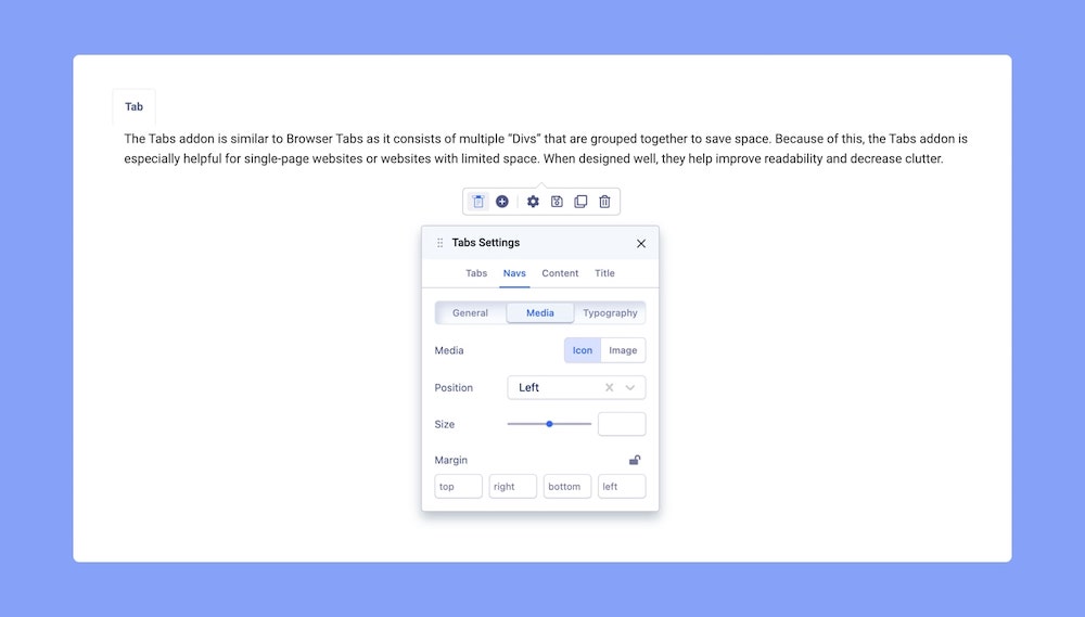
Then, head over to Tabs Settings > Navs > Media to customize the Media element that appears beside the Navs if enabled.
Here you can set the Position, Size, Margin, and Width for Icon and Images.
Typography
From Tabs Settings > Navs > Typography, you can customize the Navs’ font, font size, and more.
Customizing Tab Content
Similarly, you can go to Tabs Settings > Content > General to set its Padding and Margin. The Typography of any content within the Tabs can be customized from Tabs Settings > Content > Typography.
Customizing Tab Title
You can also associate a Title with your Tabs. To do this go to Tabs Settings > Title. Under the Title field, enter your text, set its HTML element hierarchy (H1, H2, H3, etc), and adjust its top and bottom margins.
You can further customize your Title’s style using the options from the Color and Typography menus on the Title tab. For more detailed info on these, please go through this documentation.
Customize Tab Colors
Change your Tab’s color scheme using the Color Settings. Click on the Circle icon from the inline editor to open this window. Note that this icon will only be visible if the Tabs’ Style is set as Custom.
Here, you will be able to change the Background Color, Text Color, Border Width, and Border Color. Clicking on the color box will open the Color Picker window where you can easily select the color you want. From the Hover and Active menus, you can also choose the colors for the Tabs in those modes.
More on Color Settings here.
Adding Content to Tabs
The Tabs addon comes with a Text Block by default but that doesn’t mean that it is limited to just text. What makes this addon amazing is that you can actually nest any addon you want! You have all of the flexibility you get while designing a webpage with a Tab Item’s window.
To nest other addons, open the Addons Panel and drag & drop the element you want into the Tab. You will notice grey lines appear on the Tab Item window when you hover with the new element which shows where it’ll be placed when dropped.
Once an addon’s been added, you can customize it to your preferences using its inline editor.