

Testimonials
A Testimonial is a positive user review of a product or service shared with others. Showcasing testimonials on your website is a great way to boost its credibility and deepen visitors’ trust.
Using this addon, you can display your Testimonials on your webpage in a pleasing way quite easily.
How to Add Testimonials
To start, open the Addons Panel by clicking on the plus icon inside a Row or the Addons button on the Sidebar. Scroll down to the bottom of the Content section to find the Testimonials addon. Finally, drag & drop this where you want to place it on your canvas.
Testimonial Settings
Once you’ve added the Testimonials block, it’s time to customize it to suit your purposes. To do this open the Testimonials Settings by clicking on the first icon on the inline editor.
Review
Under the Review tab, you can add the review statement and reviewer information.
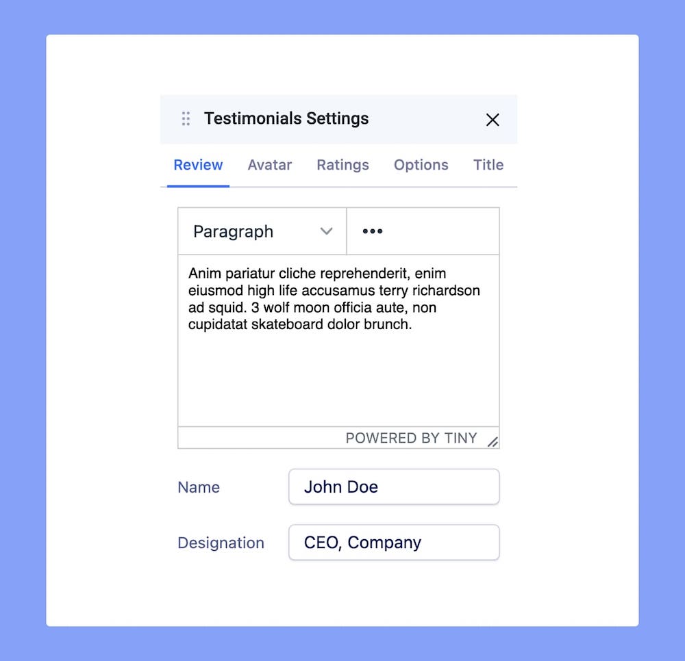
Review: This first section of the Review tab is actually a third-party rich text editor known as TinyMCE. You can enter your Review Text within the large text field or simply click on the existing content and edit it directly.
You’ll find a dropdown at the top-left corner with several options like Headings, Inline, etc. From here, you’ll be able to select the HTML elements you want your content to consist of.
And the three-dot icon on the top-right gives you even more options to customize your Review Text like font size, alignment, list, image upload, etc.
Name: Add the reviewer’s (User’s) Name in this field
Designation: Enter their job designation and their workplace.
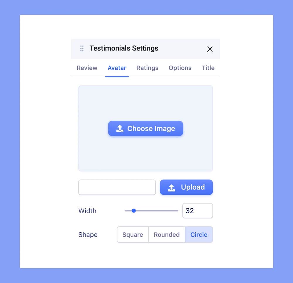
Avatar
You can also add the reviewer’s image from the Testimonials Settings > Avatar.
Choose Image: Opens the Media Manager from where you can select the image you want to add.
Upload: Also opens Media Manager and from here you can click on the Upload Files option to upload your image and then select it as your Avatar.
Width: Set the Avatar’s width. Use the range slider to increase or decrease the width or enter a number into the text field beside it.
Shape: Select the shape you want the Avatar to be. Options include Square, Rounded, and Circle.
Ratings
Apart from a review statement, Testimonials may also have ratings which is a visual representation of how much they liked the product or service. Go to Testimonials Settings > Ratings to enable this.
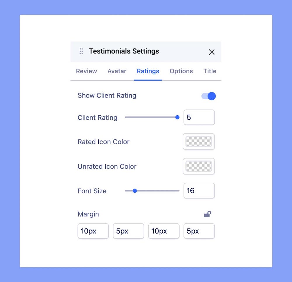
Show Client Rating: Activate this toggle to enable Ratings.
Client Rating: Define the Rating value. The minimum value is 1 and the maximum is 5.
Rated Icon Color: Select the color of the rated icons.
Unrated Icon Color: Select the color of the unrated icons.
Font Size: Define the font size i.e the size of the Rating.
Margin: Set the values of the Rating margin.
Options
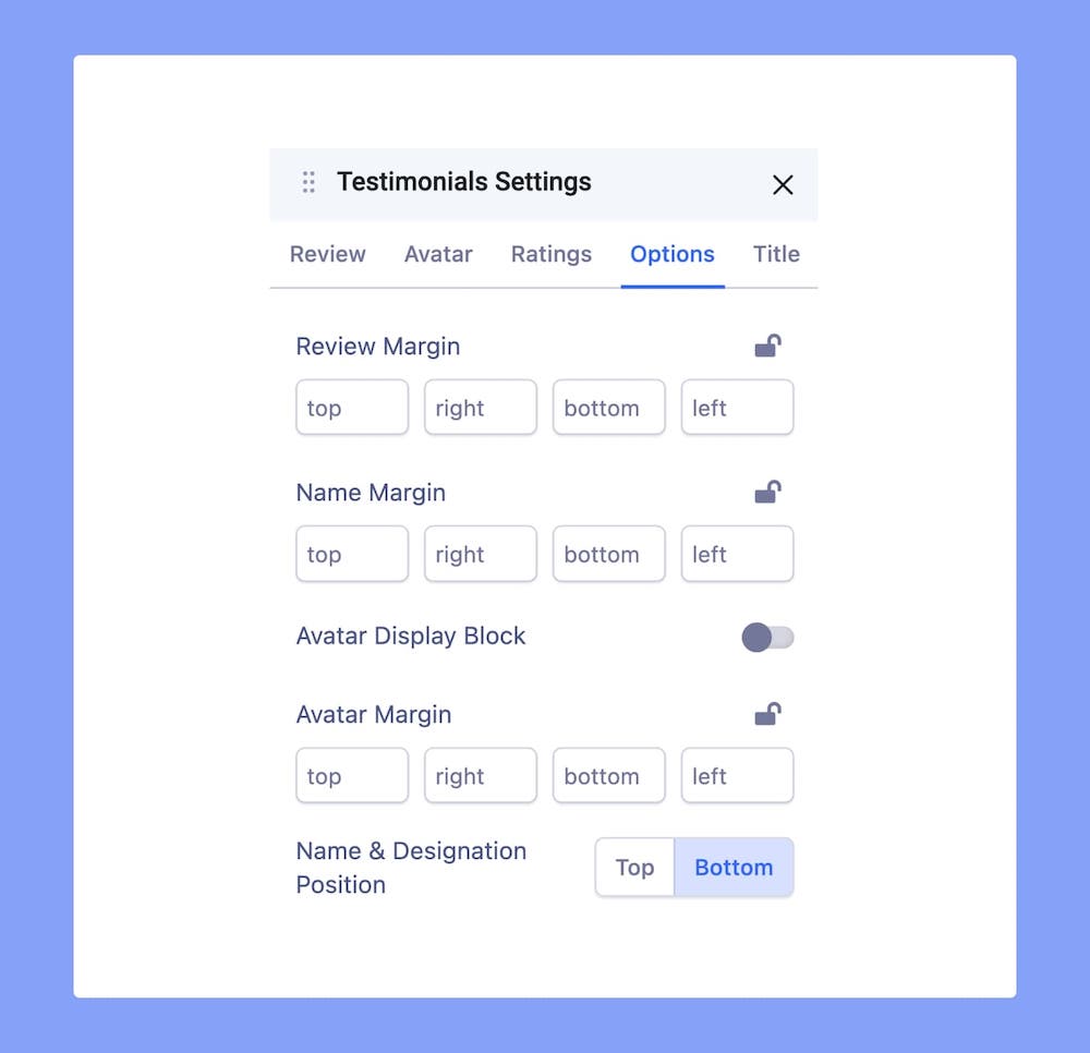
Review Margin: Set the margins for the Review Text.
Name Margin: Set the margins for the reviewer’s Name.
Avatar Display Block: Enable this option to display Avatar on top of the Name and Designation instead of on its left.
Avatar Margin: Set the margins for the Avatar.
Name & Designation Position: Position the Name, Designation, and Avatar at the Top or at the Bottom of the Testimonial block.
Title
You can also add a Title to your Testimonial. Go to the Title tab on Testimonials Settings to access this option.
Title: Enter the text for the Title
HTML Element: Set the HTML element hierarchy as H1, H2, H3, etc.
Top Margin: Set the top margin of your Title.
Bottom Margin: Set the bottom margin of your Title.
You can further customize your Title’s style using the options from the Color and Typography menus on the Title tab. For more information check out their dedicated documentation.
Typography Settings
Click on the ‘A’ Letter icon on the inline editor to open the Typography window. Here, you can adjust the Font, Font Size, Line Height, etc for the text in your Testimonials. For detailed information on Typography check out this documentation.
Link Settings
To link the Name and Designation, head over to Link Settings from the inline editor. Here you can choose between the options URL, Menu, and Page.
URL: Choose this option to add an outbound link or link using a URL.
Menu: Choose this option if you want to link to a Menu Item from this website. Select the one you want to link to from the following dropdown list.
Pages: Choose this option if you want to link to a Page from this website. Select the one you want to link to from the following dropdown list.
Open in New Tab: Open the added link in a new tab.
No Follow: Enable to tell search engines to ignore this link.
Quote Settings
Testimonials have a quote icon to signify that it is a statement made by someone. You can customize this icon from Quote Settings found on the inline editor.
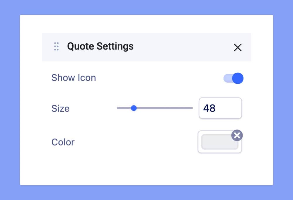
Show Icon: Enable this to show the quote icon.
Size: Define the quote icon’s size. Use the range sliders or the text field to do this.
Color: Seet the quote icon’s color.
Color Settings
Change your Testimonial’s color scheme using the Color Settings. Click on the Circle icon from the inline editor to open this window. Here, you will be able to change the color of the Review, Name, and Designation. Clicking on the color box will open the Color Picker window where you can easily select the color you want.
More on Color Settings here.