

Text Block
Using the Text Block addon, you can add text content to your webpage. It is one of the most basic but essential tools in your toolkit.
How to Add Text Block
Open the Addons Panel by clicking on the Addons button on the Sidebar or using the plus icon found within a Row. Scroll to the bottom of the Content section and drag & drop the Text Block addon where you want to place it on your canvas.
Text Block Settings
Now it’s time to customize your block of Text how you want. You will find the options you need by clicking on the Text Block icon on the inline editor. This will open the Text Block settings where you will be able to adjust the following:
Content
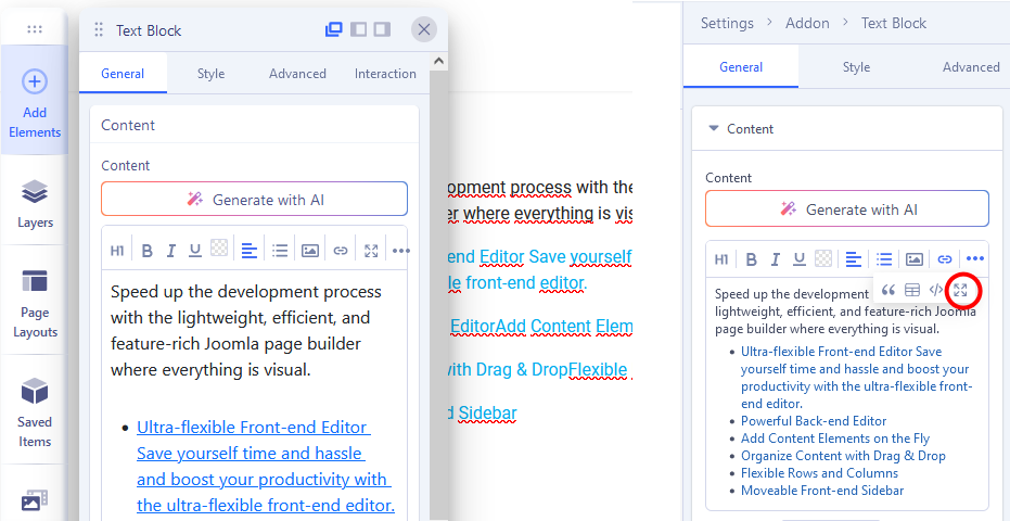
The Content tab is a third-party rich text editor known as TinyMCE. You can enter your Text within the large text field or simply click on the existing content and edit it directly.
You’ll also find a dropdown menu at the top-left corner with several style options like:
Headings: From here, you can select the HTML elements you want your content to consist of. Options include H1, H2, H3, H4, H5, and H6
Inline: Add emphasis using the options Bold, Italics, Underline, Strikethrough, Superscript, Subscript, and Code.
Color: You can set the color used for selected text.
Align: Set alignment as Left, Center, Right, or Justify.
List: Choose a style of list (number, dots).
Image: Insert image to text area using Media Manager.
Link: Insert link for selected word (phrase).
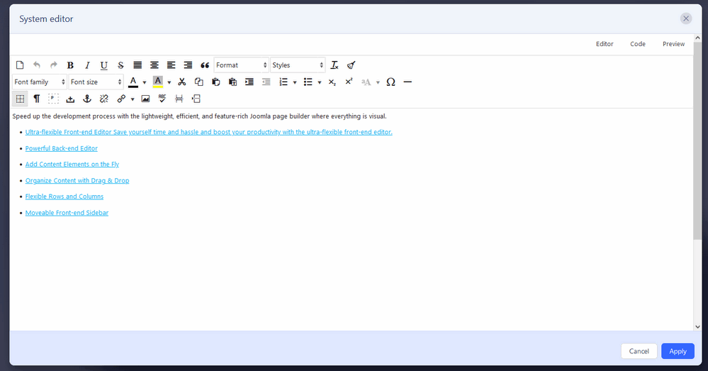
The three-dot icon on the top-right gives you even more options to customize your Text like BlockQuotes, Tables, Source Code, and System Editor to use default Joomla Editor like TinyMce or JCE.
Here is an example of how JCE Pro Editor may look in the System Editor window. We recommend using the last stable version, at least 2.9.6+.
Title
You can also give your Text Block a Title. Go to the Title tab on the Text Block Settings to access this option.
Title: Enter the text for the Title
HTML Element: Set the HTML element hierarchy as H1, H2, H3, etc.
Top Margin: Set the top margin of your Title.
Bottom Margin: Set the bottom margin of your Title.
Text Block Style Settings
To customize your Text Block’s style, open the inline editor where you’ll find the icons for Typography, Color, Alignment, and more.
Typography
Click on the ‘A’ Letter icon on the inline editor to open the Typography window. Here, you can adjust the Font, Font Size, Line Height, etc for the text in your Text Block. For detailed information on Typography check out this documentation.
Color Settings
Use the Color Picker to select a color for the Text in your Text Block or simply paste the HEX Code of a specific color into the field below the Color Picker. More on Color Settings here.
Alignment
To adjust the Text Block’s Alignment, click on its icon on the inline editor. Alignment options include Left, Center, Right, and Justified.
Font Emphasis
You can also change the Font Emphasis easily from the inline editor itself. Options include Bold, Italics, and Underline.
Content Truncation
Content Truncation allows you to hide excessive text within the Text Block addon and display a few words for a clean and minimal text area.
- Max Word to Show: Indicate the number of maximum words you want to display in your Text Block addon’s content area.
- Action Text: Add a text for your action button that will reveal the remaining text.
- Typography: Use this option to access the Typography settings related to the content truncation option.
- Action Color: Choose a color for your Action Text.