- TemplatesTemplates
- Page BuilderPage Builder
- OverviewOverview
- FeaturesFeatures
- Dynamic ContentDynamic Content
- Popup BuilderPopup Builder
- InteractionsInteractions
- Layout BundlesLayout Bundles
- Pre-made BlocksPre-made Blocks
- DocumentationDocumentation
- EasyStoreEasyStore
- ResourcesResources
- DocumentationDocumentation
- ForumsForums
- Live ChatLive Chat
- Ask a QuestionAsk a QuestionGet fast & extensive assistance from our expert support engineers. Ask a question on our Forums, and we will get back to you.
- BlogBlog
- PricingPricing
Add To Cart

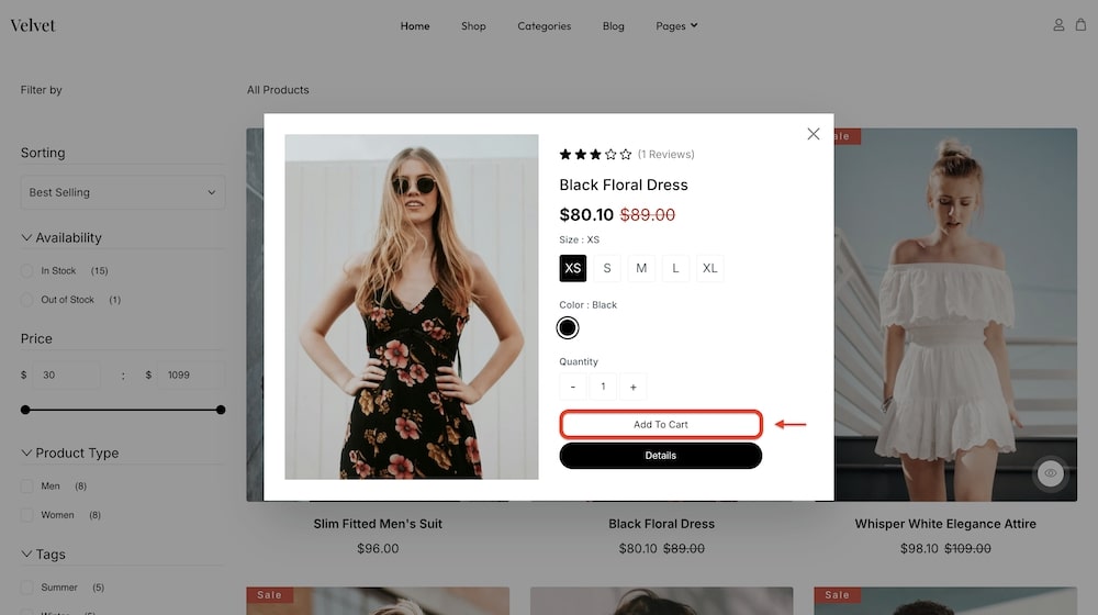
The Add to Cart addon enables customers to quickly add products to their shopping cart with a single click within your EasyStore Storefront page. You can personalize the button's icon, layout, style, border radius, border style, background, and more to match your store's design. This addon simplifies the purchasing process, enhances user experience, and encourages faster conversions.
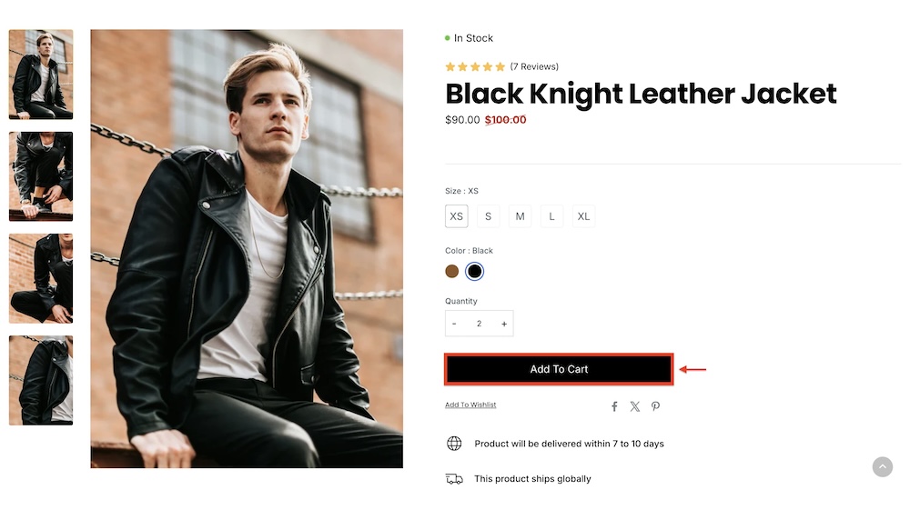
A different version of this addon is also available for Single Pages. It contains identical customization options.

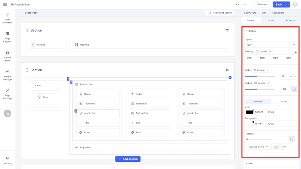
Button

Layout: You can select whether the button will consist of only text, only an icon, or a combination of both.
Typography: You can customize the font type, font size, Line Height, Letter Space, Style, and Weight of the text. You can choose the screen type, and set different font settings for each screen type (Laptop, Tablet Landscape, Tablet Portrait, Mobile Landscape, and Mobile Portrait). SP Page Builder automatically adjusts these values for responsive design by default.
Padding: You can adjust the padding dimensions for the button. You can choose the screen type, and set different padding dimensions for each screen type (Laptop, Tablet Landscape, Tablet Portrait, Mobile Landscape, and Mobile Portrait). SP Page Builder automatically adjusts padding for responsive design by default.
Width: Using a slider, you can adjust the width of the button. You can choose the screen type, and set different widths for each screen. You can use the input field to adjust the width as well (in px, rem, em, and %).
Radius: Similarly, you can adjust the radius of the button using a slider and input field. You can choose the screen type, and set different radii for each screen. By expanding the input field by clicking the radius icon, you can input measurements for all sides of the radius or select one uniform value for all sides.
Color: You can adjust the color of the button using this option. You can control whether there will be a hover animation or not.
Background: You can adjust the background color of the button using this option.
Border: Similar to the radius, you can adjust the border radius of the button via a slider or input field. You have the option to adjust the border type (solid, double, dotted, dashed, groove, ridge, inset, outset) as well as the opacity of the border.
Note: The Typography option is only available if you set the Layout to either "Text" or "Icon & Text".
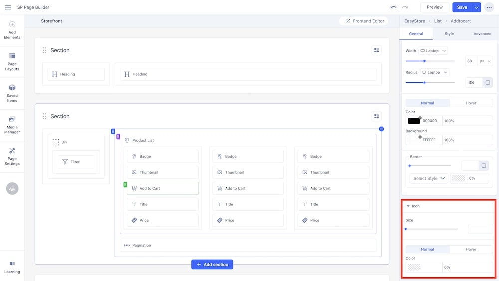
Icon

If you set the Layout to "Icon" or "Icon & Text", then you will get an additional section to customize the icon. This is not available if you selected "Text" as the layout type.
Size: Using a slider, you can adjust the size of the icon. You can choose the screen type (Laptop, Tablet Landscape, Tablet Portrait, Mobile Landscape, and Mobile Portrait), and set different icon sizes for each screen. You can use the input field to adjust the size in pixels.
Gap: Similarly, using a slider and an adjacent field, you can adjust the gap between the icon and the text. You can choose the screen type, and set different gaps for each screen.
Color: You can adjust the color of the icon using this option.
Note: The Gap option is only available if you set the Layout to "Icon & Text".

