- TemplatesTemplates
- Page BuilderPage Builder
- OverviewOverview
- FeaturesFeatures
- Dynamic ContentDynamic Content
- Popup BuilderPopup Builder
- InteractionsInteractions
- Layout BundlesLayout Bundles
- Pre-made BlocksPre-made Blocks
- DocumentationDocumentation
- EasyStoreEasyStore
- ResourcesResources
- DocumentationDocumentation
- ForumsForums
- Live ChatLive Chat
- Ask a QuestionAsk a QuestionGet fast & extensive assistance from our expert support engineers. Ask a question on our Forums, and we will get back to you.
- BlogBlog
- PricingPricing
Title
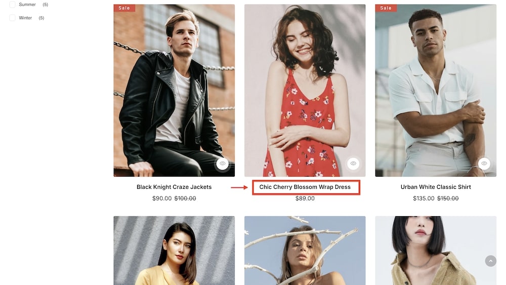
The Title is a customizable addon for your EasyStore Storefront page, designed to display product names within a product list. With options to adjust color, and typography, add icons, and modify title spacing, this addon ensures that product titles are visually appealing and aligned with your store’s branding. It plays a crucial role in eCommerce shops by making product names stand out, improving readability, and enhancing the overall shopping experience for customers.
Title
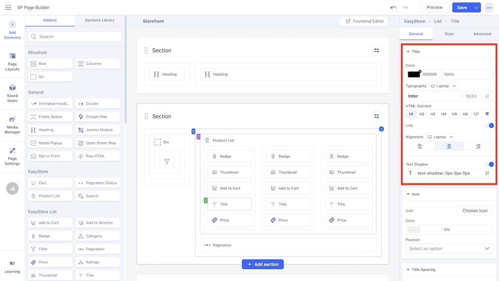
Color: You can adjust the color of the title using this option.
Typography: You can customize the font type, font size, Line Height, Letter Space, Style, and Weight of the title. You can choose the screen type (Laptop, Tablet Landscape, Tablet Portrait, Mobile Landscape, and Mobile Portrait), and set different typography settings for each screen. However, if you only set the typography for one screen type then the same will be applied to the other screens responsively.
HTML Element: This option enables you to set the HTML element for the title.
Link: By enabling this option, you can allow the users to click on the title to be redirected to the product page of the specific product.
Text Shadow: You can toggle this option to give the title a text shadow. By clicking on the adjustment icon, you will be provided with the additional settings such as:
-
Color: You can select the color and adjust the opacity of the text shadow.
-
Horizontal: You can use this slider to adjust the horizontal dimensions of the text shadow.
-
Vertical: You can use this slider to adjust the vertical dimensions of the text shadow.
-
Blur: You can use this slider to adjust the blur intensity of the text shadow.
Icon
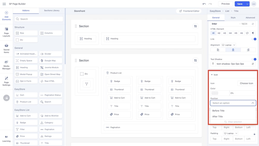
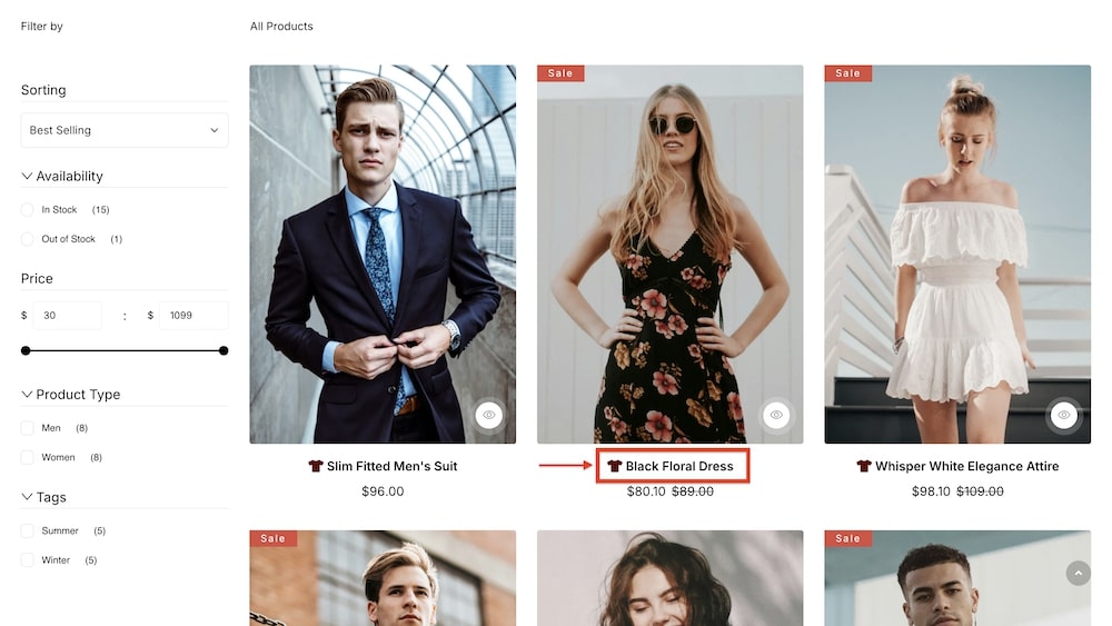
Icon: You can select an icon to accompany the title by choosing from the Font Awesome library or uploading your own.
Color: You can adjust the color of the icon using this option.
Position: Using this dropdown menu, you can adjust the position of the icon to be either before or after the title.
Title Spacing
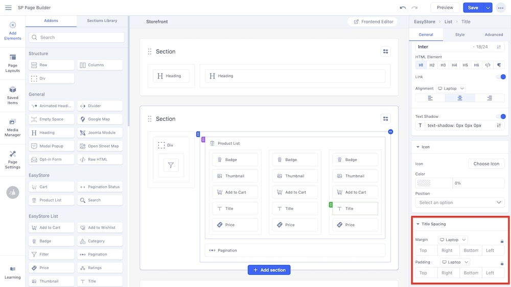
Margin: You can customize the margin dimensions for the title (top, right, bottom, and left) in relation to surrounding elements. You can choose the screen type (Laptop, Tablet Landscape, Tablet Portrait, Mobile Landscape, and Mobile Portrait), and set different margin dimensions for each screen. If you do not set the margin values manually, SP Page Builder automatically adjusts the margins for responsive design.
Padding: Similarly, you can adjust the padding dimensions for the title as well. You can choose the screen type, and set different padding dimensions for each screen. Like the margin settings, SP Page Builder automatically adjusts padding for responsive design by default.

