- TemplatesTemplates
- Page BuilderPage Builder
- OverviewOverview
- FeaturesFeatures
- Dynamic ContentDynamic Content
- Popup BuilderPopup Builder
- InteractionsInteractions
- Layout BundlesLayout Bundles
- Pre-made BlocksPre-made Blocks
- DocumentationDocumentation
- EasyStoreEasyStore
- ResourcesResources
- DocumentationDocumentation
- ForumsForums
- Live ChatLive Chat
- Ask a QuestionAsk a QuestionGet fast & extensive assistance from our expert support engineers. Ask a question on our Forums, and we will get back to you.
- BlogBlog
- PricingPricing
Review Form

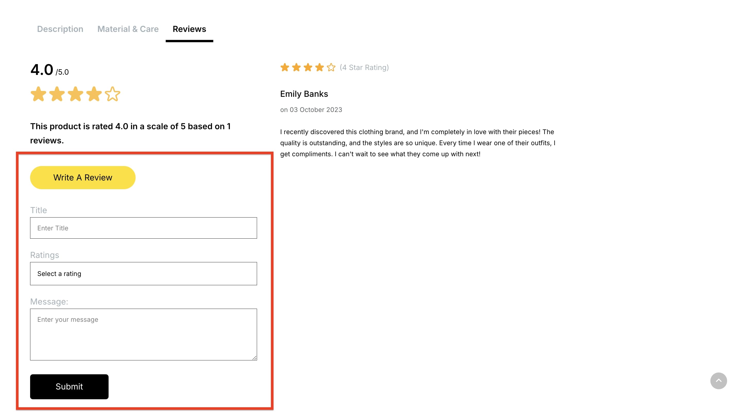
The Review Form addon for single product pages is designed to allow customers to provide their feedback and ratings. The form can be edited with extensive customization options, such as adjustments to typography, color, spacing, and more, making it more user-friendly. This addon is essential for building trust, highlighting customer satisfaction, and helping potential buyers make confident purchasing decisions.
Note: This addon can only be used on Single Product Pages. It is not available on Storefront or Collection Pages.
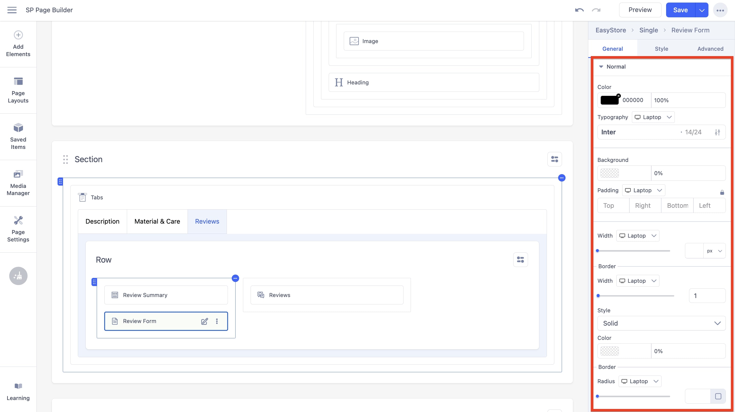
Normal

The following options can be used to adjust the Review Form Button in its normal state:
Color: You can adjust the color of the review form text using this option.
Typography: You can customize the font type, font size, Line Height, Letter Space, Style, and Weight of the review form text. You can choose the screen type, and set different font settings for each screen type.
Background: You can adjust the background color of the review form text using this option.
Padding: Using the fields, you can customize the padding dimensions for the review form text. You can choose the screen type, and set different padding settings for each screen type.
Width: Using the slider or adjacent field, you can customize the width for the review form text. You can choose the screen type, and set different width settings for each screen type.
Border: You have several customization options for the border, such as:
- Width: Using the slider or adjacent field, you can customize the width for the border. You can choose the screen type and set different width settings for each screen type.
- Style: Using the dropdown menu, you can choose the border style to be either None, Dashed, or Dotted.
- Color: You can adjust the color of the border using this option.
- Radius: Using the slider and adjacent field, you can adjust the border radius in pixels. You can set different settings for different screen sizes.

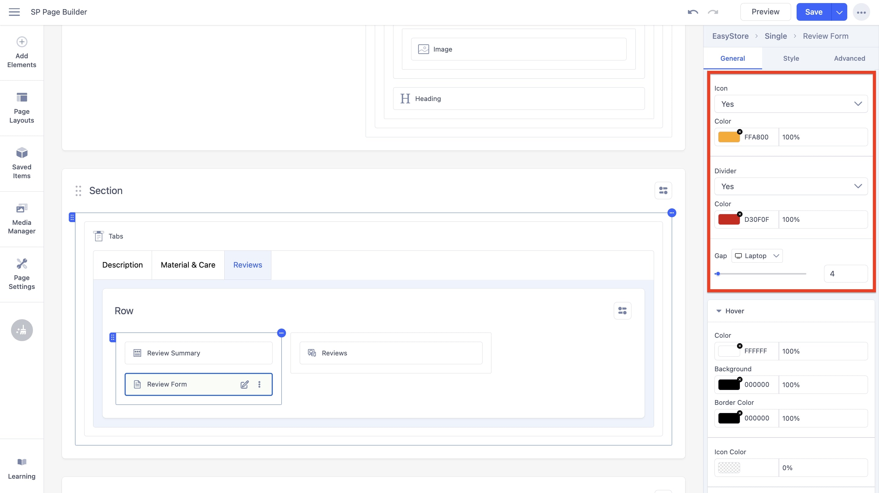
Icon: You can choose to display the icon on the review form button. If you set the option to “Yes”, you will be able to adjust the color.
- Color: You can adjust the color of the icon using this option.
Divider: You can choose to display a divider on the review form button. If you set the option to “Yes”, you will be able to adjust the color and gap.
- Color: You can adjust the color of the divider using this option.
- Gap: Using the slider and adjacent field, you can adjust the gap between the review form button elements. You can set different settings for different screen sizes.
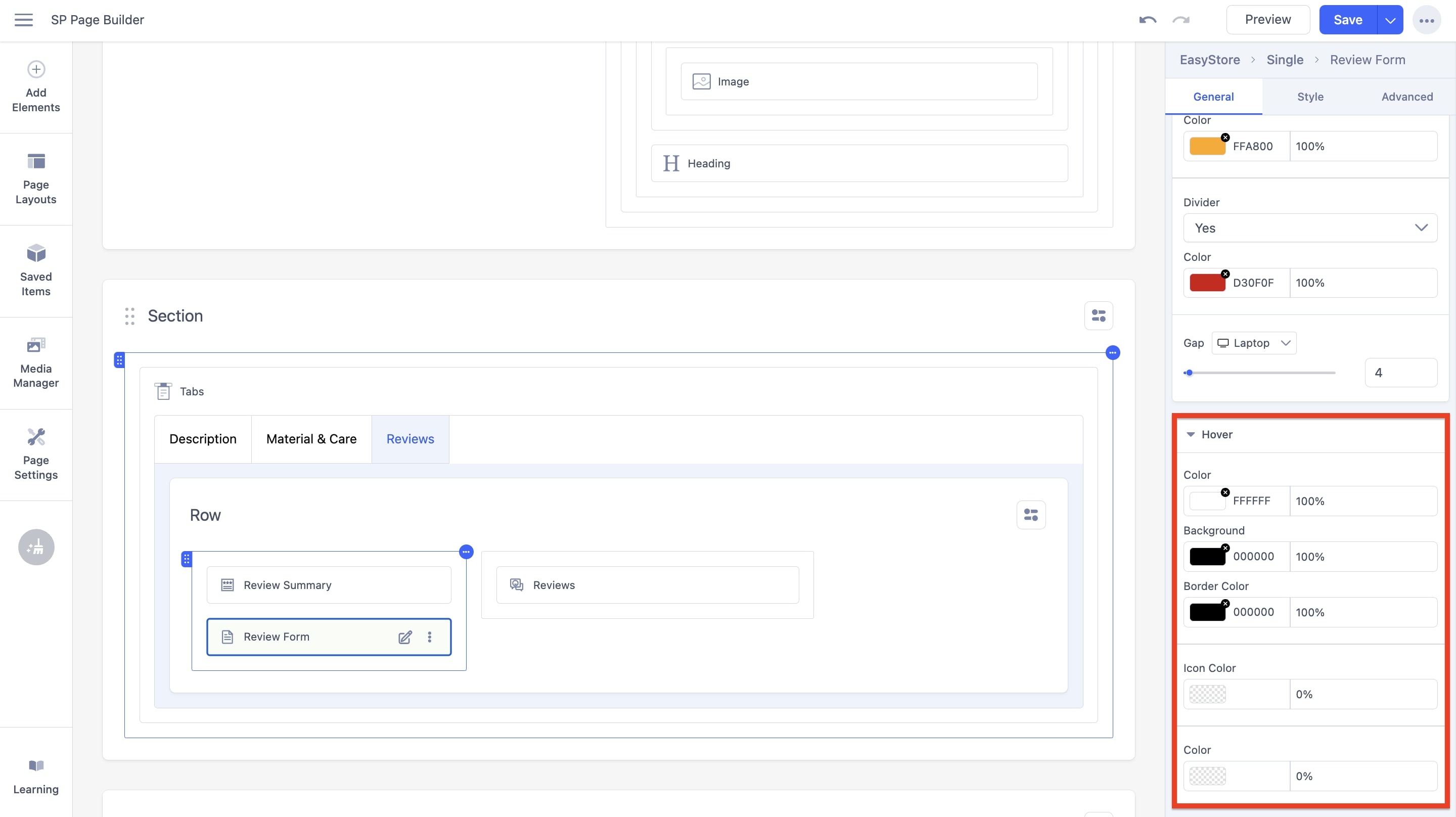
Hover

The following options can be used to adjust the Review Form Button in its hover state:
Color: You can adjust the color of the text within the review form button. This color will trigger after the user hovers over the button.
Background Color: You can adjust the background color of the review form button. This color will trigger after the user hovers over the button.
Border Color: You can adjust the border color of the review form button. This color will trigger after the user hovers over the button.
Icon Color: You can adjust the background color of the review form button. This color will trigger after the user hovers over the button.
Color: You can adjust the color of the review form button. This color will trigger after the user hovers over the button.

