- TemplatesTemplates
- Page BuilderPage Builder
- OverviewOverview
- FeaturesFeatures
- Dynamic ContentDynamic Content
- Popup BuilderPopup Builder
- InteractionsInteractions
- Layout BundlesLayout Bundles
- Pre-made BlocksPre-made Blocks
- DocumentationDocumentation
- EasyStoreEasyStore
- ResourcesResources
- DocumentationDocumentation
- ForumsForums
- Live ChatLive Chat
- Ask a QuestionAsk a QuestionGet fast & extensive assistance from our expert support engineers. Ask a question on our Forums, and we will get back to you.
- BlogBlog
- PricingPricing
Filter
The Filter addon is a powerful addon for EasyStore pages, allowing users to refine and narrow down product listings based on specific criteria such as price, availability, size, or category. This addon is essential for eCommerce shops, as it enhances the shopping experience by helping customers quickly find desired products, streamlining the purchase process, and boosting conversion rates.
Items
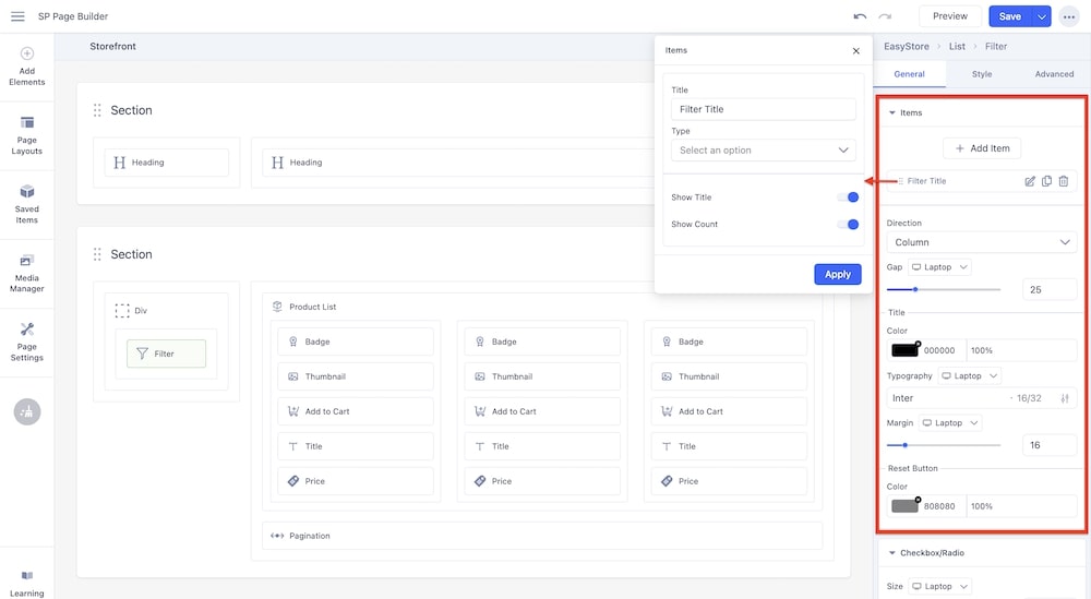
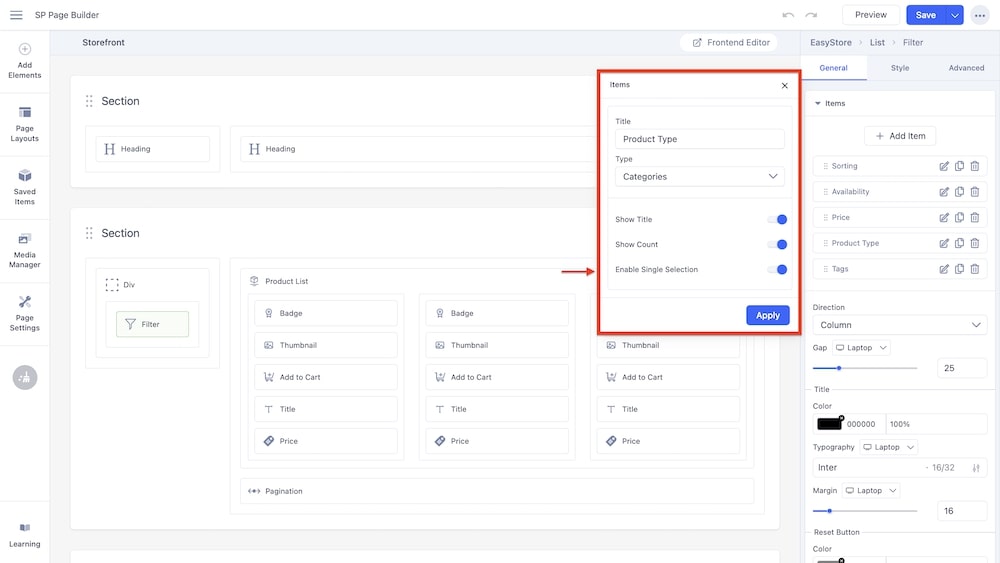
+Add Item: Click on the “+Add” button to add a filter. When you click on the edit icon, you will get the following options:
-
Title: Use the text field to enter the title of the filter.
-
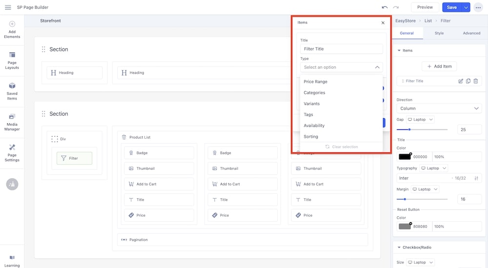
Type: Use this dropdown menu to select the type of filter that the user can apply to sort through the products in your store. The filter types include:
-
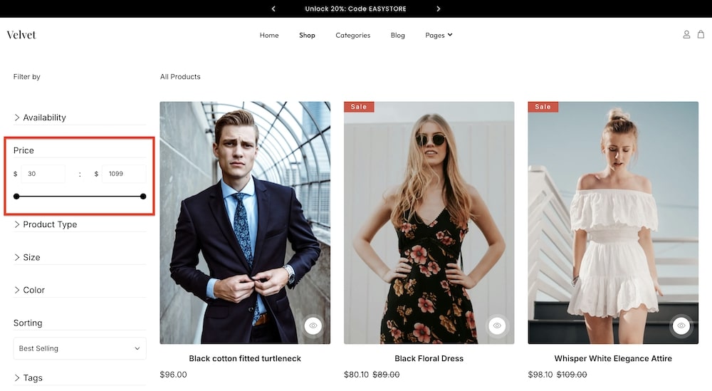
Price Range: This option allows you to create a price range slider. Users can adjust the slider to find a suitable price range, and the products will be sorted within that range.
-
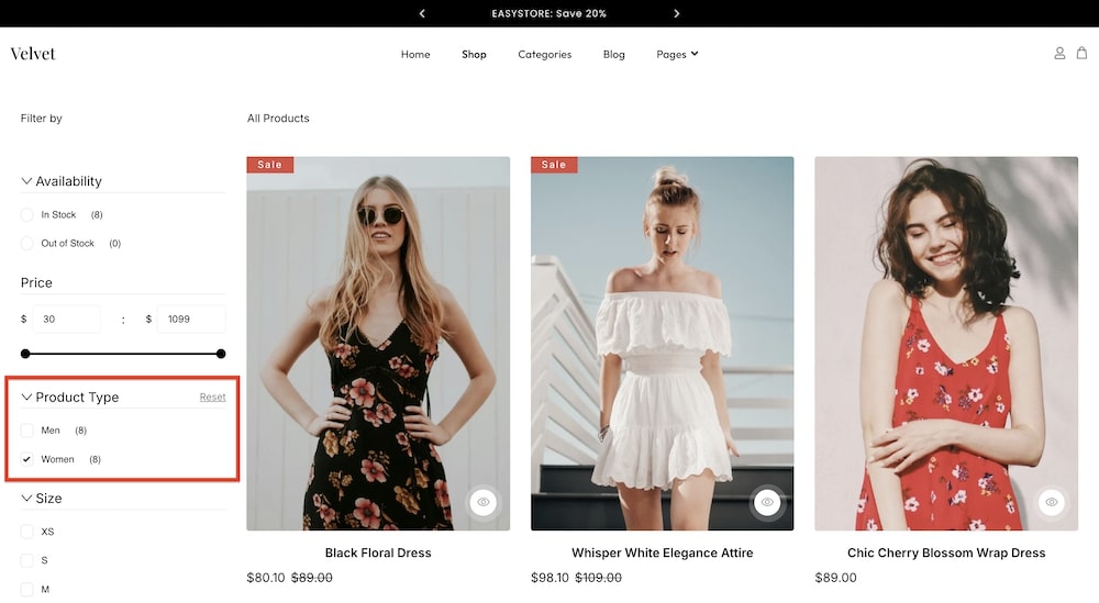
Categories: This option will create a filter that arranges the categories you have created into checkboxes that the user can click to choose their suited product category.
-
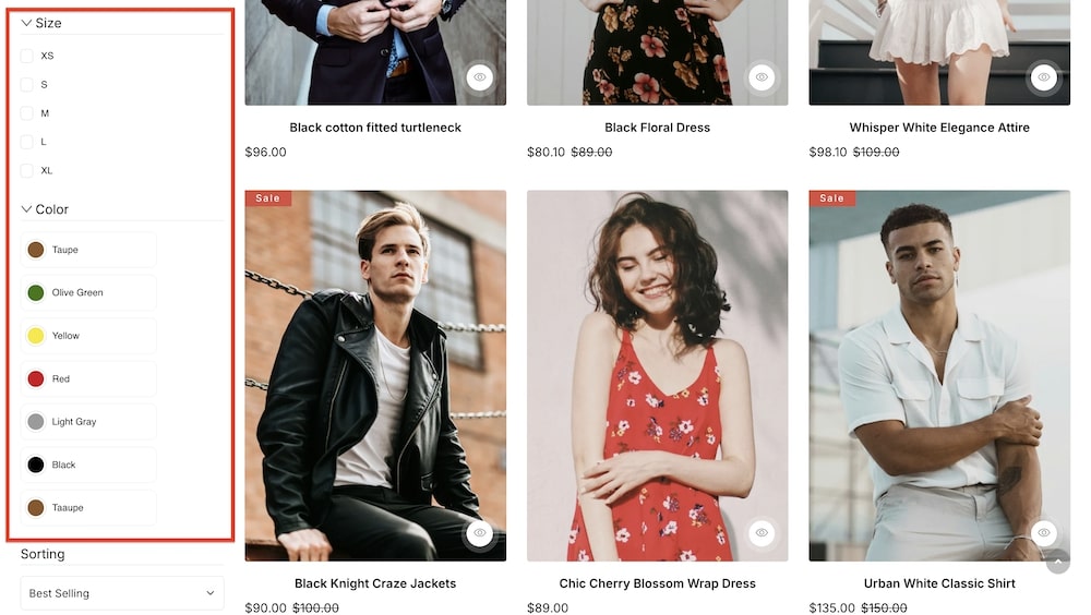
Variants: When creating a product you can add different variations (such as color, size, etc.), and this option arranges your variations as a checkbox list for the users to sort through.
-
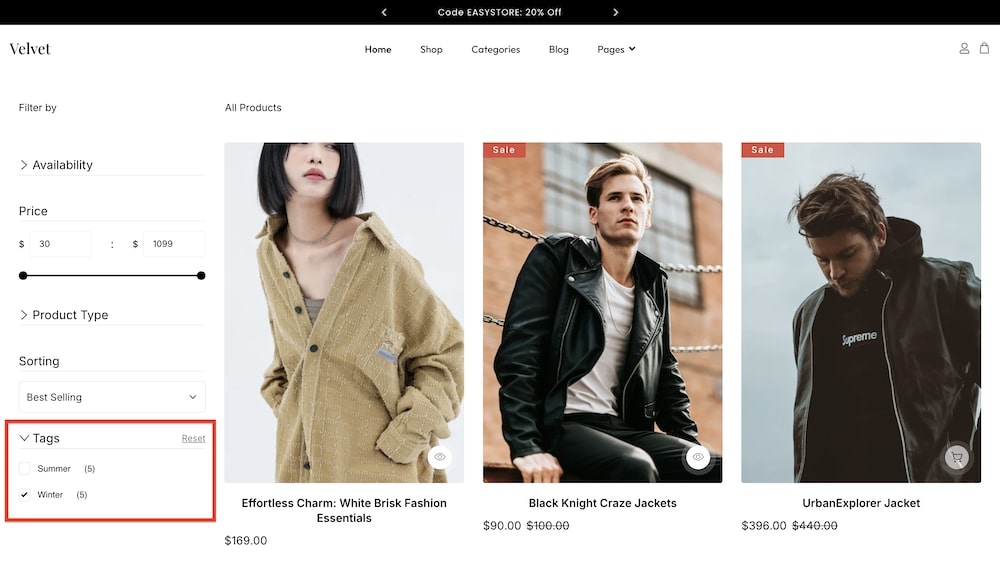
Tags: This option will create a filter that arranges the tags you have created into checkboxes that the user can click to choose their suited product category.
-
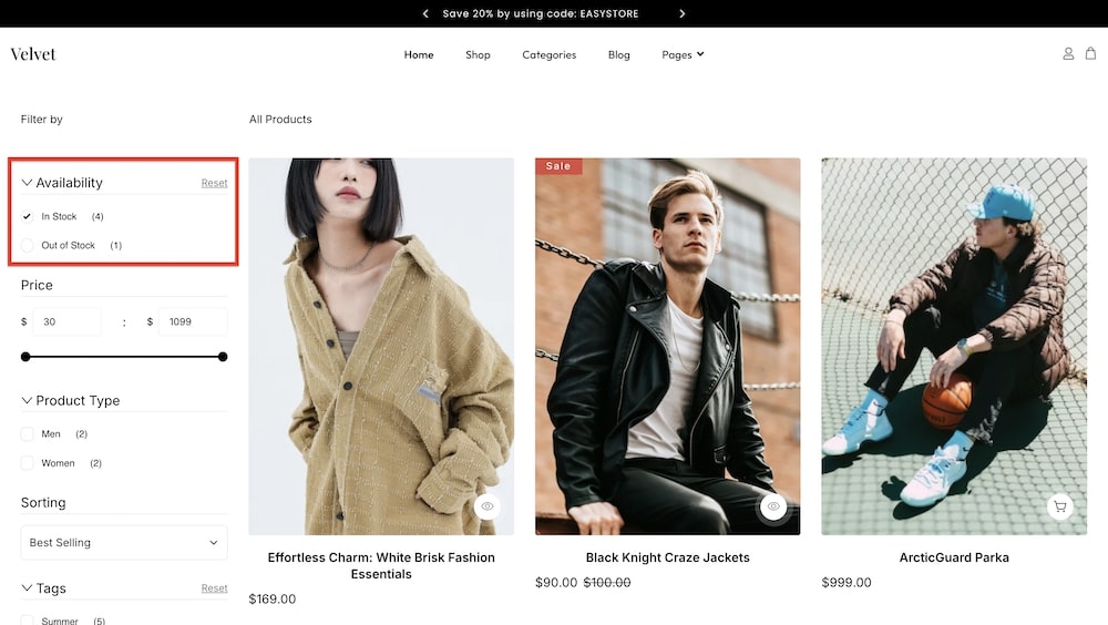
Availability: This option arranges availability options as radio buttons. Users can choose to filter products based on your available inventory or stock.
-
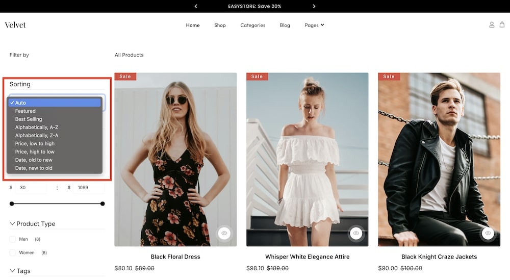
Sorting: Sorting creates a dropdown menu that allows users to filter products based on whether the product is “featured” or “best selling”, as well as allow them to view the products arranged alphabetically (A-Z or Z-A), by price (“low to high” or “high to low”), or by date (“new to old” or “old to new”).
-
Show Title: Toggle this option to determine whether the filter title will be visible or not.
-
Show Count: Toggle this option to determine whether the product count (amount of products that fall under the chosen filter) will be visible or not.
-
Enable Single Selection: This option appears when you select Categories, Variants, Tags, or Availability as the filter type. When you enable this setting, users on your storefront will be able to select only one of the categories or variants from the list rather than multiple options at once.
Direction: If you have created several filter types, you can select whether they will be placed in a “Column” or a “Row” on the storefront.
Gap: You can set the gap between different product types being displayed on your storefront. You can choose the screen type (Laptop, Tablet Landscape, Tablet Portrait, Mobile Landscape, and Mobile Portrait), and adjust the gap using a slider.
Title: You can choose the font color, opacity, typography, and margin dimensions of the filter title under this section.
Reset Button: You can adjust the color and opacity of the reset button using this option.
Checkbox/Radio
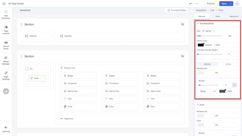
Size: You can set the size of the checkboxes and radio buttons displayed with your filter types. You can choose the screen type (Laptop, Tablet Landscape, Tablet Portrait, Mobile Landscape, and Mobile Portrait), and adjust the size using a slider.
Check Color: You can adjust the color and opacity of the check using this option.
Checkbox Border Radius: You can adjust the border radius of the checkboxes using this slider.
Border: You have the option to adjust the border padding, border type (solid, double, dotted, dashed, groove, ridge, inset, outset) as well as the opacity of the border.
Input
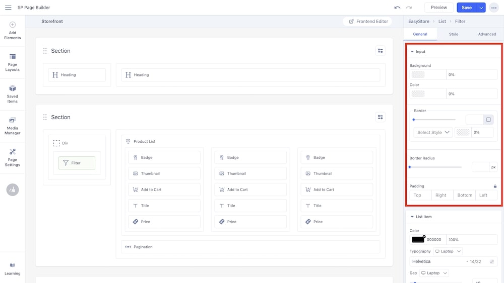
Background: You can adjust the color and opacity of the input text background using this option.
Color: You can adjust the color of the input text using this option.
Border: You have the option to adjust the border padding, border type (solid, double, dotted, dashed, groove, ridge, inset, outset) as well as the opacity of the border of the input text.
Border Radius: Using the slider and adjacent field you can adjust the border radius in pixels.
Padding: You can set the padding for the input field using this option.
List Item
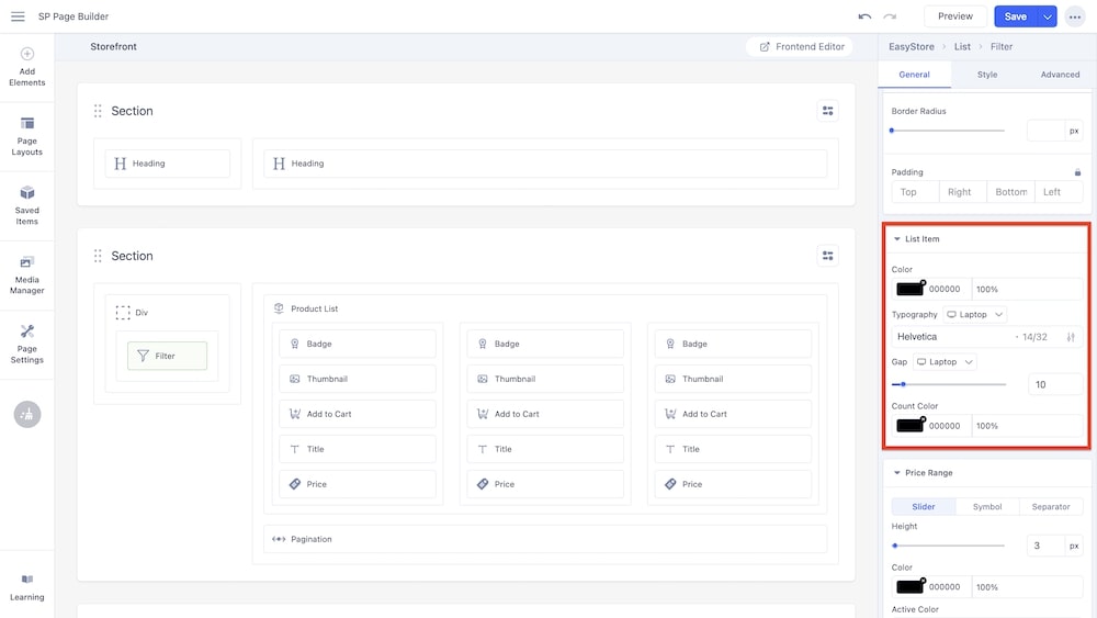
Color: You can adjust the color of the list items using this option.
Typography: You can customize the font type, font size, Line Height, Letter Space, Style, and Weight of the list items.
Gap: You can set the gap between the list items. You can choose the screen type (Laptop, Tablet Landscape, Tablet Portrait, Mobile Landscape, and Mobile Portrait), and adjust the gap using a slider.
Count Color: You can determine the color and opacity of the product counts that can be displayed alongside the list items.
Price Range
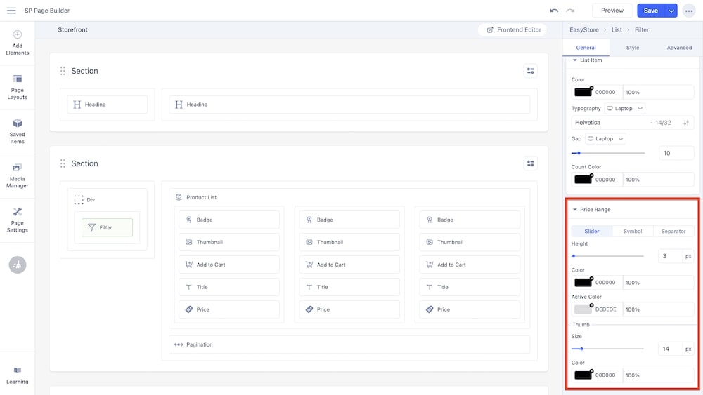
Slider: The first tab for customizing price range will provide you with the following settings:
-
Height: Adjust the height of the slider.
-
Color: Change the overall color of the slider.
-
Active Color: Change the color of the active range within the slider.
-
Thumb: Adjust the size, color and opacity of the slider thumbs.
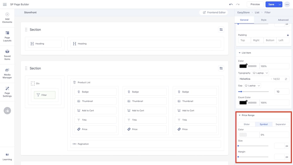
Symbol: In this tab, you can set the color and opacity of the currency symbol, as well as the size and margins.
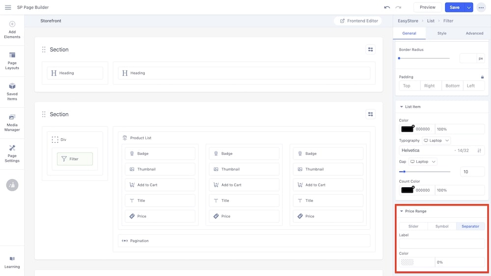
Separator: In this tab, you can customize the separation between the lower and higher ranges by inserting a label and adjusting the color and opacity of that label.

