

Columns
What are Columns
Similar to Rows, Columns are Structures that help build the layout of a webpage. Using the help of Columns, a single Row can be divided into multiple Columns and each of these Columns can hold other addons.
How to Add Columns
Using the Add New Row Button
Columns can be added to a webpage in two ways. The first way is to click on the Add New Row button that is shaped like a plus icon. You’ll find this icon appears after every section of your page so click on the one where you want to place your new Columns.
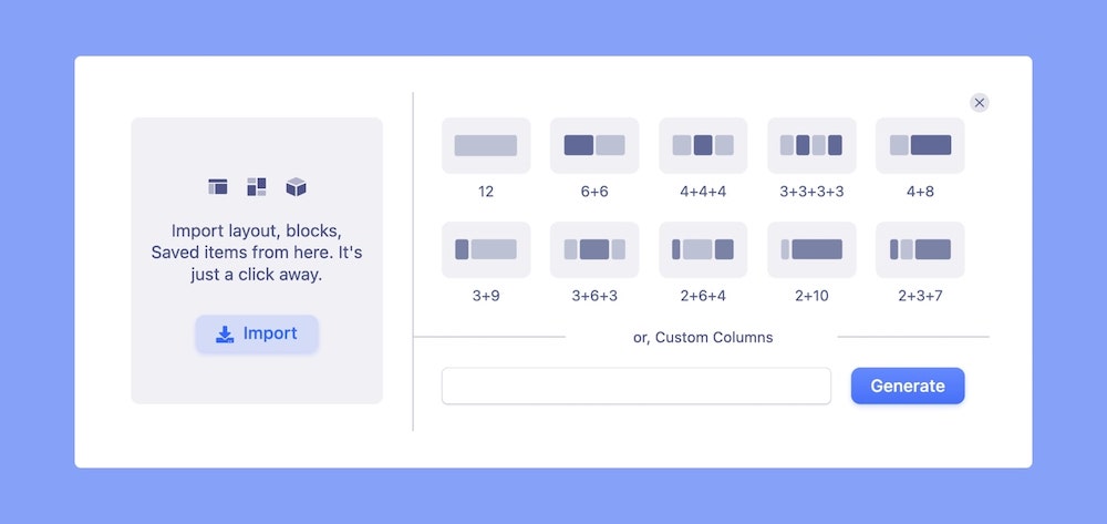
On clicking, the Column Generator panel should open up. Here, you’ll find several Column Structures to choose from. You can also generate a custom Column Structure using the field at the bottom.
Simply select the option of your choice and it should be added to your page!
Using the Column Addon
Now, the other way to add Columns is to select the single Row & Column option i.e option one from the Column Generator. Then open the Addons Panel clicking on the Addons option from the SP Page Builder Sidebar.
From this panel, find the Columns addon under the Structures section and drag and drop it inside your Row.
By default, only two Columns will be added but you can always add more by nesting one Column addon inside another.
Column Structure
Below each option is a series of numbers. These numbers signify the Column Structure and how much space each Column will occupy. To understand this fully, you first need to know that the SP Page Builder Column Structure works in a similar way to the Bootstrap Grid System.
This means that the SP Page Builder canvas is divided into 12 vertical parts in total just like in Bootstrap. Therefore, the total horizontal space available for a Row is 12 and so all Columns in a single Row will occupy space within this number.
For instance, the second option has the Column Structure 6+6 equal to 12. This means that there are two Columns and each Column takes up 6 vertical parts. On the other hand, we have the second last option with Column Structure 2+10. While the total is still 12, in this case, the first Column is smaller than the other and hence they’re unequal.
Custom Column Structure
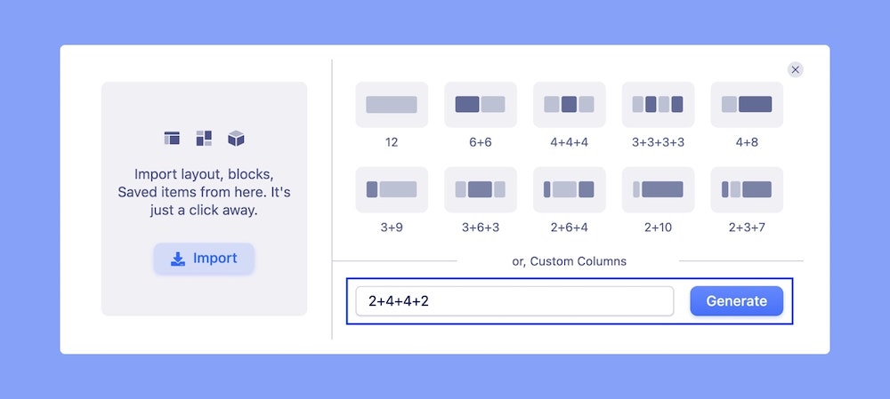
Using the field at the bottom of the Column Generator panel, you can define a Custom Column Structure. With 12 as a total, you can arrange multiple Columns of varying of widths.
Suppose you want the first and last Columns to be 2 parts wide and the second and third Columns to be 4 parts wide. Then, your Custom Column Structure will be 2+4+4+2. Like this, you can define any Structure you desire.
Note that with the total being 12, the minimum number of Columns is 1 and the maximum number of Columns is 12.

Adjusting Column Width
The width of a Column can be adjusted by clicking and dragging on the Column boundary. Or you can specify the width by entering a percentage number into the input field that appears above.
Adding Content to Columns
Now that you’ve added your Columns, it’s time to add your content. Click on the plus icon inside one of the Columns to open the Addons Panel. Here, click and drag the addon of your choice. You can choose from any of the addons from here including Columns or any other Structure for a nested layout.
Column Order Options

Control the order in which the columns are displayed on your webpage on different devices with the Column Order Options. This feature lets you order out your page layout’s columns across other devices, that is, across different screen sizes and orientations. By rearranging the order of columns for different devices, you can ensure that your content is easily readable and visually appealing on all devices.
Tablet Order Landscape: Specify the order of columns for a tablet landscape orientation.
Tablet Order Portrait: Specify the order of columns for a tablet portrait orientation.
Mobile Order Landscape: Specify the order of columns for a mobile landscape orientation.
Mobile Order Portrait: Specify the order of columns for a mobile portrait orientation.