

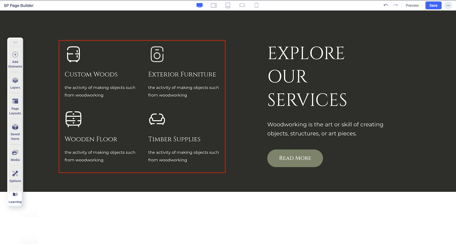
Feature Box
What is a Feature Box Addon
Feature Box addon lets you display your features, tag messages, or something with a good title, content display, and focused elements. The SP Page Builder Pro feature box will display your featured content in the most concentrated way for maximum exposure.
How to Add a Feature Box Addon
You can add a Feature Box addon to your page from the SP Page Builder sidebar. Simply drag the addon from the Addons panel and drop it on the section of the page where you want to add a Feature Box addon.
Feature Box Settings
When you click on the Feature Box addon, the addon settings will open up. You can access the Feature Box settings and customize the addon to fit your needs.
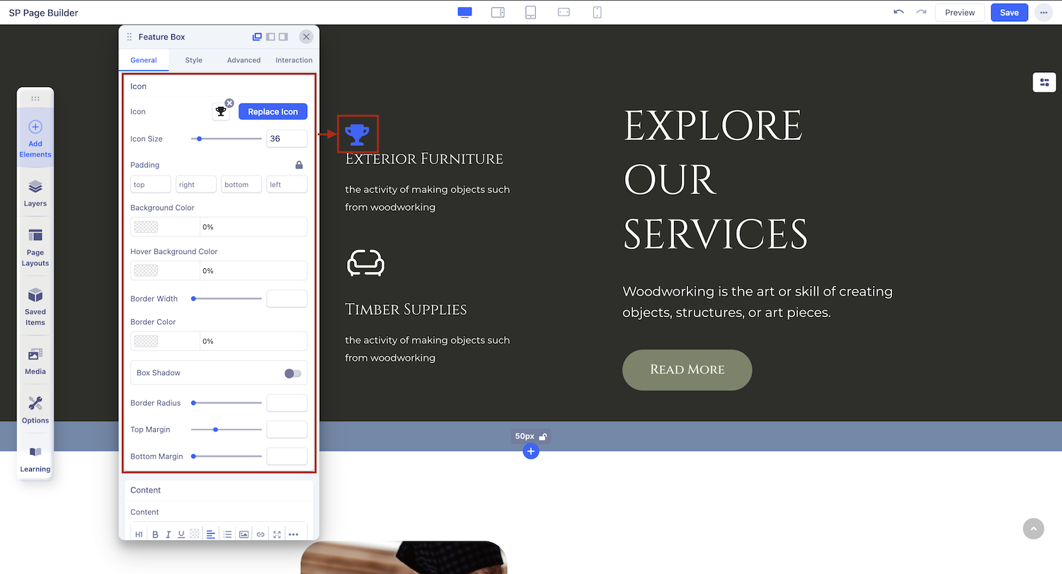
Media
The Media tab comes with a Media Type option that lets you access the settings of your used icon or image or if you have used both icon and image in your Feature Box addon.
Media Type: Icon
Choose this option if you want to set an Icon in your Feature Box. Icon media type comes with the following settings:
- Icon: Replace the icon according to your preference from a list of different icons in the Icon Library.
- Position: Choose where you want to position your chosen icon in the Feature Box.
Media Type: Image
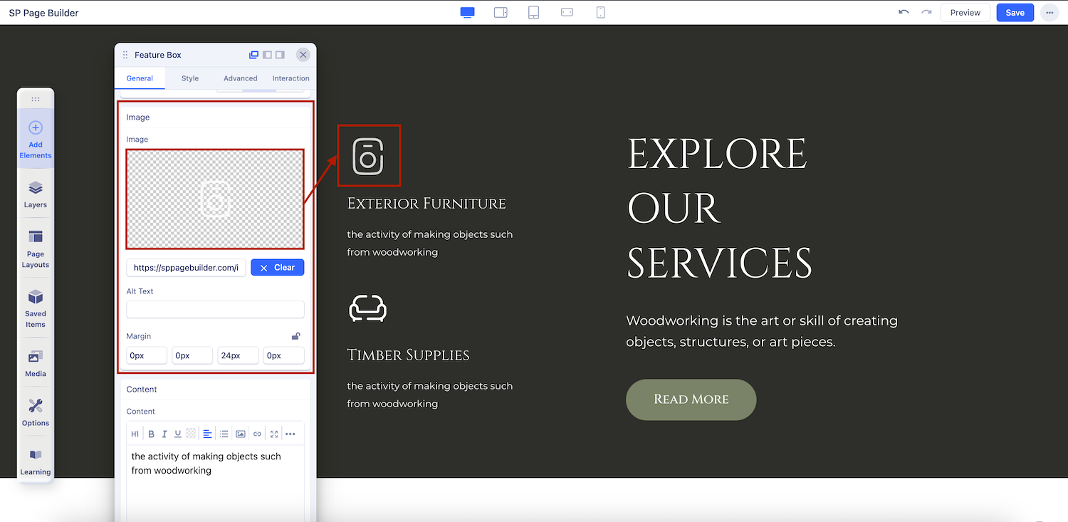
Choose this option if you want to set an image in your Feature Box. Image media type comes with the following settings:
- Image: Choose what image you want to set in your Feature Box and upload it from the Media Manager.
- Margin: Set the top, right, bottom, and left margins using these fields. The value you put is always in pixels(px).
- Position: Choose the position where you want to set your chosen image in the Feature Box. Choose from a dropdown list of different image positions.
- Alt Text: Add ALT text for your image in the Feature Box addon for creating a better user experience for your visitors.
Media Type: Both
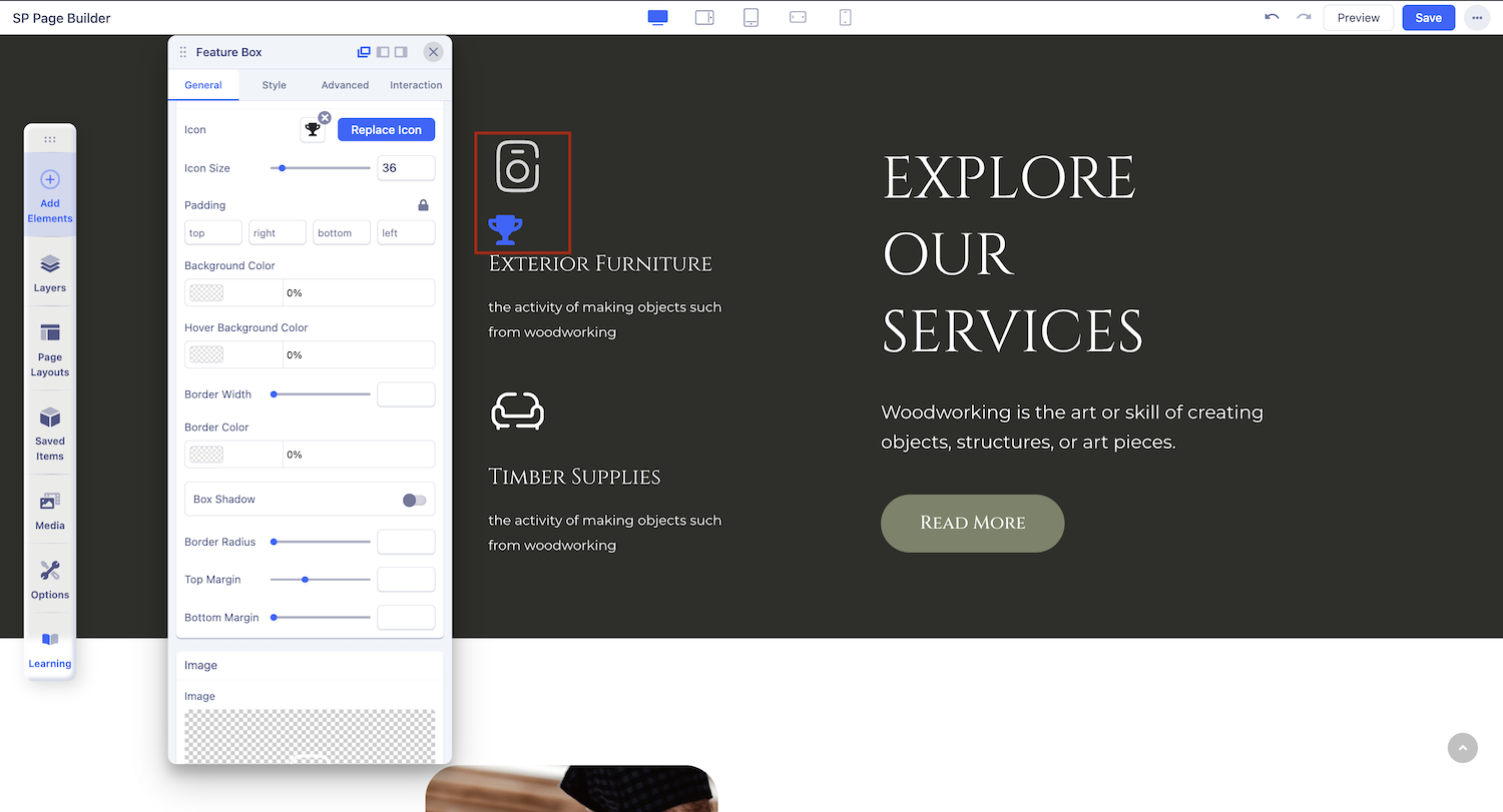
Choose this option if you want to use both icons and Images in your Feature Box. This media type comes with the following settings:
- Icon: Replace the icon according to your preference from a list of different icons in the Icon Library.
- Image: Choose what image you want to set in your Feature Box and upload it from the Media Manager.
- Margin: Set the top, right, bottom, and left margins using these fields. The value you put is always in pixels(px).
- Position: Choose the position where you want to set your chosen image and icon in the Feature Box. Choose from a dropdown list of different options.
Title
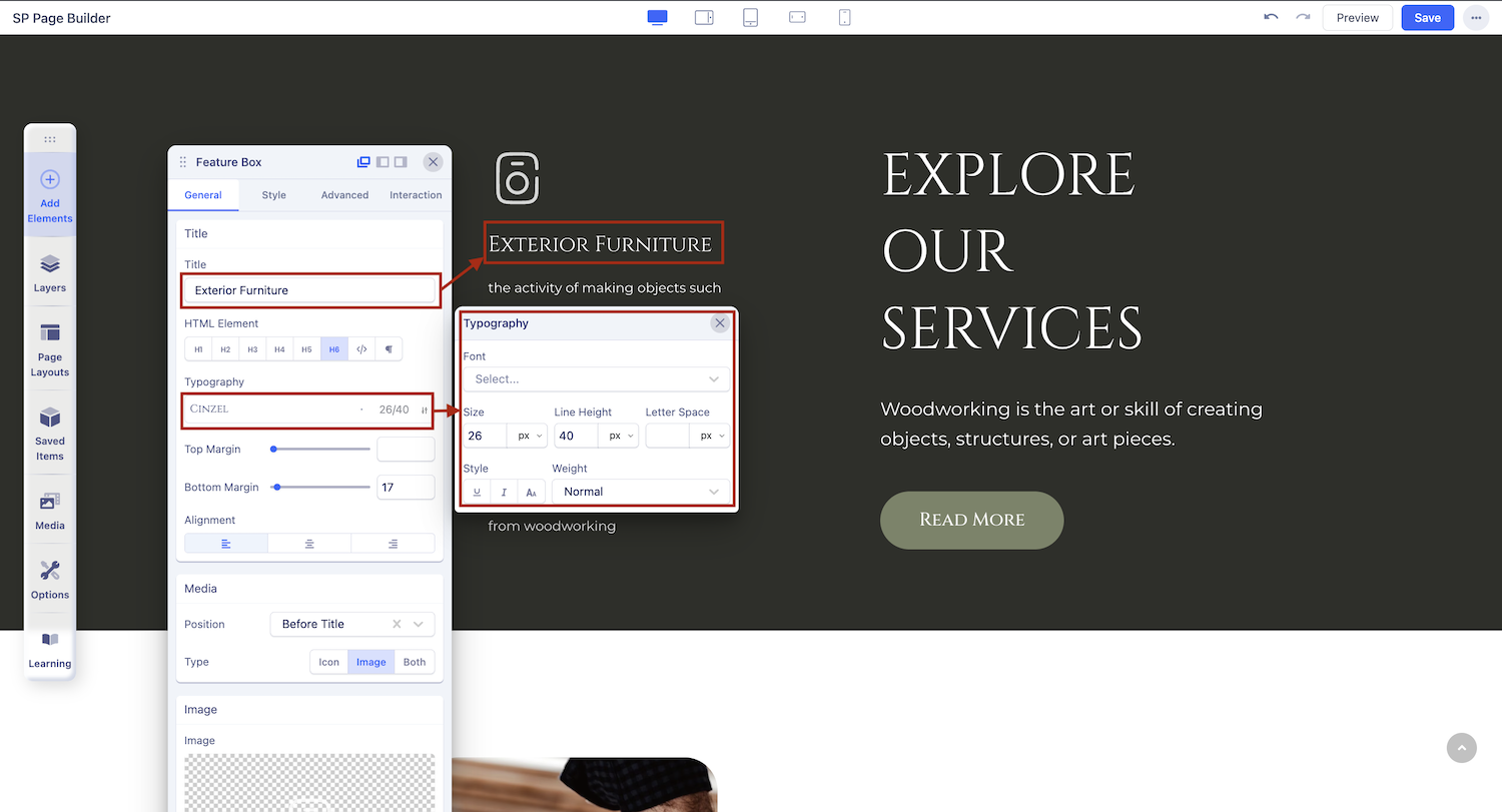
Use this tab to add a title to the section you just added with the addon.
- Title: Add a title on top of your feature box.
- HTML Element: The <h1> to <h6> tags are used to define the HTML headings according to their importance.
- Top Margin: Customize the space above your title.
- Bottom Margin: Customize the space below your title.
- Typography: Customize the font, size, and other text styles for your feature box title in this section.
Content
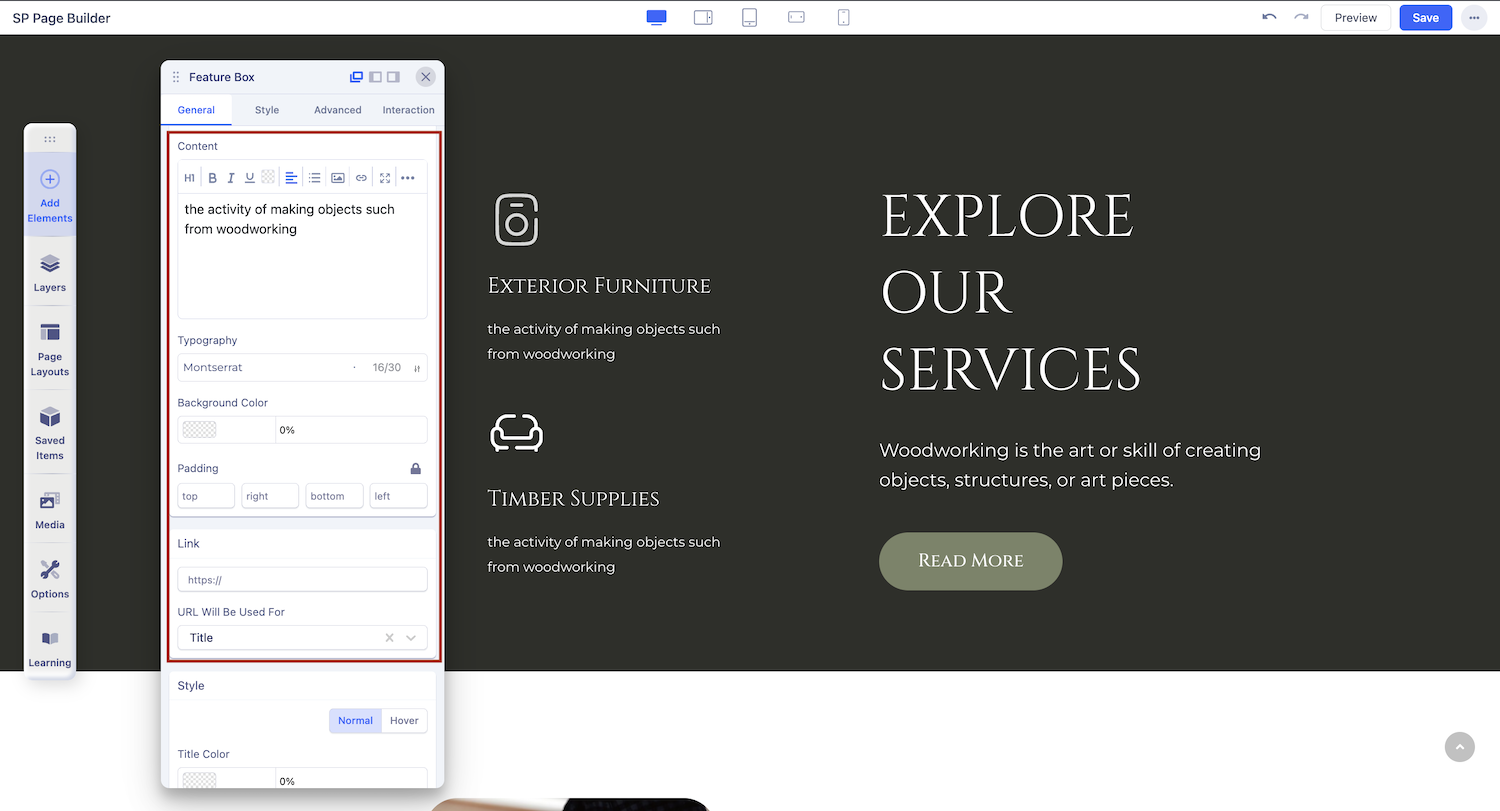
In this addon content is everything. Use this editor field to enter your content here. Arrange your content in your desired way using this content field.
Link Settings
Use the Link Settings to convert your feature box Title, image/icon, or both into a Hyperlink. Choose among the options URL, Menu, and Page.
- For URL, simply paste the web address you want to link to into the first field.
- For Menu, select the option you want to link to from the dropdown list. Note that the options on this list are all Menu Items that exist on your website.
- For Pages, select the option you want to from the dropdown list. Like Menu, these options are all existing Pages available on this website.
Lastly, you can enable the option Open in New Tab to open this link in a new tab and No Follow to tell search engines to ignore this link.
- URL Will Be Used For: Choose where you want to use your link from a dropdown menu list of available options.
Style Settings

You can customize the style of your feature box here. Customise colors for title, text, and background. Select between ‘Normal’ and ‘Hover’
Button
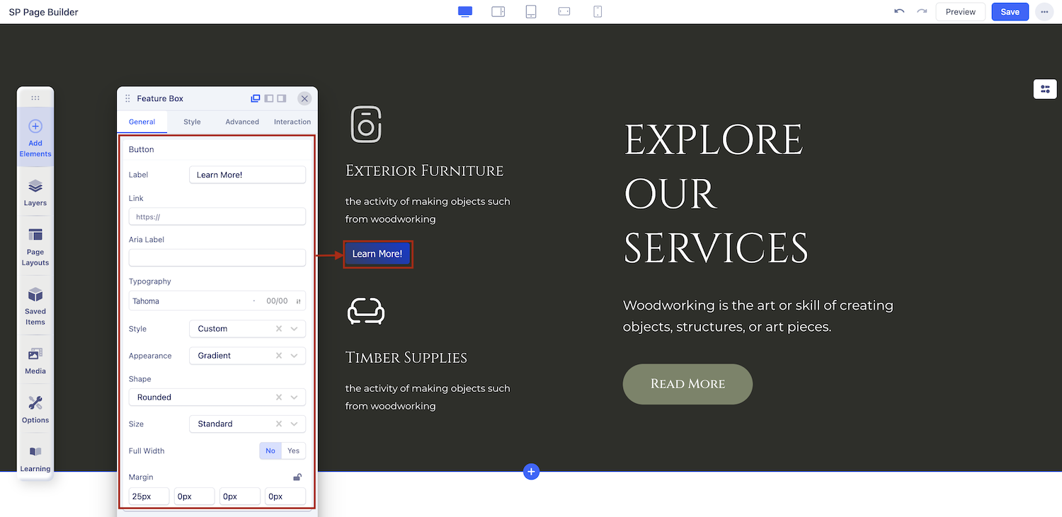
Use this setting in case you want to set a button inside your Feature Box. The Button Settings comes with all the options necessary to create a fully customized button.
Label: Enter the button text here. Leave it blank if you don’t want any button.
Link: Set an URL for your button
ARIA Label: Set ARIA labels for your buttons here so that users with impairments can easily navigate your site.
Style: You can choose a desired button style from the given list.
Appearance: You can choose a suitable button appearance from the list.
Shape: Choose your button shape from the list using this option.
Size: There are numerous options you can choose from to define your button size.
Full Width: Set this option to ‘Yes’ if you want a full-width button. Leave that to ‘No’ if you don’t.
Margin: Set an optimum distance around your button.
Button Style
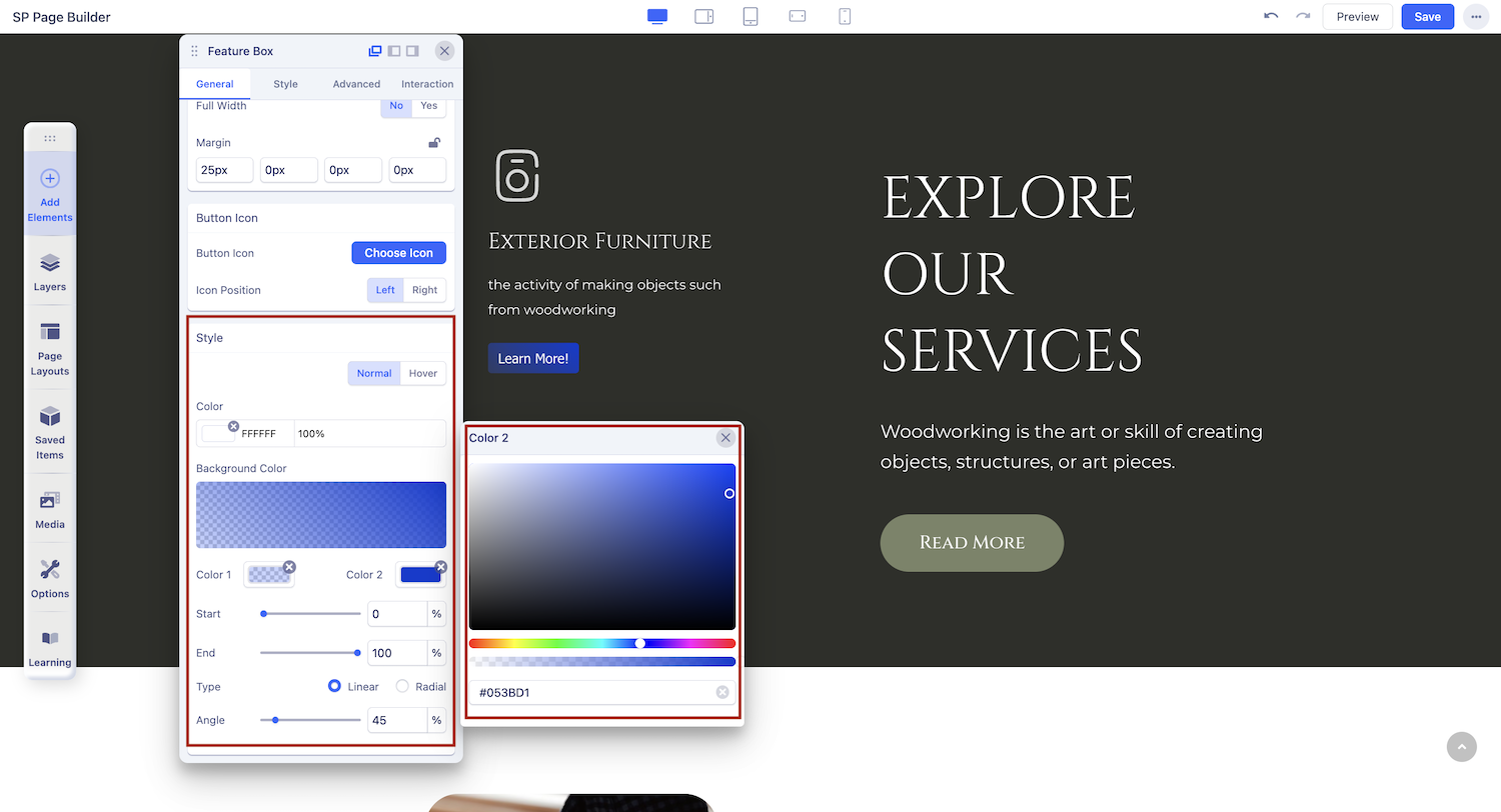
Style
Use the Color settings to customize the appearance of your button. These settings include two options:
- Normal: Adjust the background color and text color of your button.
- Hover: Customize the background color and text color of your button when hovered over.
Icon
Button Icon lets you choose any icon that you want to place inside your button.
- Button Icon: Choose your desired icon from a list of available icons in the Icon Library.
- Icon Position: Choose whether you want to set the icon position to the left or right of your button text.
Link
Add a link to your added button using the Link tab options.
- For URL, simply paste the web address you want to link to into the first field.
- For Menu, select the option you want to link to from the dropdown list. Note that the options on this list are all Menu Items that exist on your website.
- For Pages, select the option you want to from the dropdown list. Like Menu, these options are all existing Pages available on this website.
Lastly, you can enable the option Open in New Tab to open this link in a new tab and No Follow to tell search engines to ignore this link.
Popups for Buttons
The Feature Box addon allows you to launch popups directly from its button. When configuring this option, you will find the following settings:
- Action After Click
Choose what happens when the button is clicked. To trigger a popup, select the Open Popup action. - Select Popup
Choose the specific popup you want to display when the button is clicked. This links the button to your desired popup, making it easy to show promotions, announcements, or additional content.
Note: To trigger popups from the Feature Box button, ensure that the popups you want to use are already created.