

Modal Popup
A modal is a dialog box/popup window that is displayed on top of the current page.
How to Add a Modal Popup
You can add a Modal Popup to your page from the Addons panel of the SP Page Builder sidebar. Simply drag the Modal Popup addon from the Addons panel and drop it on the section of the page where you want to add the addon.
Modal Popup Settings
When you click on the Modal Popup addon, the addon settings panel will open up. You can access the addon settings from here and customize the addon to fit your needs.
The Modal Popup consists of a Selector and a window that pops up when you click on the selector.
Modal Popup Settings - Handle
There are three types of modal selectors available in modal selectors—Button, Image, and Icon.
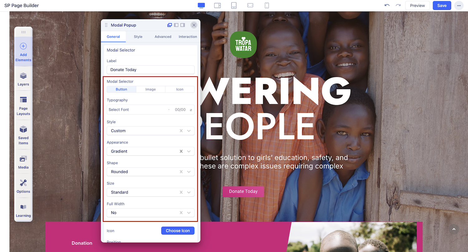
Modal Selector: Button
Select this if you want the modal selector to be a button.
Button Text: The button text is the text that will be displayed on top of the button. It’s a short text that elaborates on the button's function. Use this field to change the text on your button.
Button Settings
When you select the modal selector to be a Button, a Button Settings option appears on the inline editor. From here, you can customize the look of your Button.
Button Style: Customize the overall look of your button.
Appearance: Choose between outline, gradient, or flat styles.
Button Shape: Select from standard, large, small, extra large, and more.
Icon: From the icon tab, set a button icon and button position.
Typography: Set the font type, font size, and style of the font text from this tab.
Color: Set the Text color and Background color of the button from this tab.
Please go through the documentation for the Button addon, for an in-depth tutorial on Button.
Modal Selector: Image
Select this if you want the modal selector to be a button.
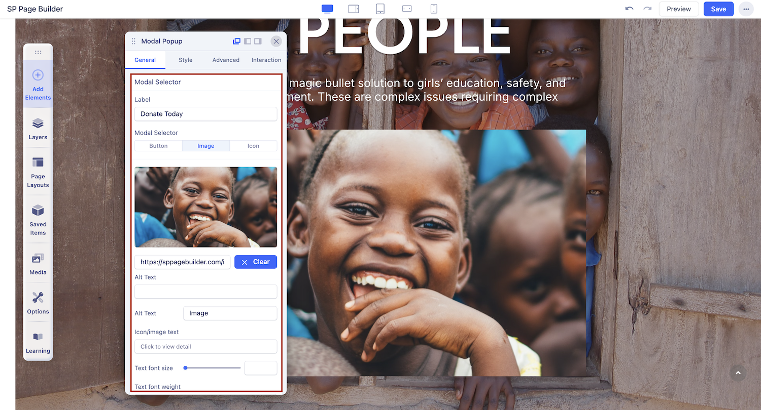
Here you can access the Media Manager to upload or use an image from the gallery as a modal selector.
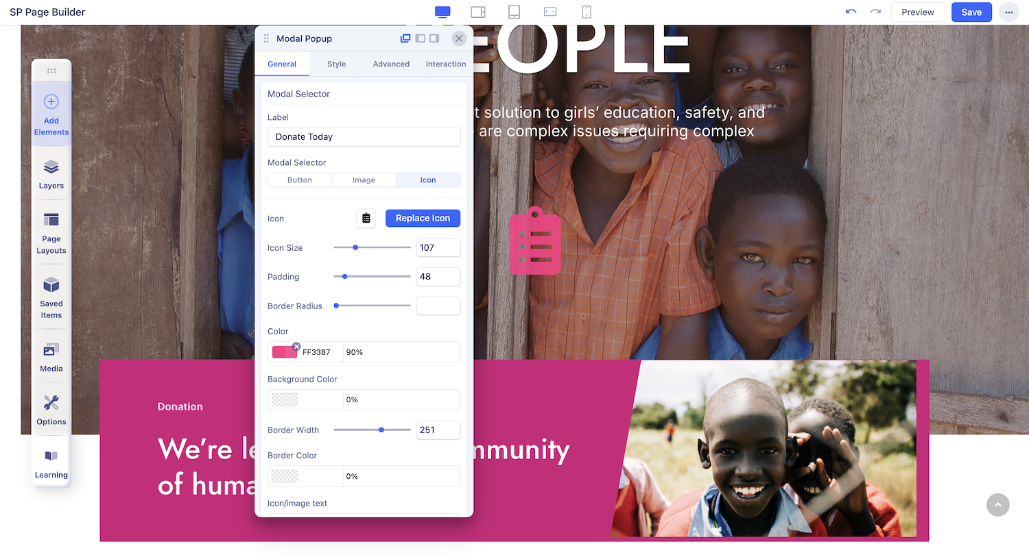
Modal Selector: Icon
Select this if you want the modal selector to be a button.
- Icon: Add visual meaning to your modal selector with the Font Awesome icons or use your own custom icons. Learn more about custom icons Here.
- Icon Size: Set the size of the icon using this option. Use the slider to up and down the number to adjust it according to your requirements.
- Padding: Set the space between the icon and its border. Use the slider to up and down the number to adjust it according to your requirements.
- Border Radius: Border radius is for the corner of the border to be rounded or straight. Use the slider to up and down the number to set the Border Radius.
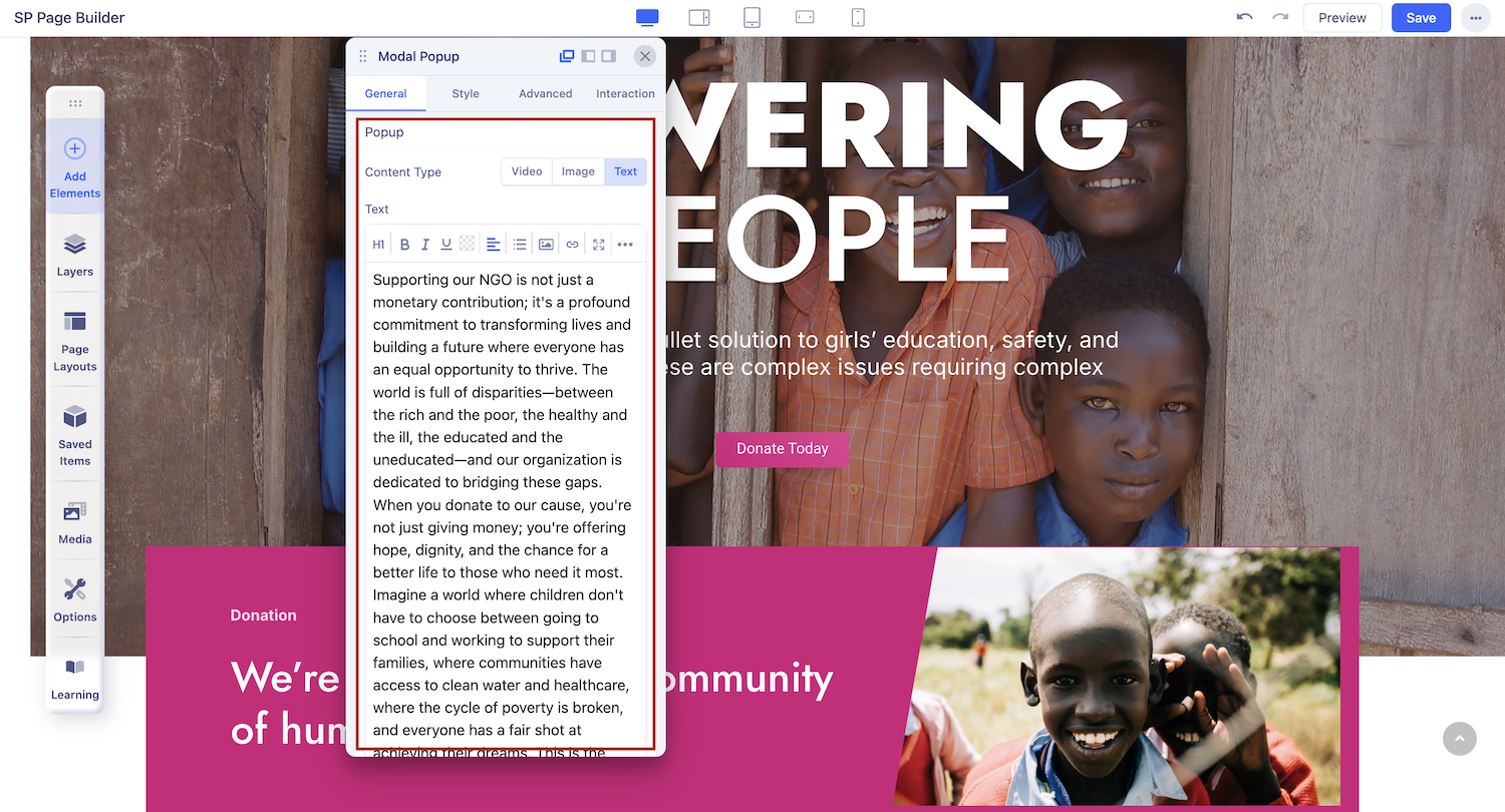
Modal Popup Settings - Popup
There are three types of popup available in SP Page Builder—Video, Image, and Text.
Content-Type: Video
Select this if you want to use a video as the modal popup.
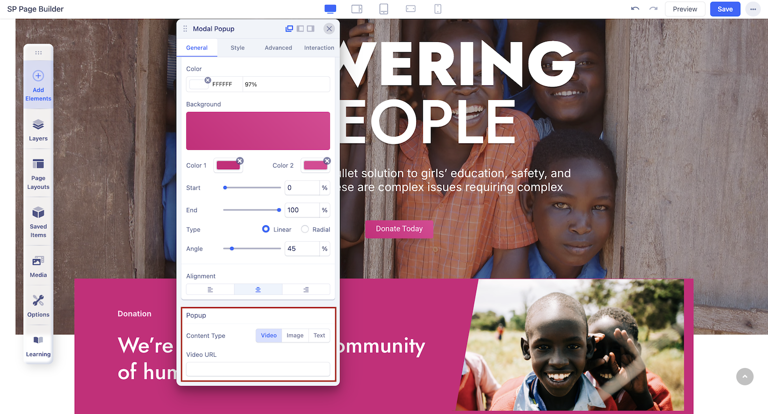
Video URL: Insert the URL of the video you want to use in this field.
Content Type: Image
Select this if you want to use an image as the modal popup.
Here you can access the Media Manager to upload or use an image from the gallery as the modal popup.
Popup Width: Set the modal popup width. The width will define the amount of space the modal is going to cover horizontally.
Popup Height: Set the modal popup height. The height will define the amount of space the modal is going to cover vertically.
Content Type: Text
Select this if you want the modal popup to show up as a text block.
Popup Width: Set the modal popup width. The width will define the amount of space the modal is going to cover horizontally.
Popup Height: Set the modal popup height. The height will define the amount of space the modal is going to cover vertically.