

Accordion
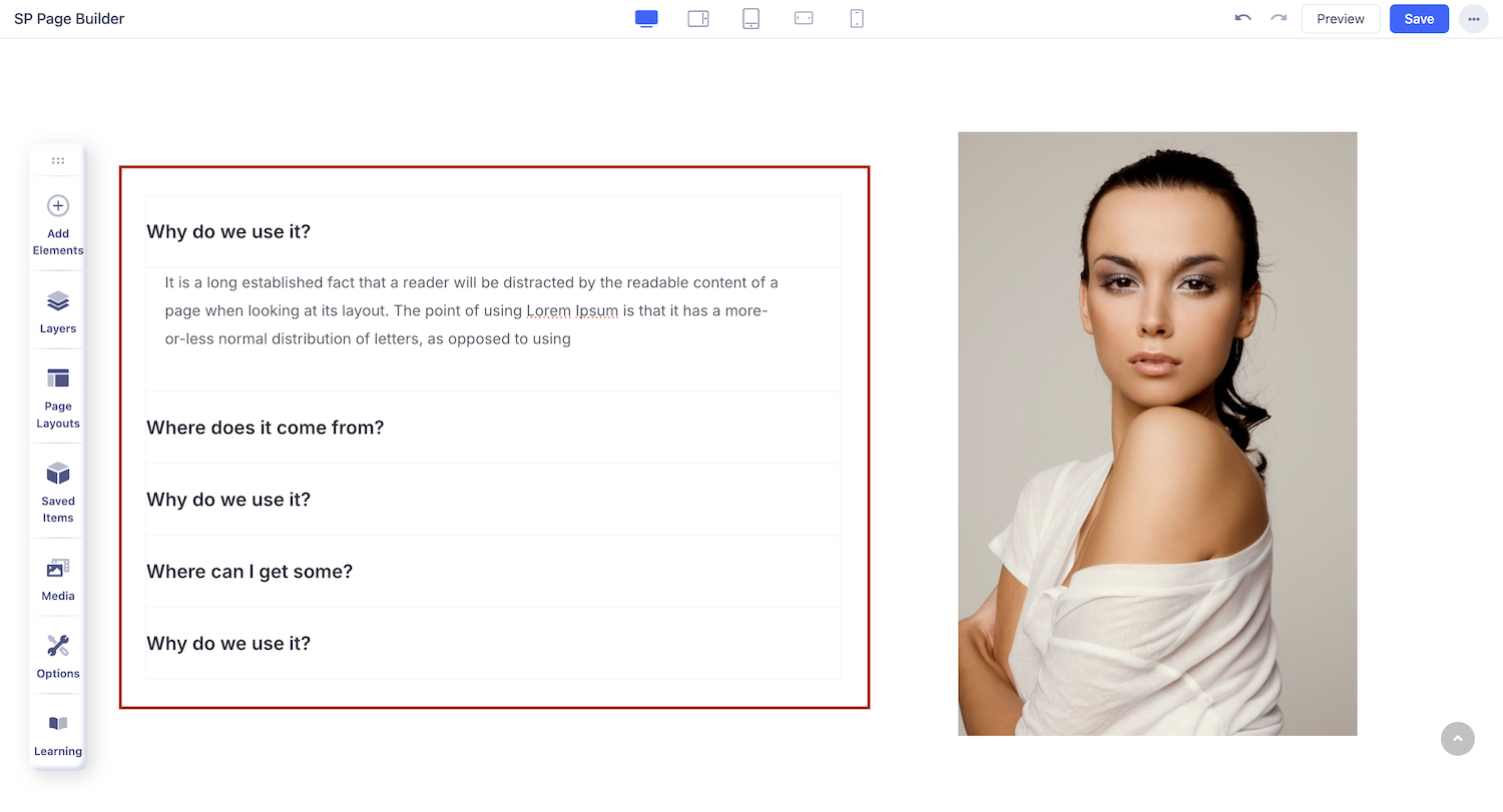
An Accordion is a vertically stacked list of headers that can be clicked to reveal or hide content associated with them.
How to Add an Accordion Block?
You can add an accordion addon to your page from the SP Page Builder sidebar. Simply drag the addon from the Addons panel and drop it on the section of the page where you want to add an accordion.
Accordion Settings
When you click on the Accordion addon, the addon inline editor will open up. You can access the addon settings and customize the accordion to fit your needs.
Accordion Items
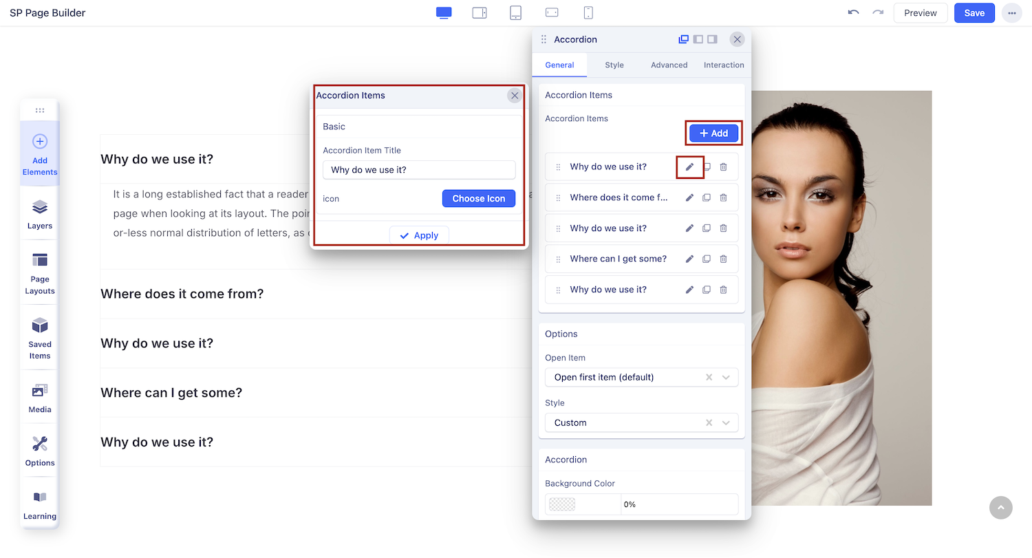
Add Accordion Items: Click on the + ADD button to add a new accordion item. Once you add an accordion item, you will see the options to edit, duplicate, or delete the accordion item.
Accordion Item Title: Use this field to give your accordion item a title.
Icon: You can also add an icon beside the accordion item title. Click on the Choose Icon button to select your desired icon.
Click Apply once done.
Accordion
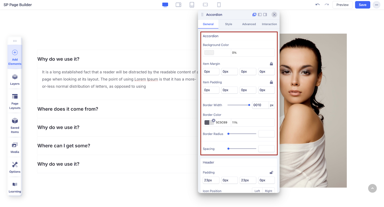
You can edit the appearance of your accordion item from this section. Set background color, add margin or borders, and customize the overall look of your accordion item.
Border Radius: Border radius is for the corner of the border to be rounded or straight. Use the slider to up and down the number to set the Border Radius.
Spacing: Use the slider to add spacing between the accordion items.
Item Margin & Padding: Set the margin and padding to the accordion items. Use the slider to up and down the number to adjust it according to your requirements.
Header

Padding: Add padding to the top, right, bottom, and left of the accordion title.
Media Position: Set your title media to be displayed right or left.
Media Size: Set the size of the media using this option. Use the slider to up and down the number to adjust it according to your requirements.
Media Margin: Add margin to the top, right, bottom, and left of the accordion title.
Media Rotation: You can rotate the media up to 360 degrees here. Use the slider to move up and down the number or type the number in the input field to rotate the media according to your requirements.
Option
Open Item: There are a few options for how the items will be displayed. If you select “open first item” then the first item will be opened and all others will be closed. The option “open all items” makes all the items open and the option “close all items” will make all the items closed.
Style: SP Page Builder accordion comes with different kinds of accordion styles. This accordion style field lets you choose your desired style from the drop-down list of styles.
- Modern
- Default
- Primary
- Success
- Info
- Warning
- Danger
- FAQ
- Custom